9 Typography Techniques to Elevate Your Food Blogs
A well-crafted food blog is more than just mouth-watering recipes and stunning photos – it’s also about capturing your readers’ attention with engaging, easy-to-read content.
The right typography can transform the look and feel of your website, making it more inviting and enjoyable. By mastering a few key techniques, you can boost readability, create a cohesive aesthetic, and highlight important information effectively. This not only keeps your audience engaged but also makes your blog stand out in a crowded online space.
9 Typography Techniques to Elevate Your Food Blogs
Typography plays a crucial role in the overall look and feel of your food blog. By using these nine techniques, you can create a more engaging, visually appealing site that readers love.
1. Choose Friendly Fonts
Selecting welcoming fonts is key to making your food blog inviting and approachable. Opt for fonts that resonate with the warm, comforting nature of culinary content. Handwritten or serif fonts often work wonders, adding a personal and playful touch to your posts.
But remember, readability is crucial – no one wants to struggle through fancy but indecipherable text. Balance aesthetics with clarity for an optimal reading experience. As you immerse readers in mouth-watering stories and recipes, enjoyable typography ensures they stay longer.
2. Create a Visual Hierarchy
Crafting a clear visual hierarchy in your food blog is essential for guiding readers seamlessly through your content. By using different font sizes, weights, and styles for headings, subheadings, and body text, you help highlight key sections and points.
This makes the reading experience more comfortable and engaging. For instance, bold headlines quickly draw attention, while smaller subheadings break down the information into digestible chunks. Effective use of visual hierarchy keeps your audience hooked from start to finish, making your blog both visually appealing and easy to navigate.
3. Add Captivating Call-to-Actions (CTAs)
Effective call-to-actions (CTAs) are essential in guiding your readers to take the next step. Use eye-catching typography techniques like bold fonts or vibrant colors to make these CTAs stand out. Phrases such as “Try this recipe now!” or something more specific like “HelloFresh offers pre-made delicious meals delivered to your doorstep” can be game-changers for your site.
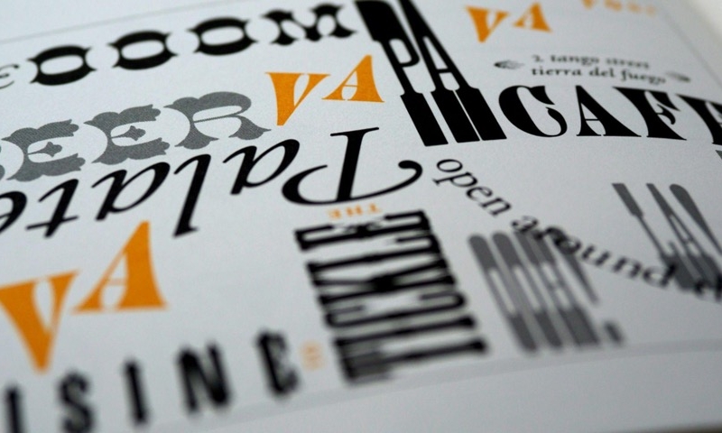
4. Pair Contrasting Fonts
Pairing contrasting fonts can significantly enhance the visual appeal of your food blog.
By combining a bold, eye-catching font for titles with a simpler, more readable font for body text, you create a striking balance that makes your content stand out. This typography technique adds personality and depth to your posts without overwhelming the reader.
Make sure the fonts complement each other and align with the overall theme of your blog. A well-chosen pair can elevate the aesthetics and readability of your site significantly.
5. Utilize White Space
Utilizing white space effectively can improve the look of your food blog. White space, or negative space, provides a visual break for readers, making your content easier to navigate. It helps highlight key elements and prevents your pages from appearing cluttered or overwhelming.
By giving each element room to breathe, you create a cleaner, more professional aesthetic. This simplicity allows your stunning food photography and compelling text to shine, ultimately enhancing user experience and keeping readers engaged longer.
6. Customize Block Quotes
Customizing block quotes can add a unique touch to your food blog, making them stand out and draw in readers. Consider using larger fonts, italics, or even a different font style for these sections to distinguish them from the main text. Adding decorative elements like borders or background colors can also help emphasize important quotes or tips from chefs.
This not only breaks up the content but also adds visual interest. Well-designed block quotes can highlight valuable insights and keep your audience engaged with dynamic content.
7. Use Consistent Alignment
Using consistent alignment throughout your food blog is crucial for creating a cohesive and professional look. Aligning text, images, and other elements uniformly across your pages makes your blog easier to read and visually appealing. For example, left-aligning your body text with center-aligned headings can create a clean, organized layout.
Consistency in alignment avoids visual clutter and guides the reader’s eye smoothly down the page. This attention to detail enhances user experience, making your content more enjoyable.
8. Embrace Color Variations
Embracing color variations can bring your food blog to life, adding vibrancy and excitement to each page. Strategically using different colors within your text enhances readability and draws attention to important points or sections. For example, you might highlight key ingredients or special tips in a bright, contrasting color that stands out from the main content.
Just be sure to maintain a cohesive color scheme that aligns with your blog’s theme. Thoughtful use of color not only beautifies your site but also captivates and engages your readers.
9. Incorporate Decorative Elements
Incorporating decorative elements can add an extra layer of charm and personality to your food blog. Small icons, illustrations, or themed borders related to food can enhance the visual experience without overpowering the main content. For instance, adding a whisk icon next to recipe sections or using leaf patterns as dividers creates visual interest.
These impactful touches bring a cohesive look to your blog, making it more engaging to explore. Thoughtful decoration can transform your site into a delightful culinary journey that readers love.
Don’t Sleep on These Typography Techniques
Now that you’re equipped with these powerful typography techniques, it’s time to put them into action on your food blog. Experiment with different fonts, play around with color variations, and don’t forget to make use of white space for a clean layout. Implementing these tips can significantly enhance your readers’ experience and make your content even more appealing.