
Why Typography and Visual Hierarchy Determine Whether Your Landing Page Converts
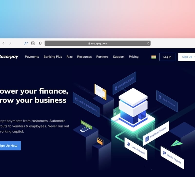
As an art director or graphic designer, you likely view typography and visual hierarchy as the bedrock of brand identity. You spend hours calibrating scale ratios, refining leading, and hunting for font pairings that evoke precisely the right tone.
However, when building landing pages for clients, your typographic decisions carry weight far beyond brand aesthetics. They act as cognitive ergonomics. Within the first 50 milliseconds of landing on a page, a visitor’s brain makes a subconscious judgment about credibility and trust—long before they read a single sentence of body copy.
If typography is sloppy, contrast is weak, or visual hierarchy is ambiguous, visitors do not simply feel a slight aesthetic discomfort. They bounce.
Understanding how design choices translate into conversion mechanics empowers you to deliver landing pages that look exceptional while directly driving client revenue. Incorporating modern workflow tools like PageKiss can help streamline this transition from visual concept to conversion-focused layout.
Typography as Cognitive Ergonomics
Good typography makes reading effortless; bad typography forces the brain to work. In conversion rate optimization (CRO), unnecessary mental effort is referred to as cognitive friction. When cognitive friction spikes, conversion rates plummet.
To craft conversion-focused typography, evaluate your layout through three technical levers:
1. Measure and Line Length
The ideal line length for web copy rests between 45 and 75 characters per line (including spaces). When lines are too long, the reader’s eye struggles to track back to the start of the next line, causing fatigue. When lines are too short, the forced rhythm disrupts reading comprehension.
If you want to start with pre-tested baseline layouts that maintain optimal line lengths across devices, exploring PageKiss’s landing page templates provides a solid visual foundation.
2. Leading and Vertical Rhythm
Digital text requires generous leading—typically 140% to 160% of the font size for body text. Tight leading causes text blocks to merge visually into intimidating walls of content. Maintaining a consistent baseline grid creates a predictable cadence that keeps users scrolling down the page.
3. Font Scale Ratios and Contrast
Relying solely on weight differences (e.g., medium vs. bold) to establish hierarchy rarely creates enough visual distinction on screen. Using an explicit modular scale (such as a Major Third 1.25 or Perfect Fourth 1.333 ratio) guarantees that H1, H2, and body text maintain undeniable visual distinction across responsive breakpoints.
Visual Hierarchy Mechanics: Directing the Eye to Action
Visual hierarchy is the intentional arrangement of elements to signal their relative importance. On a landing page, visual hierarchy dictates the visitor’s visual scan path.
Most web users do not read landing pages sequentially; they scan in structured patterns:
- The F-Pattern: Standard for text-heavy pages, where users scan across the top, down the left edge, across a shorter horizontal span, and down.
- The Z-Pattern: Common on landing pages with hero sections, guiding the eye from the top logo across to navigation, down diagonally to key value propositions, and finally to the call-to-action (CTA).
When visual hierarchy breaks down, user scanning fails. Here are two frequent hierarchy traps that art directors must prevent:
Competing Focal Points
If your primary CTA button shares the exact color saturation, weight, or scale as secondary elements (like navigation items, badge icons, or secondary buttons), you create visual clutter. A landing page should feature one unmistakable primary action per viewport.
Scale-to-Significance Mismatch
Subheadings or testimonial quotes that dwarf the primary value proposition confuse the visual story. Scale must directly correlate with narrative importance. The H1 should articulate the primary value proposition, supported immediately by visual cues that lead directly to conversion.
The Pre-Launch Conversion Checklist for Designers
Before handing off or publishing a client landing page, move past purely aesthetic reviews. Run through this conversion-centric visual audit:
- The Squint Test: Zoom out or squint at your design. Does the primary CTA button remain the most prominent element on the screen? If it blends into the background, bump its scale, increase whitespace, or adjust visual contrast.
- Above-the-Fold Anchoring: Is the primary value proposition (H1), supporting visual, and main CTA visible without scrolling on mobile viewports?
- Typographic Contrast Ratio: Ensure body copy meets WCAG AA standards (minimum 4.5:1 contrast ratio against the background). Low-contrast gray copy on white backgrounds may look subtle, but it damages readability and accessibility.
- Scannable Subheads: Can a visitor grasp the offer by scanning only the headings and bolded lead-ins in under five seconds?
- Micro-Spacers and Proximity: Group related content using spatial proximity (Gestalt laws). The space above a heading should always be greater than the space below it to clearly associate the heading with its following paragraph.
Connecting Craft with Data
Designers often face pushback from clients or marketers who push for cluttered layouts, massive buttons, or aggressive pop-ups in the name of conversion. You can protect design integrity by backing your typographic and structural choices with objective pre-launch data.
Using an intelligent pre-launch auditing tool allows you to grade visual and structural performance before going live. PageKiss’s AI landing page scorer evaluates page layouts across multiple conversion and credibility dimensions, giving you actionable feedback to validate your visual hierarchy decisions with clients.
Conclusion: Craft Meets Conversion
Typography and visual hierarchy are not decorative afterthoughts—they are the foundational architecture of user behavior. By applying your design expertise toward reducing cognitive friction and guiding the user’s eye intentionally, you create landing pages that elevate brand perception while driving measurable client success.