
Digital Versus Offset: What Actually Changes When Your File Leaves the Screen
Every designer has had the moment where a proof arrives and the color is wrong, the small type has gone muddy, or a hairline rule has vanished entirely. Most of the time this isn’t a production error. It’s a mismatch between what a screen can show and what a print process can physically do — and the fix starts with understanding the mechanics of the process you’ve chosen, not with arguing about calibration after the fact.
Two different machines, two different economics
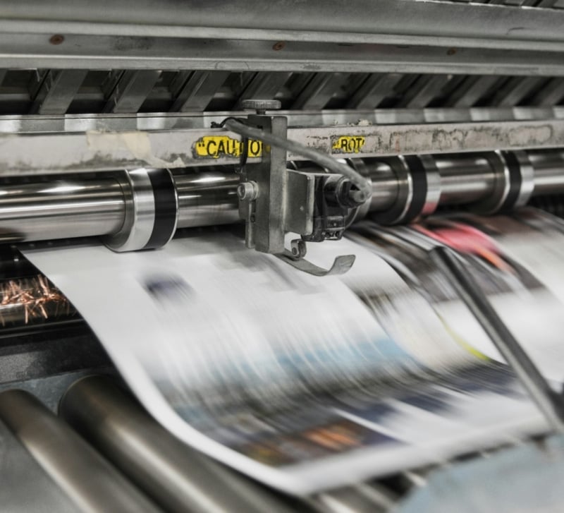
Offset printing transfers ink from a plate to a rubber blanket to paper. Someone has to make a plate for every color in the job — typically four, for CMYK — before a single sheet runs. That plate-making step is fixed cost: it doesn’t matter if you’re printing 500 sheets or 50,000, the plates cost the same to produce. Digital printing skips this entirely. A digital press — toner-based or inkjet — images each sheet directly from the file, page by page, the way a very fast, very precise office printer does. There are no plates, no makeready in the traditional sense, and no minimum to justify the setup.
That single mechanical difference explains almost everything else that follows. Because there’s no plate cost, short runs become economical on digital in a way they never were on offset — a hundred postcards or a run of twenty personalized brochures stop being a pricing problem. Variable data — each piece printed with different text or images, pulled from a database — is only possible on digital, because every sheet can be a unique imaging event. But that same sheet-by-sheet imaging means ink or toner behaves differently than offset ink pressed uniformly across a blanket, and that difference shows up most on stock, coverage, and fine detail — more on that below.
Where the crossover sits
Ask any print buyer where digital stops making sense and offset takes over, and the honest answer is “it depends,” not a number. The real question to ask your printer is: at what quantity does the fixed plate cost of offset get absorbed enough that its lower per-unit ink cost overtakes digital’s per-sheet click charge? That crossover moves depending on the number of colors, the stock, the finishing, and the specific shop’s equipment. A job with tight color matching or a huge run of a simple one-color piece might tip toward offset at a few hundred units. A four-color job with spot varnish might not cross over until the thousands. Don’t assume a threshold — ask the question of whoever’s running the job.
Color: what the screen promises and what the sheet delivers
Your monitor is emissive — it makes color with light — and most print is subtractive, built from CMYK ink or toner on a reflective surface. The gamuts don’t match. Saturated blues, bright greens, and neon-adjacent colors that look glorious in RGB on an sRGB or wide-gamut display frequently fall outside what CMYK can reproduce, and no amount of profile-swapping recovers that lost saturation — it has to be designed around, not corrected after the fact.
Spot colors complicate this further on digital output. Offset can lay down a genuine Pantone spot ink mixed to formula; most digital presses simulate spot colors by building them from CMYK (or CMYK plus additional toners on some machines), which means a brand color matched perfectly on an offset spot run can shift when reproduced digitally, particularly in corporate blues, oranges, and deep greens. If exact brand color is non-negotiable, ask your printer explicitly how spot colors are being simulated on their digital equipment before you approve anything.
None of this is resolvable by staring harder at a monitor. Monitors vary by age, calibration, ambient light, and manufacturer, and two correctly-configured screens can still disagree with each other. A calibrated hard proof, pulled on the actual stock and process the job will run on, is the only argument worth having — it’s a physical object, not an opinion.
Type is where the process shows its seams
This matters more than most file-prep checklists suggest, because type is where imaging resolution and ink spread are least forgiving. A typeface with fine hairline strokes — many geometric sans and modern serifs are drawn this way deliberately — can look razor-sharp at 100% on screen and still break up or drop out entirely in print, because toner and ink both have a physical minimum width they can hold before they fail to register or bridge together.
A few working rules:
- Keep stroke weights above roughly 0.25–0.5 pt for positive (black-on-white) type, and heavier — often 0.75 pt or more — for reversed-out (white-on-color) type, since knockouts are far less forgiving of ink spread closing the counters. Verify the safe minimum with your printer’s spec sheet, since it varies by press and stock.
- Avoid setting body text below about 6 pt in a typeface with fine hairlines or high contrast between thick and thin strokes; the thins may not survive.
- On uncoated stock, toner sits on the surface less cleanly than on coated stock and can spread slightly at the edges, which is exactly where small counters (the enclosed spaces in letters like “e,” “a,” and “o”) fill in first.
Reversed-out type is worth flagging on its own: white text sitting inside a dark background depends on the surrounding ink not creeping inward, and that creep is more visible in digital toner than offset ink because of how each lays down coverage. If a piece leans on delicate reversed type at small sizes, test it on the actual process before finalizing.
File prep that actually protects the design
Standard bleed is 0.125 in (3 mm) beyond the trim edge, with live text and important elements kept at least that same distance inside the trim line as a safe margin — more if the piece will be folded or bound. Place raster images at 300 ppi at final size; anything lower will visibly soften on press, digital or offset. Embed fonts rather than relying on the printer having them installed, and outline type only when a workflow specifically calls for it, since outlining removes the ability to make late text edits and can subtly affect hairline rendering in some RIPs. Understand overprint versus knockout for any black text or elements sitting on a color background — overprint avoids the tiny white gaps that appear when two elements aren’t perfectly registered — and export as PDF/X-1a or PDF/X-4, which lock down color spaces and font embedding so the file can’t silently change on the way to the RIP.
Stock is a color decision, not a paper decision
Coated stock has a surface coating that reduces how much ink or toner soaks in — ink holdout — which keeps colors saturated and detail sharp. Uncoated stock absorbs more, dulling saturation and softening edges, including in type. The same file can look meaningfully different printed on the two stocks, which is another reason a proof on the actual intended stock matters more than a proof on whatever the shop had on hand.
Once the file is built to these specs — bleed, resolution, fonts embedded, PDF/X exported, and a proof pulled on the real stock — it’s ready to hand off. That’s the point to talk through run length and color simulation directly with your printer; VSL Print is one option for that digital production conversation once the file itself is production-ready.