
AI Meets Typography: New Possibilities for Visual Designers with Free AI Image Editor Online Tools
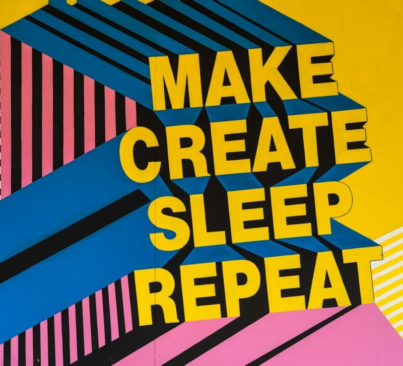
Typography has always been one of the most demanding disciplines in visual design. Getting a headline to feel bold without shouting, or a body font to feel readable without feeling flat, takes a trained eye and a lot of trial and error. For years, that trial and error meant switching between font managers, layout software, and image editors just to test a single idea. Now, AI is changing that rhythm. A growing wave of free ai image editor online platforms is giving designers new ways to experiment with type directly inside their images, no installation, no subscription, and no steep learning curve required.
This shift isn’t just about convenience. It’s changing how designers think about the relationship between text and image in the first place.
Why Typography and AI Are a Natural Fit
Typography is fundamentally about pattern and proportion — spacing, weight, contrast, rhythm. These are exactly the kinds of visual patterns that AI models are good at recognizing and generating. When paired with image editing, AI can suggest font pairings, adjust text to fit irregular spaces, or generate background textures that complement a headline’s mood, all in a fraction of the time manual design would take.
For visual designers, this means less time spent on repetitive testing and more time spent on creative decisions that actually shape the final piece: tone, hierarchy, and story.
What Makes a Free AI Image Editor Online Useful for Type-Driven Design
Not every image editor is built with typography in mind. Many focus purely on photo retouching or background removal. The tools that stand out for type-driven work tend to share a few key capabilities.
Smart Text Placement
Placing text over a busy or textured image can easily result in poor readability. AI-powered editors can detect areas of visual complexity and suggest placement zones where text will remain legible without needing a heavy background overlay. This is especially useful for social graphics, posters, and thumbnails where space is limited.
Automatic Contrast and Color Adjustment
Instead of manually adjusting a text layer’s color against every new background, some AI tools automatically shift text color or add subtle shadows and outlines to maintain contrast. This keeps a design accessible and readable across a wide range of backgrounds, without the designer needing to fine-tune it by hand each time.
Font Pairing Suggestions
Choosing complementary fonts is part science, part instinct. AI tools trained on large design datasets can suggest pairings based on the mood or category of a project — editorial, playful, corporate, minimalist — giving designers a useful starting point rather than a blank font list to scroll through.
Background Generation Around Text
Rather than searching stock libraries for a background that fits a headline’s tone, some editors can generate one directly, matching color palette and texture to the typography style already chosen. This keeps the entire composition cohesive from the start.
The Advantage of Free, Browser-Based Tools
A free ai image editor online removes two of the biggest barriers designers face when experimenting: cost and setup time. Freelancers, students, and small studios often can’t justify a full subscription to heavyweight design software just to test an idea. Browser-based tools let them open a tab, upload an image, and start working immediately.
This accessibility also changes how design teams collaborate. A quick mockup can be created, shared, and iterated on without requiring every collaborator to own the same software license. For typography specifically, this means faster feedback loops — a designer can test three headline treatments in the time it used to take to prepare one.
Of course, free tools often come with trade-offs: limited export resolution, watermarks, or fewer advanced features compared to paid software. For early-stage exploration and drafts, though, these limitations rarely get in the way. The goal at that stage is testing ideas, not producing final assets.
Practical Ways Designers Are Using AI for Typography
Rapid Headline Testing
Instead of manually retyping and repositioning a headline five different ways, designers can generate several typographic treatments quickly, compare them side by side, and pick the strongest option before investing time in refinement.
Poster and Social Graphic Drafts
For time-sensitive content like event posters or social media graphics, speed matters. AI editors let designers combine a background, text, and color adjustments in one session, producing a shareable draft in minutes rather than hours.
Logotype Exploration
While AI won’t replace the craft of custom lettering, it can help generate rough directional concepts — testing how a wordmark might feel in different weights or with different letter spacing — before a designer commits to manual refinement.
Multilingual Layout Testing
Text length varies significantly between languages, which can break a carefully balanced layout. AI tools that automatically reflow or resize text boxes make it easier to preview how a design holds up when translated, without redoing the layout from scratch each time.
Where Human Judgment Still Matters Most
AI can speed up mechanical tasks, but typography carries emotional and cultural weight that still depends on a trained eye. A font choice can signal trust, urgency, elegance, or rebellion — nuances that come from a designer’s understanding of context, audience, and brand voice. AI suggestions are a starting point, not a final answer.
The most effective designers treat these tools as a collaborator for the exploratory phase: generating options, testing combinations, and speeding up production work. The final judgment calls — does this typography actually communicate what the brand needs it to say — remain firmly in the designer’s hands.
Tips for Getting the Most Out of AI Typography Tools
- Start with a clear message. Know what the headline or text needs to communicate before generating variations, so you can judge results against a real goal rather than aesthetics alone.
- Test contrast in context. Always preview text over the actual background it will appear on, not just a plain preview swatch.
- Combine AI suggestions with manual kerning. AI-generated spacing is a good baseline, but fine-tuning by hand often makes the final difference in polish.
- Keep brand consistency in mind. If working within an established brand system, use AI suggestions as inspiration rather than a direct replacement for approved fonts and colors.
- Export early drafts, refine later. Use free online tools for quick iteration, then move final assets into more robust software if higher resolution or advanced typographic control is needed.
Looking Ahead
As AI models continue to improve at understanding visual hierarchy and reading patterns, expect typography tools to get even more context-aware — adjusting not just for legibility, but for tone, pacing, and even accessibility needs like dyslexia-friendly spacing. The rise of free, browser-based editors suggests this technology will keep becoming more accessible rather than more exclusive.
For visual designers, the takeaway is straightforward: AI won’t replace typographic craft, but it’s already reshaping how quickly ideas move from concept to visible draft. Used thoughtfully, a free AI image editor online can become one more tool in a designer’s kit — one that clears away repetitive work and leaves more room for the creative decisions that actually define great typography.