
The Visual Language of Cannabis Branding
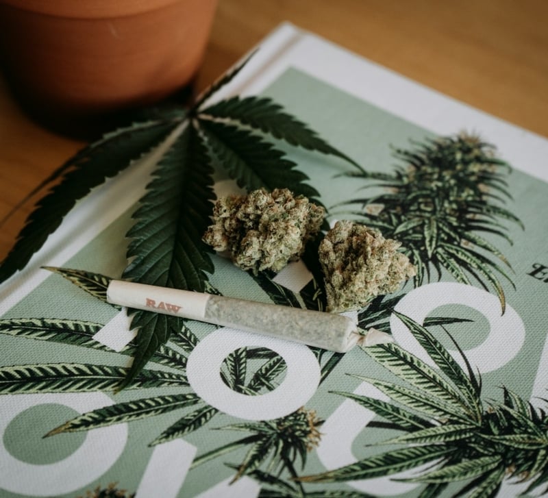
Walk past a cannabis dispensary, and you will notice something unique in every product design. Some use soft colors, elegant typography, and botanical illustrations. Others lean more towards bold lettering, playful characters, or sharp graphics. Even before you read the label, the logos, fonts, and colors have already started shaping your impression. That’s the power of visual language.
Every color, illustration, font, shape, and image can create a particular “vibe.” For instance, a muted green can evoke imagery of nature, while clean white space might convey simplicity. Meanwhile, a bright, unexpected color can make the product feel modern and edgy.
Moving Beyond the Classic Cannabis Look
For decades, the visual identity of cannabis relied on familiar cues: trippy green leaves, psychedelic artwork, tie-dye patterns, and hazy imagery. While these visuals remain easily recognizable, they can make brands look remarkably similar.
So, businesses are turning to cleaner layouts, distinctive illustrations, and unexpected color palettes to give their products a fresh visual identity. This shift lets the design say something unique about the product, rather than only identifying it as cannabis.
However, a memorable visual identity does not stop at the artwork you choose. The way your brand identity appears on the packaging can shape the entire customer experience.
When Packaging Becomes Part of the Brand
Packaging is the first physical interaction you have with a cannabis product. Before you open the box or read the details, the colors, textures, imagery, and layout have already set an impression.
Brands such as Crescent Canna show how thoughtful packaging can turn a product into a recognizable visual experience. A clean design makes a product feel modern and approachable, while rich texture and restrained typography add premium character. When these elements work together consistently, packaging becomes more than just a box. It becomes a recognizable extension of a brand.
Color Builds Brand Recognition
Color is one of the quickest ways customers can recognize a cannabis brand. A distinct palette can separate one product from a shelf full of competitors.
However, the real impact of brand building comes from consistency. When the same color appears across the website, products, packaging, and other branding touchpoints, customers begin to associate it with the brand. The color becomes less of a decorative element and more of a visual signature.
Typography Establishes a Brand’s Personality
A strong cannabis brand needs more than just an aesthetically pleasing font. Its type suite should bring together font weights, typefaces, sizes, and styles to give the brand a consistent voice and tone across packaging, websites, and marketing materials. For instance, serif fonts feel more classic and sophisticated, while sans-serif options are suitable for modern, minimalist brands.
Typography should also remain legible, customer-friendly, and appropriate to the brand’s personality. A brand’s typography choices can shape both brand identity and user experience, influencing how target customers read and interpret the message.
Photography Gives the Brand a Human Touch
Logos, fonts, and color palettes may define a cannabis brand, but photography brings its personality to life. Carefully chosen images can communicate lifestyle, audience, and product characteristics across websites, social media, and print. Even textures, lighting, shadows, backgrounds, props, and models influence the impression.
More importantly, a consistent photography style can make a cannabis brand quickly recognizable, while original imagery can make it stand out from competitors using repetitive stock photos. With thoughtful photography, brands can tell a cohesive story and navigate the visual considerations of cannabis marketing.
Let Your Design Tell the Story
A cannabis brand has only a few seconds to make an impression, and the visual language you choose makes the moment count. From the typeface to the color palette to packaging and photography, every element is part of the marketing puzzle.
The strongest visual identities make a brand feel intentional. When these elements work together consistently, they create familiarity, personality, and trust across every marketing channel. Even in a crowded market, a thoughtful visual language can help a cannabis brand build a distinctive presence that customers remember.