
Setting Type in Light: How to Choose Fonts for LED Neon Signs
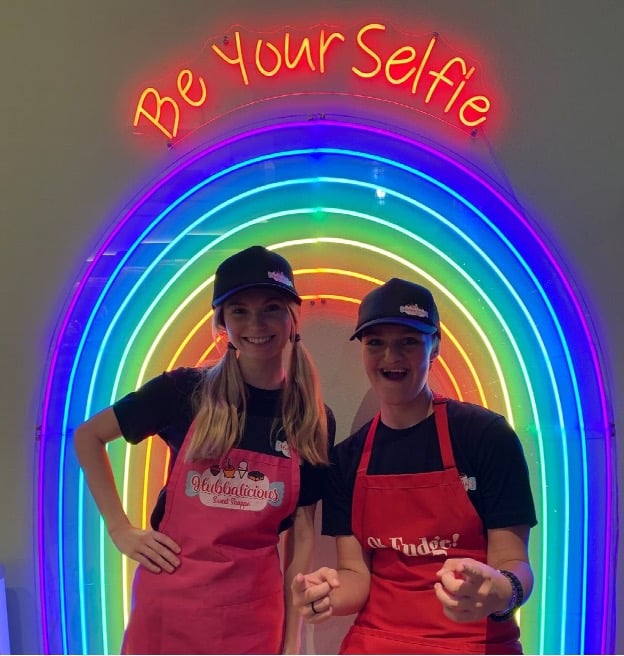
A typeface that looks effortless on a screen can fall apart the moment it becomes a line of light. Designers discover this at the worst possible time: after the proof is approved, when the sign is switched on and the lowercase “e” has turned into a glowing dot.
Neon, whether traditional glass or modern LED flex, doesn’t simply reproduce letterforms. It redraws them. LED neon translates letterforms into illuminated paths of relatively consistent thickness, shaped and mounted to an acrylic or other backing structure. Understanding what that process does to type is the difference between a sign that reads across a room and one that only reads in the mockup.
Why neon changes typography
On paper, a letter is a filled shape. In neon, a letter is closer to a path. In many LED neon designs, the original letterform is reinterpreted as a centerline or simplified illuminated path, and the flex follows that route. Three things happen as a result.
Stroke contrast flattens. A Didone’s hairline serifs and heavy verticals move toward a single, even weight. Fonts that depend on contrast for their personality lose much of it unless the design compensates.
Light spreads. Lit flex glows past its physical edge. Counters in letters like “a”, “e”, and “g” visually fill in, and tightly kerned pairs start to merge. What looked like comfortable spacing on screen becomes crowded.
Every stroke needs a route. Flex has a minimum bend radius, and a letter may be built from one run or several. Sharp interior corners, tiny terminals, and detached elements such as the dot on an “i” or an accent all need a fabrication decision.
Best fonts for LED neon signs
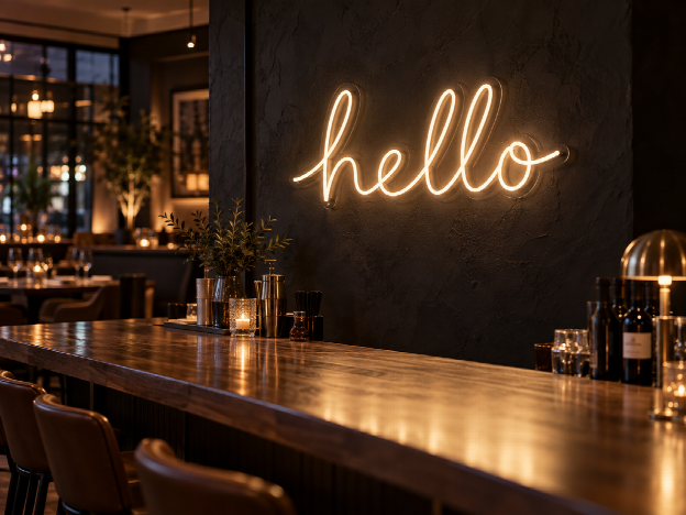
There is no single best font for an LED neon sign, but fonts with open counters, moderate spacing, rounded forms, and relatively consistent stroke weights generally translate most cleanly. Script fonts work especially well when their connections are simple and their lowercase letters remain open at the final sign size. Geometric sans-serifs are often the safest choice when readability at distance is the priority.
Monoline scripts
The most natural fit. They were already drawn as a single stroke, so the translation is close to direct. Connected scripts have a further advantage: joined letters mean fewer separate runs and cleaner wiring on the back.
Rounded and geometric sans-serifs
These read well at distance. Open apertures and generous counters survive the glow, and rounded terminals match the natural end of a flex run.
Display faces drawn for signage
Tube-style, retro diner, and art deco-inspired lettering often already accounts for line-based construction, because much of it descends from the neon era.
Fonts that need adaptation
High-contrast serifs, hairline weights, heavily condensed faces, and distressed or textured fonts are the usual problems. That doesn’t necessarily mean changing the typeface. In many cases, the original character can be preserved by selectively opening counters, simplifying tight details, or adjusting stroke paths. A good fabricator will tell you exactly which adaptations a font needs before anything is bent.
Size and spacing
Scale matters more in neon than in almost any other medium. A lowercase script that reads well at 30 inches wide can become illegible at 15, because the counters close up before the letters shrink. As a working rule, give small lowercase text more room than you think it needs, open the tracking beyond your screen default, and check the design at the distance it will actually be viewed from, whether that’s across a bar, down a hallway, or behind a wedding head table.
When the brand typeface isn’t negotiable
For many designers, the font is not a stylistic choice. It is the brand. A restaurant group with a custom wordmark, a hotel with a proprietary typeface, a retailer whose logo has been redrawn three times to get the “R” right: in these projects, “close enough” is a failure.
This is where the fabrication method matters most. When our studio works from a designer’s file, we don’t substitute a similar font from a library. We work from the exact letterforms supplied, then show a lit mockup that flags any point where the geometry needs adjusting for light, such as a joint, a terminal, or a counter, so the designer approves every change rather than discovering it on install day.
Consistency becomes even more important in multi-location work. Across our rollout of LED logo signs for more than 120 Rosati’s Pizza locations, every sign had to reproduce the same wordmark, proportions, color, and visual character from one location to the next.
What to send the fabricator:
- Vector artwork (AI, EPS, SVG, or PDF) with text converted to outlines
- The font file itself, if the letters are live type and you hold the license
- Final dimensions and the viewing distance
- Color references for the light, not just the brand swatch, since LED white alone comes in several temperatures
- Mounting context: wall, window, suspended, indoor or outdoor
Starting from a library instead
Not every project begins with a proprietary typeface. For event signage, interiors, and personal pieces, a curated font library is often the faster route, because every option has already been tested as light. An online neon sign customizer lets you compare typefaces, approximate proportions, sign sizes, and illuminated colors before ordering. It’s a useful way to pressure-test a concept even if the final piece ends up fully custom.
Timelines, events, and rush work
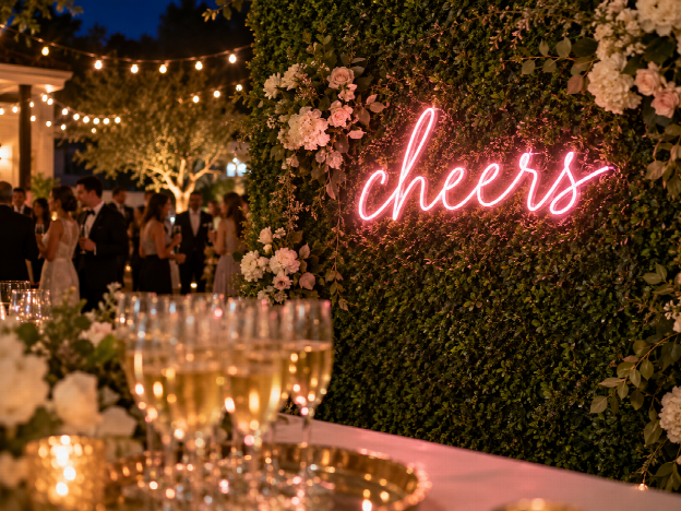
Neon is often the last item on an event or launch checklist and the first one guests notice. Standard custom LED neon production typically takes about 7–12 days after artwork approval, depending on size and complexity. For launch parties, pop-ups, weddings, and trade show booths, rush production may be available for simpler deadline-driven projects. Our studio quotes custom work within about two hours, and for qualifying projects, rush production can reduce fabrication time to roughly 3–5 days.
The rule for rush jobs is simple: the faster the timeline, the more complete the file needs to be. Outlined vectors, confirmed dimensions, and a single decision-maker for the proof will save more days than any production shortcut.
A pre-order checklist for designers
- Test the font as a single-weight stroke. If it loses its character, choose a monoline alternative or plan adaptations.
- Open the tracking and check counters at real size.
- Decide how detached elements such as dots, accents, and underlines will be handled.
- Specify light color and white temperature separately from brand colors.
- Ask for a lit mockup and approve adaptations in writing.
- Build rush time into the schedule only when the artwork is truly final.
Type has always been shaped by its medium, from metal to phototype to pixels. Light is simply the most unforgiving of them. The designers who get it right treat the fabricator as a collaborator in the typography, not just the production.