
The World Cup Got a Custom Font. The Scoreboard Shows Why Live Video Needs Different Typography
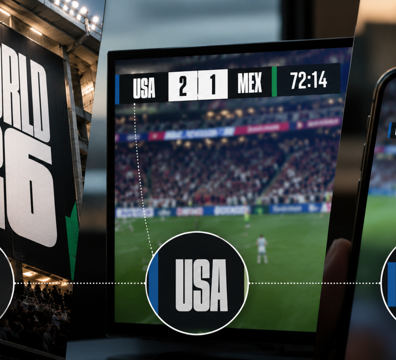
A custom typeface can carry an enormous amount of identity. The 2026 World Cup made that idea unusually visible with FWC26, a bespoke, ultra-condensed face built around heavy geometric forms and a strong connection to the tournament’s wider visual system. At poster scale, in social graphics, and across stadium branding, that density gives the event a recognisable voice. The official identity was designed from the start to make typography one of the tournament’s core assets.
The scoreboard reveals the harder part. Live television is not a poster that happens to move. Information may occupy only a few dozen pixels, sit over constantly changing footage, pass through video compression, and then appear on anything from a large television to a smaller secondary screen. A letterform that feels forceful at headline size can lose vital internal space when typography is reduced for small interface elements.
That distinction makes better sense beyond football.
Live gaming shows how smart font choice can matter more than custom type
A global sports event can afford to build a typeface from the ground up. Many online gaming products work under very different conditions. Instead of commissioning a complete custom font family, a casino site may rely on existing typefaces chosen carefully for clarity, density and visual consistency. When users are invited to play live dealer games and tournaments, that choice becomes more complex because the typography has to support several distinct game environments rather than one fixed visual language.
That is the key difference. A live dealer lobby is rarely built around a single table format. It may contain:
- card games,
- wheel-based games,
- number-driven games
- and branded variations,
each with its own pace, visual hierarchy and amount of information on screen. Typography therefore has to respond to the game design itself.
Gaming typography also extends beyond the live table into lobby tiles, promos and social posts. Here, condensed uppercase lettering keeps match names and dates prominent without crowding the artwork. It shows why gaming brands often need a flexible type system: live interfaces prioritize fast reading, while promotional content can use more expressive display styles.
One type system, several levels of emphasis
The typography also has to handle hierarchy inside each game. Game title, table name, limits, player actions, result messaging and live status do not all deserve the same emphasis. If every layer uses the same weight and width, the interface becomes visually flat. If every game invents its own typographic logic, the wider product becomes inconsistent.
That balance is central to how people play live dealer games across a large catalogue. The strongest systems do not force one decorative font onto every table. They establish a dependable typographic base, then allow each game to adjust width, weight, spacing and character style according to its own mechanics and visual design.
One visual system now has to survive several kinds of “television”
The old assumption that broadcast graphics mainly appear on a large television is increasingly weak. Recent U.S. viewing data shows streaming occupying almost half of television time, while consumer research suggests the meaning of “watching TV” itself now stretches across streaming and social video.
| Viewing signal | Recent figure | Typographic consequence |
| Streaming share of measured U.S. TV use, May 2026 | 48.6% | Graphics need to remain clear through streamed compression and varied playback setups. |
| U.S. consumers who regard both social video and streaming as forms of “watching TV” | 41% | A visual system may move between landscape television, web video and smaller social formats. |
| Streaming subscribers using ad-supported options in a 2026 U.S. survey | 68% | Live-video layouts increasingly compete with additional overlays, transitions and interface elements. |
| Extra daily entertainment time reported by self-described fans versus non-fans | 51 minutes, or 16% more | Repeated exposure makes consistency important, but persistent information must remain effortless to scan. |
This changes how a type family can be planned. Instead of simply producing light, regular and bold weights, designers can think in terms of viewing conditions: expressive display cuts for large graphics, sturdier widths for overlays, carefully drawn numerals for scores and timers, and spacing that still works after aggressive reduction.
Variable-font technology makes that approach especially interesting. Width does not have to be treated as one fixed branding decision. A family can remain narrow where space is scarce while opening up when legibility becomes more important. The identity remains related, but the typography adapts to its actual job.
The scoreboard argues for optical roles, not one-font purity
The scale of World Cup viewing makes small typographic decisions unusually consequential. In June 2026 alone, tournament matches generated more than 84 billion viewing minutes across the U.S. broadcaster properties included in one major measurement report. Together with basketball finals, major live sport drove a 118% monthly increase in broadcast sports viewing.
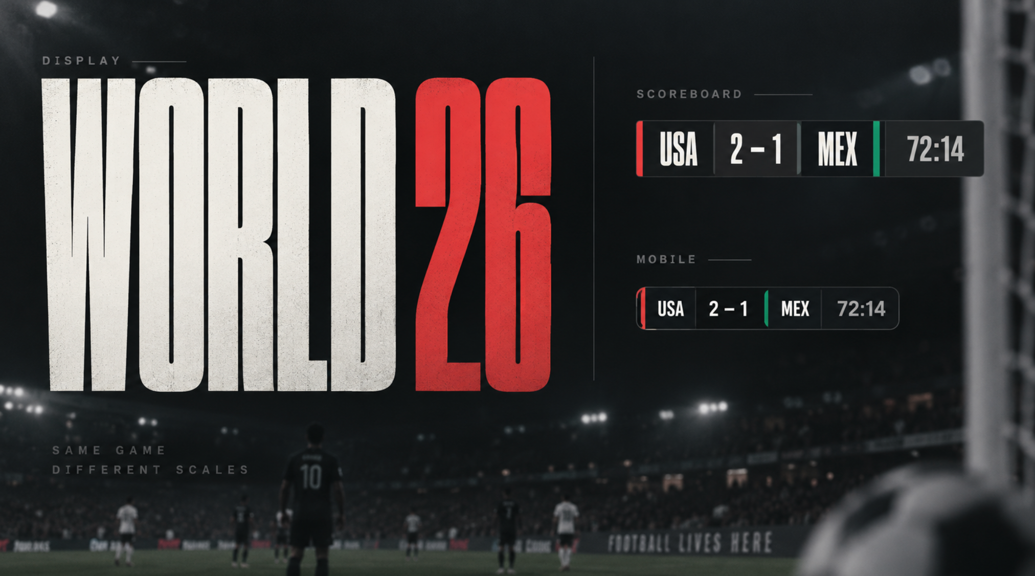
A typographic comparison showing how the same visual identity can adapt across display, broadcast and mobile contexts, with increasingly legible forms as the text becomes smaller.
The image was created by us for demonstration purposes.
That amount of exposure turns a tiny scoreboard into one of the most frequently viewed pieces of typography in the entire identity system.
Character works at headline scale; clarity takes over at scoreboard scale
The reported problem with FWC26 is not that the typeface lacks character. Its condensed geometry is precisely what gives large tournament graphics their force. The tension appears when those same characteristics are reduced into small country identifiers. Tight forms leave less internal white space, while unfamiliar three-letter codes give the eye little contextual help when one shape is unclear.
Typography consultant Oliver Schöndorfer captured the design opportunity neatly: “there should be a companion version for smaller sizes.”
That idea is more useful than insisting that every surface display exactly the same cut. A companion can retain shared proportions, terminals or geometric motifs while changing width, weight and spacing for rapid reading.
- Numerals can receive special treatment.
- Counters can open.
- Ambiguous characters can separate more clearly.
The result can still feel unmistakably related to the headline face.
For live video, that may be the better definition of typographic consistency: not identical letterforms everywhere, but a family of related forms built for the distance, resolution, motion and attention available in each setting.
The World Cup scoreboard makes a broader point visible. Strong branding gives typography a voice; strong information design makes sure that voice can still be understood when the screen gets small, busy and fast.