
How to Choose Typography That Prints Clearly on Custom Packaging
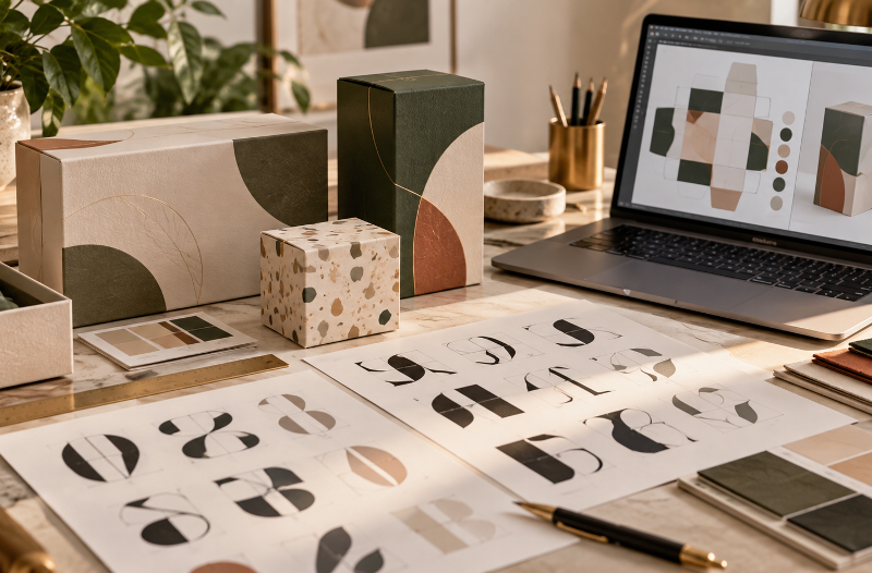
Typography can completely change how packaging looks and feels. A well-chosen font can make a box appear refined, modern, playful, or premium, while a poor font choice can make even an attractive design difficult to read.
The challenge is that a font that looks great on a computer screen does not always print equally well on cardboard, kraft paper, coated stock, or other packaging materials. Fine strokes can disappear, small letters can blur, and low-contrast text can become difficult to read once the design moves from screen to print.
Choosing packaging typography therefore requires more than simply selecting a beautiful typeface. Brands also need to consider readability, printing method, material, size, spacing, color, and the physical shape of the box.
What Makes a Font Suitable for Packaging?
A packaging font should remain clear when printed at the actual size customers will see.
The best fonts for packaging usually have:
- Clear letterforms
- Good spacing between characters
- Enough stroke thickness to reproduce accurately
- Strong contrast against the background
- Multiple weights for creating visual hierarchy
Simple sans-serif fonts often work well for product information because they remain readable at smaller sizes. Serif fonts can create a more traditional or premium appearance, but very thin serifs may lose detail during printing.
Decorative fonts can also work effectively, especially for logos or short headings, but they should normally be used in moderation.
Start With the Actual Print Size
One of the most common packaging design mistakes is judging typography only on a large computer monitor.
A heading that looks perfectly readable at 150% zoom may become much harder to read once printed on a small box panel.
Designers should test typography at its final physical size before approving artwork. Important information such as product names, instructions, contact details, and required labeling should remain readable without excessive effort.
For smaller packaging, simpler letterforms usually perform better than fonts with very fine strokes or complex details.
It is also useful to print a basic paper proof at 100% scale. Even a standard printer can reveal whether text feels too small, crowded, or visually weak.
Match Typography to the Packaging Style
Typography should support the shape and purpose of the packaging rather than compete with it.
A luxury gift box may benefit from elegant serif typography, generous spacing, and restrained text. A modern e-commerce package may work better with clean sans-serif fonts and stronger visual hierarchy.
The physical structure of the box also matters.
For example, unusual packaging formats provide different areas for branding, product information, and decorative typography. On products such as custom purse gift boxes, designers may need to consider how the text interacts with handles, folds, closures, and decorative elements.
Instead of forcing large amounts of copy onto every available surface, prioritize the information customers should notice first.
Create a Clear Type Hierarchy
Good packaging should tell the eye where to look first.
A simple hierarchy might include:
Primary level: Brand or product name
Secondary level: Product type, flavor, collection, or key message
Supporting level: Product details, instructions, website, or other information
Using different sizes and weights within the same font family is often more effective than using several unrelated fonts.
For example, a bold weight can highlight the product name, while a regular weight can handle supporting information. This creates separation without making the design feel inconsistent.
In most cases, two font families are enough for one packaging design.
Think About the Printing Method
Different printing processes reproduce typography differently.
Digital printing can handle detailed artwork well, but extremely small or thin text can still lose clarity. Offset printing generally produces sharp results, although the final appearance also depends on the substrate and artwork preparation.
Other techniques, such as foil stamping, embossing, debossing, and screen printing, require additional consideration.
Very thin type may not work well with foil because small details can fill in or lose definition. Embossed typography also needs enough thickness and spacing to remain recognizable after the letters are physically raised or pressed into the material.
Before finalizing the font, designers should know how the packaging will actually be printed and finished.
Consider the Packaging Material
Typography does not behave identically on every surface.
Smooth coated paper generally reproduces small details more accurately than rough or highly textured stock. Kraft materials can also affect color contrast, especially when lighter inks are used.
Dark text on a light background usually provides strong readability, but designers should not rely on contrast alone. Very thin letters can still become difficult to read even when the colors are technically different enough.
When working with textured materials, slightly heavier fonts are often more dependable.
Give Letters Enough Space
Letter spacing and line spacing are easy to overlook, but both strongly influence print readability.
Text that is packed too tightly can merge visually when printed. This is especially noticeable with bold fonts, reverse text, or typography printed over dark backgrounds.
Headlines can sometimes use tighter spacing for stylistic reasons, but smaller informational text usually benefits from more breathing room.
Spacing becomes even more important when typography is placed on compact or structured packaging. A product such as custom clock boxes may contain several visual elements competing for limited panel space, so a clean layout can help important information remain easy to scan.
Avoid Extremely Thin Font Weights
Thin and light font weights can look sophisticated on screen, but they are often less reliable in print.
Problems become more noticeable when:
- The font size is small
- The background is dark
- The material has texture
- Ink coverage varies
- Foil or specialty finishes are used
Regular, medium, or semibold weights generally provide more dependable reproduction for essential packaging information.
Light weights can still be used for larger decorative text where losing a small amount of detail will not affect readability.
Use Contrast Carefully
Strong contrast helps customers read packaging quickly.
Black text on white is an obvious example, but packaging design often involves brand colors, gradients, photography, patterns, and illustrations.
Text should not disappear into these elements.
If typography is placed over an image, consider using a solid background area, adjusting the image behind the text, or choosing a stronger font weight.
Color combinations should also be reviewed in printed form because screen colors can appear different after production.
Always Review a Physical Proof
A digital mockup cannot show everything.
Whenever possible, review a printed proof before approving a large production run. Check whether:
- Small text remains readable
- Thin strokes reproduce correctly
- Colors provide enough contrast
- Spacing feels comfortable
- Text is positioned safely away from folds and cut lines
- Special finishes affect readability
A physical proof can reveal problems that are easy to miss during screen-based design.
Final Thoughts
Good packaging typography combines visual personality with practical readability.
The best font is not simply the one that looks most attractive on a screen. It is the one that continues to communicate clearly after printing, cutting, folding, finishing, and handling.
Designers should consider the font style, physical size, weight, spacing, material, printing method, and box structure as part of the same decision.
When typography is tested under real production conditions, packaging becomes easier to read, more consistent, and more effective at communicating the brand message.
FAQs
1. What type of font is best for custom packaging?
Clean, readable fonts with clear letterforms and balanced spacing usually work best. Sans-serif fonts are often suitable for small text, while serif fonts can work well for premium or traditional packaging.
2. What font size should be used on packaging?
Font size depends on the box size, printing method, and viewing distance. Important product information should always remain easy to read at the final printed size.
3. Can thin fonts be used on packaging?
Yes, but very thin fonts can lose detail during printing, especially on textured materials or when using foil, embossing, or small text.
4. How many fonts should be used in a packaging design?
In most cases, one or two font families are enough. Using too many fonts can make packaging look inconsistent and difficult to scan.
5. Does packaging material affect typography?
Yes. Smooth coated materials usually reproduce fine details better, while kraft and textured stocks may require thicker fonts and stronger contrast.
6. Should packaging typography be tested before printing?
Yes. Reviewing a physical proof helps identify issues with font size, spacing, contrast, positioning, and print clarity before full production.