
GPT Image 2 UI Design: Turn a Mockup Into a Working Screen
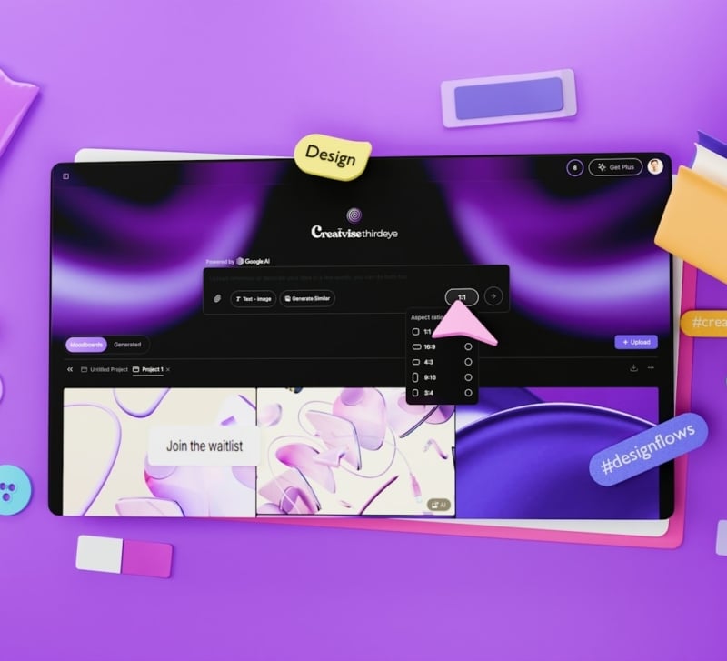
The screen looks finished until someone asks to change the price. In a generated mockup, the headline, button and product photo may all belong to the same flattened image. GPT Image 2 UI design can help establish a visual direction, but the transition to a working interface requires editable text, real controls and decisions about behavior.
That transition is where typography earns its place. A letterform that looks appealing in a picture must eventually belong to a font you can use. A button label must survive a longer translation. A layout must accommodate a real amount, including the unusually large one the initial image left out.
What a GPT Image 2 UI design can settle
Use GPT Image 2 to explore a focused visual question: the relationship between a page title and a form, for example, or the density of a product comparison screen. Give the model the actual content when possible. Generic placeholder text can make a layout appear spacious simply because it is shorter than the copy you will publish.
An illustrative request might ask for a membership settings screen with a plan name, renewal date, payment summary and one primary action. Describe the intended hierarchy and the width of the viewport. Keep the task small enough that you can inspect every label.
Treat the output as a proposal. A convincing shadow does not establish that the button is clickable, and a drawn switch has no stored state. The picture can settle whether the screen feels dense or calm; it cannot demonstrate keyboard behavior or error handling.
Choose one direction before rebuilding. Combining the heading from one image, spacing from another and controls from a third may be reasonable, but those choices need to become an explicit design. Otherwise the next iteration has no stable reference.
Rebuild the type before polishing the screen
Replace generated lettering with actual text early. Select an available font, set a deliberate size and line height, then place the real content into the layout. The result may need more space than the picture suggested. That is useful information, not a reason to squeeze the text until it resembles the mockup.
Check the font’s terms for the intended use and obtain the appropriate files. An image of a distinctive typeface is not the typeface itself, nor does the image establish permission to use a commercial font. Avoid identifying a font solely from a generated resemblance.
Build a small type hierarchy around the content’s jobs. A page title, a field label and a validation message do not need three unrelated font families. They need enough distinction that a reader can tell what to do and what has happened.
Test awkward content before refining decorative details. Use a long plan name, a missing renewal date and an amount with more digits than the sample. If a heading wraps, inspect whether it still belongs visually to the section below it. If the payment summary grows, the action should remain understandable.
Text should also remain useful when copied, selected or enlarged. Replacing a block of interface copy with an image can conceal layout problems while creating a different problem for the person using the screen. Keep decorative image assets separate from text that performs a task.
Design the states the picture left out
A single mockup usually shows one moment. A working screen must also explain what happens while information loads, when a field is invalid and after an action succeeds. Write those states before deciding the design is complete.
For the membership example, ask what the user sees if a renewal date is unavailable. A blank space could mean several things. A short, specific message is easier to interpret than an empty card that looks accidentally broken.
You can ask GPT-6 Astra to help draft a state inventory from the chosen screen and its requirements. Keep the decisions reviewable: what action starts the state, what message appears and what the user can do next. A generated inventory still needs to be checked against the product’s actual behavior.
Implement controls with the appropriate semantics, then use them. Tab through the page, activate the primary action and read the response to an invalid entry. Check whether focus remains visible and whether an error is described in text. These observations tell you something that another static image cannot.
Make the handoff usable without the original prompt
The final design file should identify the font, spacing choices, reusable components and required states. Include the approved image as a reference if it helps, but do not make the next person reconstruct important decisions by reading a long generation history.
Export visual assets individually where the implementation needs them. A texture or illustration can remain an image; the renewal date and action label should be content. This division lets the product change without regenerating an entire screen.
Review the implemented page at more than one width. The mockup’s carefully balanced composition may depend on a single crop. When space narrows, decide what wraps, what stacks and which visual details can disappear without affecting the task.
GPT Image 2 UI design is useful when the picture helps a team choose a direction. The finished interface needs a further kind of clarity: someone must be able to read it, operate it and recover when the happy path fails. Make those behaviors part of the design before calling the screen done.