
How to Test Ad Fonts Against Slow and Fast Backgrounds
A font can look right for a bicycle ad and still need work once the footage starts moving. A line that reads clearly over dark pavement may cross a pale stack of crates a moment later. The letters stay fixed, but the picture behind them changes.
Test the actual headline over the moving shot before choosing its final treatment. Use the same wording and footage, compare typography settings separately, and review more than the opening frame. The bicycle example below shows how to make that comparison without asking a generation model to draw the words.
Start with the ad’s message
This example treats a nighttime cycling scene as a fictional bicycle campaign. The headline is “Take the long way home.” It gives the ride an emotional direction: the bicycle is part of a journey worth enjoying. It does not make a claim about speed, range, or safety.
The scene shows a rider passing market stalls, with pale wooden crates moving through the foreground. That creates a useful test surface: the fixed headline appears against different colors, edges, and levels of brightness during the shot.
Inter and Source Serif 4 provide two contrasting font candidates. Set the complete headline in each. Compare the shapes of the actual words rather than choosing from an alphabet specimen alone. The serif gives the line a different character, but that difference is not evidence that either family is universally easier to read.
Prepare the moving background separately from the type
For an ad built from a starting image, an image-to-video workflow can supply the motion before typography is added. Use the approved still in Astorie, describe the rider’s action and camera movement separately, and keep lettering out of the generated footage. Review the result before taking it into post-production.
The supplied bicycle clip contains 121 frames at 24 fps, runs for about five seconds, and measures 1280 by 720 pixels. The comparison uses those source dimensions throughout. The headline is added afterwards using actual font files; the generated model is not responsible for preserving its spelling or letterforms.
Keep one background copy at its original speed and make another at half speed. Add the text after retiming the footage, so both speed versions can have the same readable hold. Keep its color, position, and animation unchanged during each paired comparison.
Change one typography setting at a time
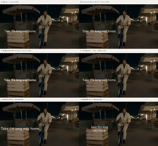
The baseline uses Inter Regular at 44 pixels, on one line, with default letter spacing. A matching source frame at two seconds is used to show the individual changes below. These are settings for this particular example, not minimum sizes for every ad.
| ID | Treatment | What the comparison isolates |
| A | Inter Regular, 44 px, one line | Baseline |
| B | Source Serif 4 Regular, 47 px | Font family, with a similar visible capital height |
| C | Inter Semibold, 44 px | Weight |
| D | Inter Regular, 44 px, tracking increased by 1.5 px | Letter spacing |
| E | Inter Regular, 54 px | Size |
| F | Inter Regular, 44 px, two lines | Line length and the break between words |
Keep the sentence unchanged when testing line length. Version F breaks it into “Take the long” and “way home.” Shrinking the one-line version would introduce a second change and make the comparison less useful.
In the matched frame, the pale crates sit behind part of the single-line headline. The semibold treatment makes the strokes more pronounced, while the serif changes the word shapes. Neither change removes the lighter background beneath the letters.
The larger setting extends the sentence farther across the image. Increased letter spacing also lengthens it. Those changes may help individual characters stand apart, but they change which moving objects sit behind the words. The two-line treatment shortens the horizontal span and moves different parts of the sentence over the crates.
These observations explain why “make it bigger” or “use a bold font” is not a complete selection method. Inspect the whole phrase against the footage it will actually accompany.
Replay each treatment at both speeds
Use equal text holds for the speed comparison. A three-second hold is one production choice to try, not a reading standard. Keep the complete sentence visible throughout that interval, without spending part of it on an entrance animation.
Compare original and half-speed footage from the same source starting point. The faster version will pass through more source frames during the hold. Note whether a particular crate edge or bright patch causes the difficulty, rather than assuming motion speed alone explains it.
A slower background can leave an awkward overlap behind a word for longer. It does not automatically improve the font treatment. Likewise, a different-looking still does not establish that a sentence was easier to finish during playback.
If the hold needs adjustment, change its duration in a separate comparison. Keep the selected typography and background speed fixed while comparing three and four seconds. This keeps a timing decision separate from a font decision.
Compare the combined revision across the shot
After the individual comparisons, combine selected changes into one candidate. The illustrated revision uses Inter Semibold at 50 pixels with the two-line break. Its wording, color, and text-block position remain consistent with the baseline.
Compare the two treatments at source times zero, two, and four seconds. At the opening, the headline sits mainly over a dark scene. At two seconds, the foreground crates introduce a lighter reading surface. By four seconds, the rider and surrounding objects have shifted again. This sequence makes the changing background visible in the article without embedding a video.
The combined version has a different emphasis and a shorter line. It also places different words over the passing objects. Evaluate those relationships rather than calling it a universal winning font. Because several settings changed together, the before-and-after image shows the overall revision; the individual versions explain the separate decisions.
Retain the font source and license with the project. Inter and Source Serif are distributed under the SIL Open Font License, which permits design uses including video titling. Check the applicable terms when choosing another family or handing font software to someone else.
Save the chosen family, weight, size, tracking, line breaks, and readable hold with the approved export. Repeat the playback check when the headline or footage changes. This example supports a practical visual review of one bicycle-ad concept, not a claim about audience reading speed, accessibility certification, or advertising performance.