The power of first impressions in modern brand design
In the modern digital environment, brands rarely get a second chance to introduce themselves. Before a person reads a mission statement, before they explore a product, before they even understand what a company does — they already feel something. That feeling is created by design. Visual identity has become the silent ambassador of every brand, shaping perception before logic ever enters the conversation.
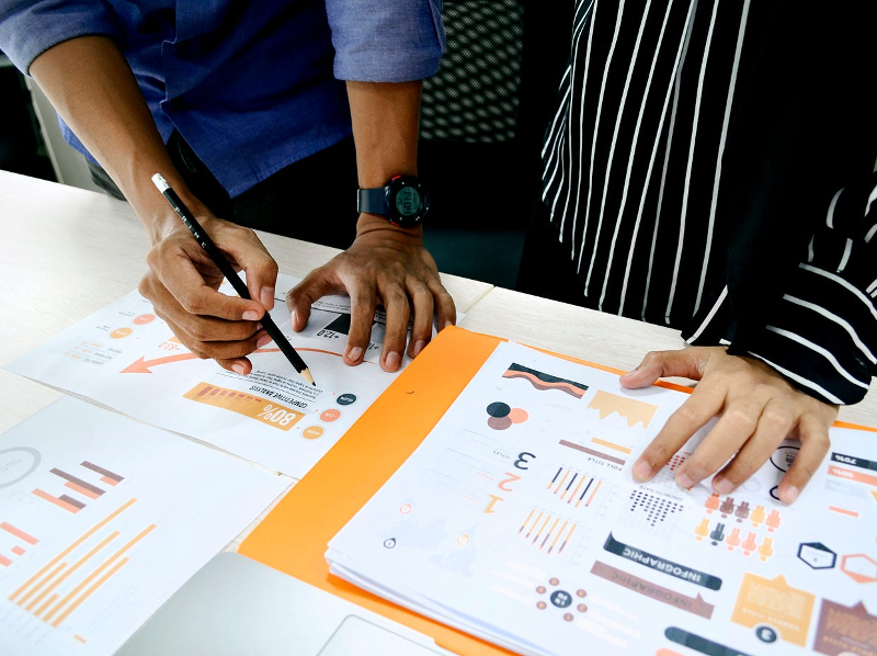
More than a logo: Building a cohesive visual language that speaks volumes.
Many people still think of branding as a logo problem. In practice, a logo is only one note in a much larger visual composition.
True visual identity is a system that includes:
- Typography and how it behaves in different contexts
- Color relationships and contrast rules
- Image tone and visual storytelling style
- Layout rhythm and structural logic
- Secondary graphic elements that add movement and energy
When these elements work together, they form a recognizable visual language. The brand begins to feel like a person with a consistent voice and attitude. When they don’t work together, the brand feels fragmented — like several personalities competing for attention. This is why businesses often turn to a professional visual identity design agency not to decorate the surface, but to establish internal visual logic that holds the brand together across all platforms.
From anonymous to trusted: The direct link between visual polish and brand credibility.
Trust rarely begins with proof. It begins with impression.
A brand that looks structured feels organized. A brand that looks intentional feels reliable. A brand that looks careless feels risky. These judgments happen instantly and quietly.
Visual polish doesn’t guarantee quality, but it creates the expectation of quality. And expectations shape behavior. When people feel safe visually, they explore further. When something looks inconsistent or poorly assembled, caution appears immediately.
The blueprint of memorability: A step-by-step journey in crafting a signature brand design.
Memorable design is not a sudden inspiration. It is a constructed identity built through stages.
It begins with understanding, not sketches. Who is the brand speaking to? What problem does it solve? What emotions should surround it? Without this foundation, visuals become guessing.
Then comes direction setting through references, moods, and visual territories. This stage filters chaos into intent.
Next is design construction: logo systems, type structures, color behavior, and graphic elements are built and tested in real environments — not just on a white background.
After that, the identity moves into application. Websites, social platforms, content templates, and products all begin to carry the visual language.
Finally, everything is organized into guidelines so that future growth doesn’t dilute recognition.
This process transforms abstract brand values into something people can actually see, remember, and recognize.
Standing out in the scroll: Creating distinctive visuals for a digital-first world.
Design today survives in motion, compression, and constant distraction. Most brand encounters now happen on small screens, surrounded by noise.
This forces designers to work with:
- Extreme simplicity
- Bold contrast
- Clear visual hierarchy
- Instant legibility
Subtlety often disappears in motion. Complexity often collapses. What survives is clarity. The strongest digital identities don’t try to show everything. They commit to a few visual decisions and repeat them with confidence.
Consistency is king: How repetition transforms design elements into mental shortcuts.
A brand becomes strong not through surprise, but through familiarity.
Every repeated exposure strengthens recognition. The same color structure. The same typographic rhythm. The same spacing logic. Over time, the brain stops analyzing and starts identifying.
Consistency does not mean stagnation. It means that change happens without breaking recognition. The frame remains stable while content evolves inside it.
This is how visual elements turn into mental shortcuts. A single color, shape, or layout structure becomes enough to trigger brand recall. At that point, design stops being decoration and becomes memory.
When design tells a story: Weaving narrative and emotion into visual identity.
The most powerful identities do not just look polished. They feel meaningful.
Every visual choice is a narrative sentence:
- Rounded shapes can suggest care and approachability
- High contrast can suggest boldness
- Minimalism can suggest focus
- Density can suggest richness and depth
When these choices are intentional, visual identity stops being aesthetic and becomes emotional storytelling. People don’t just recognize the brand. They sense its personality.
That emotional layer is what turns audiences into long-term followers. Because people remember how brands make them feel more clearly than what they actually say.
First impressions in modern brand design are no longer introductions — they are filters. They decide whether a brand will be explored or ignored, trusted or questioned, remembered or forgotten.
Visual identity now carries responsibility. It holds attention. It signals intent. It builds emotional positioning before language has a chance to arrive.