Visual Brand Consistency: 5 Elements Most Companies Get Wrong

You can usually tell when a company built its brand in pieces.
The website looks polished. The LinkedIn profiles look like they belong to a different organization. The pitch deck uses fonts nobody agreed on. And the team headshots? Half are selfies, a quarter are from different studios with clashing backgrounds, and the rest are cropped group photos from the holiday party.
It is not that each piece is bad on its own. It is that nothing feels like it belongs together. And in a market where people form opinions about your credibility in under a second, that disconnect costs more than most teams realize.
The invisible thread nobody talks about
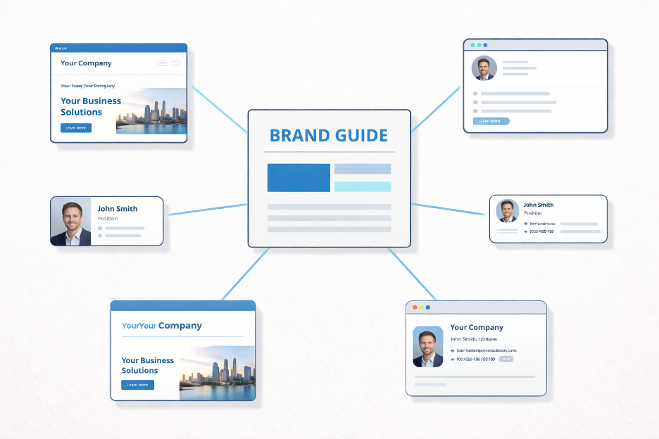
Most brand guides focus on logos and color palettes. Those matter, obviously. But the elements that actually make or break visual consistency are subtler: typography choices, photography style, spacing patterns, and the overall “texture” of how your brand looks across different surfaces.
Think about it. You recognize Apple’s visual language before you see the logo. You can spot a Stripe webpage from the typography alone. That is not because they picked nice colors. It is because every visual decision follows the same logic.
The gap for most growing companies is not that they lack a brand. It is that their brand exists as a collection of one-off decisions rather than a coherent system.
Here is what most people miss.
1. Typography is doing more work than your logo

Your logo appears in a handful of places. Your typography appears everywhere: emails, proposals, social posts, presentations, invoices, job listings, internal docs.
When a company uses three different fonts across five platforms, it trains people to feel uncertainty. Not consciously. Nobody thinks, “Hmm, that’s a different typeface.” But the brain registers inconsistency the same way it registers a slightly off-key note. Something feels wrong even when you cannot name what.
The fix is surprisingly simple. Pick two typefaces maximum. One for headers, one for body text. Define sizes for three levels (title, subtitle, body). Then apply them everywhere.
Not almost everywhere. Everywhere.
The companies with the strongest visual brands are not using exotic fonts. They are using ordinary fonts with extraordinary discipline.
2. Your color palette is probably too flexible
Another common mistake: brands define 6 to 8 colors and treat them all as equally important. The result is that every new asset feels like a different interpretation of the same brand.
The better approach is a strict hierarchy. One primary color that dominates (70% of usage). One secondary color for accents and calls to action (20%). Everything else is neutral (10%).
This sounds limiting. It is not. Constraints create recognition.
Look at any brand you instantly recognize. Chances are you associate it with one, maybe two colors. Not because they only use those colors, but because those colors always dominate.
3. Photography style matters more than photography quality
![]()
This is where it gets interesting.
A team of twelve people with consistent, well-lit, same-background headshots will always look more professional than a team where half have studio portraits and the other half have magazine-quality editorial shots in different styles.
Consistency beats quality. Every time.
The challenge is obvious: coordinating professional photography across distributed teams, remote workers, and new hires is a logistical headache. Scheduling alone becomes a project. And the moment someone joins or leaves, the set is broken.
This is exactly why AI-generated company headshots have gained traction in the last two years. The appeal is not just cost or convenience. It is consistency. When every team member’s photo shares the same lighting, background, and style, the brand signals alignment from the outside.
For teams weighing whether to go this route, evaluating different AI headshot platforms helps clarify what actually matters: output quality, style customization, and how natural the results look at scale.
But that’s not the whole story.
Technology only solves half the problem. The other half is knowing what visual standards you are trying to maintain. Without clear guidelines on background color, crop ratio, and lighting tone, even the best tools will produce headshots that clash with the rest of your brand.
4. Spacing and layout are your brand’s body language
Most people do not think about whitespace as a brand element. But the amount of breathing room around your text, images, and design elements communicates just as much as color and type.
Cramped layouts signal urgency (or desperation). Generous spacing signals confidence and clarity. Neither is wrong, but the choice should be intentional and consistent.
Create a simple spacing scale and apply it everywhere: padding around content blocks, margins in presentations, distance between profile photos and names on the team page.
When spacing is consistent, everything feels “designed” even when individual elements are simple. When it varies, even beautiful individual pieces feel thrown together.
5. Your social profiles are part of the brand (act like it)
The fastest place brand consistency breaks down is social media. Especially LinkedIn.
A company can spend months perfecting its website, then have a team of 20 employees with wildly inconsistent profile photos, headline formats, and banner images. Every one of those profiles is a brand touchpoint. For B2B companies, they are often the first brand touchpoint.
The real question is: does your team’s LinkedIn presence reinforce your brand or contradict it?
A few practical starting points. Define a simple photo standard: consistent background, similar framing, professional but natural. Provide team members with banner image templates. Suggest headline formats that include the company name.
For the photo piece specifically, tools like LinkedIn Headshot Generators can generate on-brand photos for an entire team in hours rather than weeks.
None of this requires policing anyone’s personal expression. It requires providing people with easy-to-use assets that happen to be consistent.
Putting it together
Visual brand consistency is not about rigidity. It is about making dozens of small decisions in advance so that every new asset, profile, or piece of collateral reinforces the same story instead of telling a slightly different one.
The action list is shorter than you think:
Lock in two typefaces with a clear size hierarchy. Define a color system with strict primary and secondary ratios. Establish a photography style guide before your next round of headshots. Set a spacing scale and apply it to templates. Extend your brand standards to employee social profiles.
None of these require a six-figure rebrand. They require decisions, documented once, applied consistently.
The brands that feel “put together” are not spending more money. They are spending more attention. And in a world flooded with visual noise, attention to coherence is one of the few remaining competitive advantages that scales.