Why Website Font Choices Look Different on Desktop vs Mobile
You choose a typeface. You test it on your laptop. It looks clean, balanced, and professional. The spacing feels right. The headings stand out. The paragraphs flow comfortably.
Then you open the same website on your phone.
Suddenly the font feels heavier. Or tighter. Or slightly harder to read. Headlines wrap awkwardly. Paragraphs feel dense. The design doesn’t look wrong, but it doesn’t feel the same.
The font didn’t change. The environment did.
Typography on the web is not static. It lives inside different screen sizes, different operating systems, different browsers, and different rendering engines. The same font file can appear noticeably different depending on where and how it’s displayed.
Understanding why this happens is essential for anyone designing or developing modern websites.
The Screen Width Changes Everything
The most obvious difference between desktop and mobile is width. But width doesn’t just affect layout – it changes how text feels.
Line Length Shrinks Dramatically
On a desktop monitor, a content column might be 700 to 900 pixels wide. That allows for long horizontal lines of text. On mobile, that same content might shrink to 320 to 420 pixels wide.
Even if the font size stays proportionally similar, the reading experience changes because:
- Shorter lines increase vertical stacking.
- Words break more frequently.
- Hyphenation may appear.
- Headings wrap sooner than expected.
A font that feels elegant and airy in a wide layout can feel compact and compressed in a narrow one.
Line Height Becomes More Noticeable
Line height (the vertical space between lines of text) often looks subtle on desktop. On mobile, it becomes much more important.
If line height is too tight:
- Paragraphs feel dense.
- Reading requires more effort.
- Blocks of text appear heavier.
If it’s too loose:
- Content feels disjointed.
- Scrolling increases unnecessarily.
- The layout loses rhythm.
Mobile amplifies spacing problems. What feels “fine” on desktop can feel uncomfortable on a smaller screen.
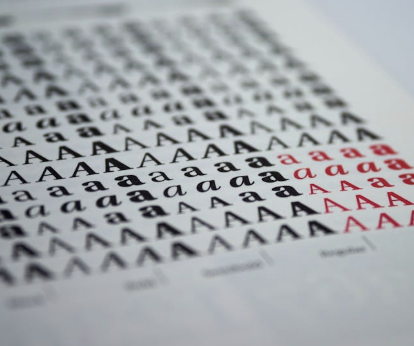
Font Rendering Is Not Universal
Even if screen size were identical, fonts would still look different across devices. That’s because each operating system and browser renders text differently.
Anti-Aliasing Differences
When text appears on a screen, it is not displayed as perfectly sharp vector outlines. It is rendered using pixels. To smooth edges, systems apply anti-aliasing techniques.
Different platforms prioritize different things:
- Some prioritize crisp edges.
- Others prioritize smooth blending.
- Some enhance contrast.
- Others soften it.
As a result, the same font weight may appear slightly heavier or lighter depending on the system.
A medium weight on macOS might appear subtly bolder on Windows. A light weight that looks refined on desktop might appear faint on certain mobile devices.
These differences are not design errors. They are rendering differences at the system level.
Subpixel Rendering vs Grayscale Rendering
Many desktop environments use subpixel rendering. This technique takes advantage of the red, green, and blue subpixels within each pixel to sharpen text edges.
Mobile devices often use different approaches, sometimes relying more heavily on grayscale rendering.
The result:
- Desktop text can appear sharper.
- Mobile text can appear slightly thicker or smoother.
- Fine details in thin typefaces may behave differently.
This is why ultra-light font weights sometimes look elegant on desktop but feel less readable on mobile. The smoothing process changes the perception of thickness.
Pixel Density Changes Perception
Modern mobile devices typically have very high pixel density. “Retina” and high-DPI screens pack more pixels into a smaller physical space.
This affects how fonts appear in several ways:
- Edges look sharper.
- Curves look smoother.
- Small sizes may remain legible.
- Thin strokes may appear lighter than expected.
Meanwhile, desktop monitors vary widely:
- Some are standard density.
- Some are 4K.
- Some use scaling.
- Some are older and lower resolution.
Designing typography without considering pixel density differences can lead to mismatched experiences.
A font that looks balanced at 16px on desktop might feel slightly small on a high-density mobile screen. A bold heading that feels strong on desktop might appear heavier on certain phones.
Responsive Typography Is More Than Scaling Down
One common mistake in web design is assuming that typography simply scales proportionally from desktop to mobile.
It doesn’t.
Responsive typography requires intentional adjustments at breakpoints.
Font Size Adjustments
Headings often need separate mobile sizes. A 48px desktop heading might need to become 32px or 28px on mobile. But the adjustment is not purely mathematical – it must account for line wrapping and visual balance.
Line Height Adjustments
Mobile often requires slightly increased line height for body text. The narrower layout increases density, and additional vertical space can restore readability.
Letter Spacing Adjustments
Tighter screens sometimes benefit from subtle letter spacing adjustments in headings. What looks balanced on desktop can appear cramped when stacked vertically.
Weight Adjustments
Sometimes a font weight that feels correct on desktop needs to be slightly lighter on mobile to maintain balance.
These refinements are small individually, but together they create a consistent experience across devices.
Headings Behave Differently on Mobile
Headlines deserve special attention because they wrap unpredictably.
On desktop:
- Headlines may sit comfortably on one or two lines.
- Words have more horizontal room.
- Designers can visually balance phrases.
On mobile:
- Long words may push onto awkward second lines.
- Two-line headings may become three lines.
- Visual hierarchy may weaken.
For example, a bold geometric font might look striking in a wide desktop header. On mobile, that same font could feel blocky or overpowering once broken into multiple stacked lines.
This is not a font problem – it’s a layout interaction problem.
Responsive typography must consider how headlines wrap, not just how large they are.
Font Loading Can Change First Impressions
Sometimes the font truly does look different – at least temporarily.
Web fonts don’t always load instantly. Depending on connection speed and device performance, a visitor might briefly see:
- A fallback system font.
- Invisible text while the font loads.
- A flash where spacing shifts once the font appears.
This can cause:
- Layout shifts.
- Perceived inconsistency.
- Slight changes in spacing or weight.
On slower mobile connections, these differences are more noticeable. A desktop user on fast Wi-Fi may never see them.
From the visitor’s perspective, it can feel like the font behaves differently between devices – even when the final loaded version is identical.
Optimizing font loading strategy reduces these issues, but they are part of the overall picture.
Touch Interaction Changes the Experience
Typography on mobile is not just about reading – it’s also about interaction.
Buttons, links, and navigation text must:
- Be readable.
- Be tappable.
- Have sufficient spacing.
- Avoid accidental clicks.
A font size that feels appropriate for desktop navigation may feel too small for mobile tapping.
This leads to practical adjustments:
- Slightly larger navigation text.
- Increased vertical spacing.
- Clearer visual separation between links.
Again, the font hasn’t changed – but its role in the interface has.
Operating System Defaults Influence Perception
Each operating system has default typography standards.
- iOS emphasizes clarity and legibility at smaller sizes.
- Android uses its own typographic scaling patterns.
- Windows may render contrast differently.
- macOS handles weight transitions subtly.
When custom web fonts are displayed inside these environments, they are influenced by those system-level preferences.
This is one reason why testing typography only on a single device can be misleading. A font that looks refined on a MacBook might feel slightly heavier on a Windows laptop or a mid-range Android device.
The differences are often subtle – but subtle differences shape perception.
Real-World Implementation Requires Cross-Device Testing
Because of all these variables – width, density, smoothing, loading behavior, wrapping – typography decisions should never be finalized based on a single screen.
In structured website projects, typography is typically reviewed across desktop, tablet, and mobile before launch. Professional web design agencies like Mendel Sites evaluate font weights, spacing, hierarchy, and wrapping at each breakpoint to ensure the design holds up consistently across devices rather than relying on a one-size-fits-all scale.
This kind of testing reveals issues that are invisible on a single monitor:
- Headings that feel too bold on mobile.
- Body text that becomes cramped in narrow columns.
- Navigation that needs slight scaling adjustments.
- Spacing that collapses visually when stacked.
Cross-device refinement is not about overcomplication. It is about respecting how typography behaves in different environments.
Why Thin Fonts Often Struggle on Mobile
Designers often gravitate toward thin, elegant typefaces. On large screens, these can feel modern and sophisticated.
On mobile, thin fonts face challenges:
- Smaller physical screen size.
- Variable brightness conditions.
- Outdoor glare.
- Reduced stroke contrast at small sizes.
A thin font that looks refined at 18px on desktop may appear faint at 14px on mobile.
This doesn’t mean thin fonts should never be used. It means they must be tested carefully and paired with sufficient contrast and spacing.
Contrast and Background Matter More on Small Screens
Typography never exists alone – it interacts with background color, images, and layout density.
On mobile, contrast becomes even more important because:
- Screens are viewed in varied lighting conditions.
- Users may glance quickly rather than read slowly.
- Eye strain accumulates faster in dense layouts.
If body text color is slightly too light, it may still pass visually on desktop but become harder to read on a smaller screen.
Subtle design decisions become amplified on mobile.
Fluid Typography and Scaling Behavior
Modern websites sometimes use fluid typography – meaning font sizes scale gradually based on viewport width rather than switching abruptly at breakpoints.
While this creates smoother transitions, it also introduces new considerations:
- Fonts may appear slightly different at intermediate widths.
- Headlines may shift size subtly across devices.
- Designers must test across multiple screen widths, not just two extremes.
Fluid scaling can improve consistency, but only when paired with careful testing.
The Bigger Takeaway
The same font file can feel lighter, heavier, tighter, or looser depending on where it appears. Recognizing this is the first step toward designing websites that feel consistent across devices.
Good web typography is not just about choosing a beautiful typeface. It is about understanding how that typeface behaves across screens, systems, and contexts.
When typography is treated as adaptable rather than fixed, the experience becomes smoother and more cohesive – no matter what device is used.