Best Fonts for Custom Packaging: What Survives Cardboard, Kraft & Foil
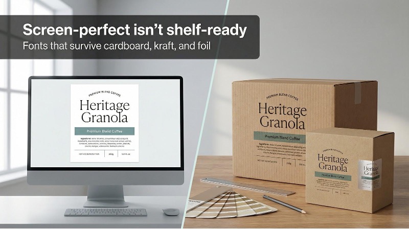
You pour hours into a label that sings on screen. Then the first boxes arrive and those elegant hairlines have bled into a fuzzy blur. Customers squint, shrug, and move on.
Font choice is more than looks; it’s survival. A Journal of Business Research test found shoppers pick packaging set in a brand-appropriate typeface 42 percent more often than a mismatched one. Clarity converts.
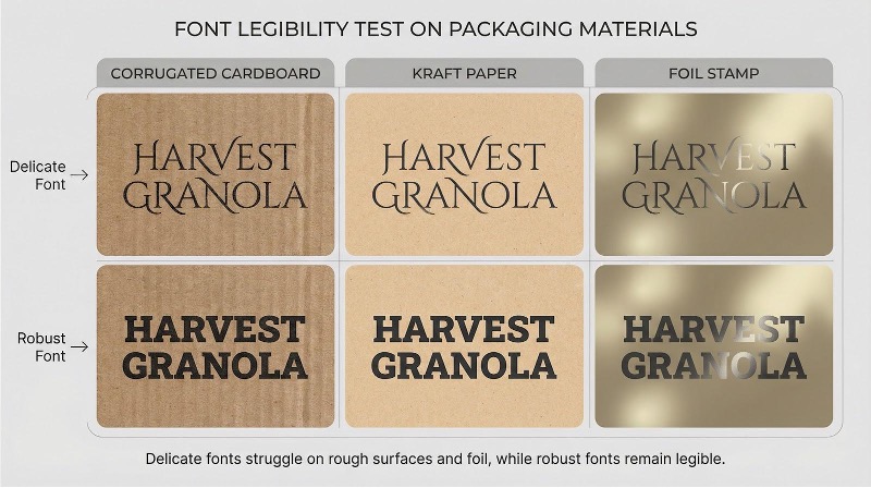
Screens hide the truth. Corrugated cardboard drinks ink, kraft paper roughs up thin strokes, and foil stamping punishes anything dainty. If your typeface can’t take that abuse, the design—no matter how pretty—fails on the shelf.
Why you can’t pick fonts in a vacuum
Screens tell half-truths.
They glow, smooth edges, and hide printing flaws.
Real packaging does the opposite. Cardboard drinks ink like a sponge, kraft paper blurs thin serifs, and foil stamping flattens delicate strokes into blank metal. Type that looked polished on your monitor can crumble the moment it reaches the press.
Shoppers never fault the substrate; they fault your brand. When a nutrition panel is unreadable, or a logo looks cheap, trust evaporates in seconds.
That’s why font selection starts with production reality, not mood boards. First, prove the glyphs survive flexography, digital, and hot-foil runs. Style follows.
The right typeface does two jobs at once: it tells your story and survives the trip from PDF to shelf. Everything that comes next rests on that principle.
How we tested and scored the contenders
We treated each font like a prototype on the press floor, not a mock-up on a Retina screen.
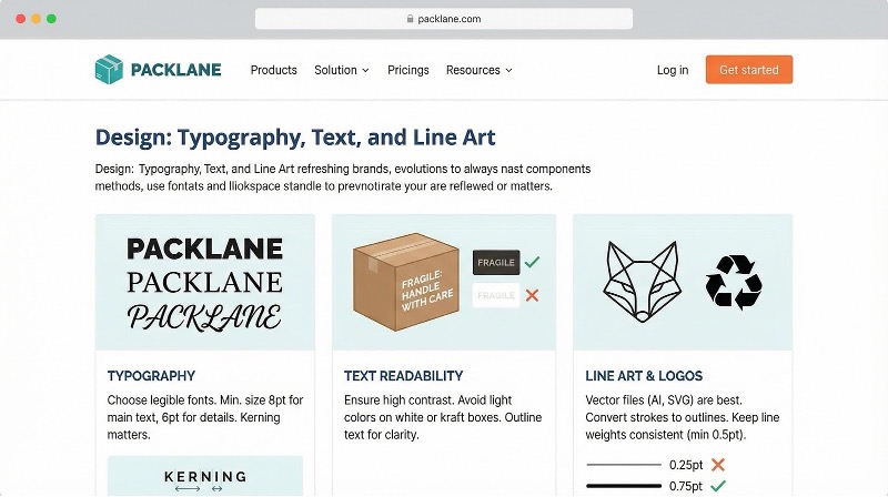
First, we printed sample panels at actual size on three common substrates: E-flute cardboard, 100 gsm kraft wrap, and soft-touch coated board. We ran both positive and reverse text at 6, 8, and 10 point to watch for ink spread, breakage, and fill-in. Packlane’s minimum-size rules (10 point on corrugate, 6 point on paperboard, 1 point lines) set our baseline for pass or fail. (Packlane typography guidelines)
Screenshot of Packlane typography guidelines minimum text sizes for packaging
Then we scored every survivor on six criteria that guide daily packaging work:
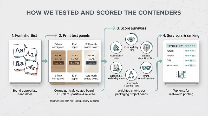
- Print legibility (30 percent)
- Material durability (20 percent)
- Brand versatility (20 percent)
- Family depth and pairing ease (15 percent)
- Licensing cost and availability (10 percent)
- Ink efficiency for eco goals (5 percent)
Fonts that aced small-text clarity climbed the list quickly. Letterforms that failed under foil never left the bench.
Zenpack’s rapid-prototyping lab can ship corrugate and kraft mock-ups within 24 hours thanks to its ESKO Kongsberg X22 cutting table, letting teams catch ink-spread problems while the file is still editable.
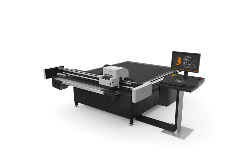
ESKO Kongsberg X22 cutting table in packaging prototyping lab
Building on those prototypes, Zenpack offers custom packaging solutions for growing brands that integrate structural engineering, sustainable materials, manufacturing, and global logistics. The dieline you tweak today can move straight into scaled production, avoiding the cost of scrapping thousands of imperfect prints.
The outcome is a ranking you can trust on press day, not just pin on a mood board.
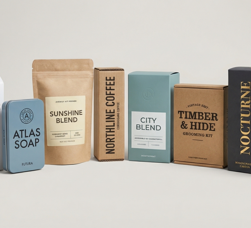
Top fonts that survive real-world printing
1. Helvetica Now: the dependable workhorse.
Helvetica Now fixes the classic’s tight spacing and limited optical sizes. The result is a neutral sans that stays legible at 7 point on corrugate and scales to billboard titles without gaps. Even-width strokes shrug off ink spread, so ingredient lists stay crisp on thirsty kraft. Use the Micro cut for tiny legal copy and the Display cut for a foil-stamped logo to keep every panel consistent.
Style-wise, Helvetica Now is a blank canvas. Pair it with a playful script for personality, or let it stand alone for the clean, Apple-like minimalism customers already trust.
2. Futura: geometry that holds its edge.
Futura’s round counters and clean diagonals project modern confidence, and those shapes also protect against ink spread. Even in Bold, the strokes stay close to monoline, so nothing clogs on corrugated sleeves. Set product names at 24 point and the letters look carved, not stamped.
Use Regular or Medium for side-panel details; counters remain open down to 9 point on kraft. On foil, the sharp geometry turns into mirror-smooth facets that catch light from every shelf angle.
3. Avenir: friendly clarity for tight spaces.
Avenir blends geometric precision with a human touch, making it a standout on crowded labels. A tall x-height keeps lowercase readable when you squeeze nutrition data into an eight-point grid. Softly curved terminals give headlines a welcoming tone that minimal sans often miss.
On kraft, Avenir’s slightly thicker joins resist feathering, so the “e” never closes and the “a” keeps its counter. On coated board, the same glyphs snap into focus. One family can cover logo, subhead, and micro-copy without visual whiplash.
4. DIN 1451: engineered to stay sharp.
Born on German road signs, DIN is built for abuse. Slightly condensed forms tuck into slim panels without feeling cramped, and uniform stroke widths absorb the weight gain common in flexo printing. DIN supports extended Latin, Greek, and Cyrillic, so your English headline and Spanish ingredients match perfectly.
Pair DIN with a soft script for contrast or keep the whole pack in DIN to project industrial confidence.
5. Montserrat: premium look at a free font price.
Budgets get tight, but legibility cannot. Montserrat solves that tension. Inspired by Buenos Aires street signs, it offers wide counters, generous spacing, and a full weight spectrum without a license fee.
Regular weight prints clean at nine point on kraft; bump to SemiBold and product names pop on matte cartons. Bold reversed in white ink even survives flexo passes that drown thinner fonts. Montserrat Alternates ships in the same family, so you can add subtle Art Deco flair for a limited edition without loading a new typeface.
Free rarely looks this refined.
6. Trade Gothic: the quiet pro for fine print.
Trade Gothic may not make mood boards, yet it shows up on more ingredient panels than any other sans. Moderate width and slightly humanist shapes stay readable at seven point, and counters resist filling after two passes of aqueous coating.
Use Condensed Bold for front-panel punch, then swap to Regular for details to keep hierarchy inside one family. Drawn for metal type, these letterforms shrug off modern press challenges.
If your package carries lots of regulatory copy, Trade Gothic meets size mandates without cramming.
7. Clarendon: slab serifs built like brick.
Clarendon carries Old West swagger, but its true virtue is structural. Thick slabs and minimal contrast leave nothing delicate for ink to destroy. On uncoated kraft, the letters look stamped rather than printed, adding heritage charm.
Set the brand name in Black weight for shelf impact, then let a clean sans handle micro-copy. In foil, Clarendon gleams without losing its chunky outlines, delivering a luxe-meets-vintage vibe ideal for whiskey, coffee, or grooming kits.
When you need personality and durability in equal measure, this slab rises to the task.
8. Bodoni Poster: luxury that survives foil.
Classic Bodoni oozes couture flair, but its hairlines vanish on rough stock. Bodoni Poster fixes the problem by thickening those strokes just enough to live through real print runs.
Set your logo in Poster weight, stamp it in gold foil, and every dramatic contrast still pops. On smooth cartons the letters look engraved; on kraft they read like vintage signage. Keep sizes above fourteen point and the elegance stays intact.
Pair Bodoni Poster with a neutral sans for body text to capture the fashion-house mood without print headaches.
9. Bebas Neue: tall caps, zero drama.
Some products must shout from afar. Enter Bebas Neue, an all-caps free font whose condensed skeleton lets you set forty-point words on a can without wrapping.
Each stroke is thick and uniform, so even low-resolution flexo presses keep contours crisp. On kraft mailers the letters feel branded, not printed, and in reverse white they survive extra ink that chokes finer fonts.
Use Bebas Neue for flavor names or limited-edition badges, then hand detail work to a calmer sans to balance the volume.
10. Oswald: condensed grit with lowercase options.
Think of Oswald as Impact’s cooler, more flexible cousin. It keeps the narrow footprint that saves real estate on slim bottles, yet offers multiple weights and lowercase letters so you can whisper and shout in one family.
Bold headlines stay solid on corrugated cartons because each stroke is a beam. Drop to Light for secondary copy and the texture evens out without losing the voice. Silver foil on matte black? Oswald’s squared terminals reflect light like machined parts.
Free on Google Fonts and press-ready out of the box—hard to ask for more.
11. Great Vibes: a script that stays legible.
Scripts often crumble on rough stock, but Great Vibes uses generous stroke widths and open loops to dodge that fate. Set at sixteen point or larger, the swashes remain distinct even on fibrous kraft. Foil the same lettering and the curves catch light like ribbon—gift-ready elegance.
Use it sparingly: a product name, a flavor call-out, a “handcrafted” accent. Surround those flourishes with a steady sans so your packaging feels personal without sacrificing clarity.
12. Pacifico: playful strokes that print bold.
Pacifico serves surf-shop energy in a package-friendly form. Thick brushy curves shrug off ink spread, so the word “Sunshine” stays joyful on a kraft pouch instead of turning to mush.
Each letter leans forward, giving a sense of motion—perfect for summer flavors, kids’ products, or any brand that sells fun first. Drop it in bright foil on a pastel carton and the mood is instant vacation.
Use Pacifico for the spark, then anchor the rest of the layout with a calm sans to keep readability rock solid.
Quick-glance survival matrix
You have the backstories; now check the numbers.
The table below distills our press tests into a single scorecard. Five stars mean the font stayed crisp under harsh conditions, while three still passes but needs care with size or weight. Use it to narrow options before you even open your design file.
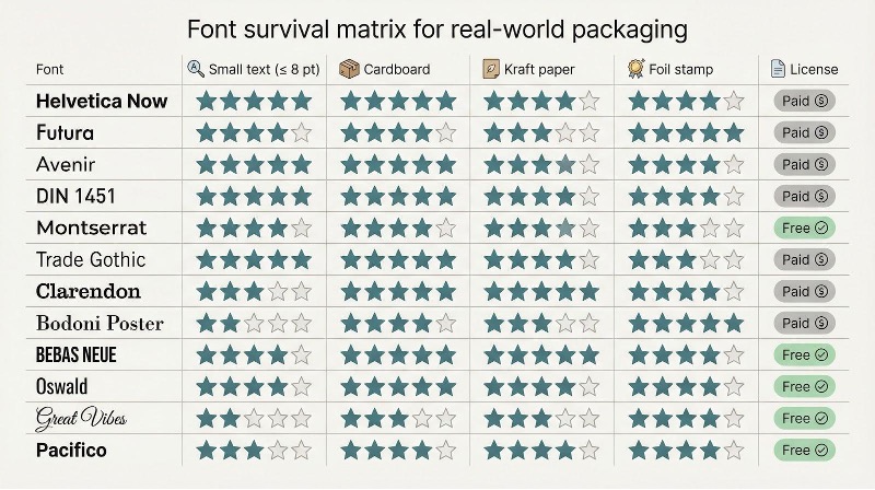
| Font | Small text (≤8 pt) | Cardboard | Kraft paper | Foil stamp | License |
| Helvetica Now | ★★★★★ | ★★★★★ | ★★★★☆ | ★★★★☆ | Paid |
| Futura | ★★★★☆ | ★★★★☆ | ★★★☆☆ | ★★★★★ | Paid |
| Avenir | ★★★★★ | ★★★★★ | ★★★★☆ | ★★★★☆ | Paid |
| DIN 1451 | ★★★★★ | ★★★★★ | ★★★★☆ | ★★★★☆ | Paid |
| Montserrat | ★★★★☆ | ★★★★☆ | ★★★★☆ | ★★★☆☆ | Free |
| Trade Gothic | ★★★★★ | ★★★★★ | ★★★★☆ | ★★★☆☆ | Paid |
| Clarendon | ★★★☆☆ | ★★★★★ | ★★★★★ | ★★★★☆ | Paid |
| Bodoni Poster | ★★☆☆☆ | ★★★★☆ | ★★★☆☆ | ★★★★★ | Paid |
| Bebas Neue | ★★★★☆ | ★★★★★ | ★★★★★ | ★★★★☆ | Free |
| Oswald | ★★★★☆ | ★★★★★ | ★★★★☆ | ★★★★☆ | Free |
| Great Vibes | ★★☆☆☆ | ★★★☆☆ | ★★★☆☆ | ★★★★☆ | Free |
| Pacifico | ★★★☆☆ | ★★★★☆ | ★★★★☆ | ★★★★☆ | Free |
Stars are only a starting point. Always print a physical mock-up before committing ink or foil to thousands of boxes.
Conclusion
Stars are only a starting point. Always print a physical mock-up before committing ink or foil to thousands of boxes.