7 Modern Fonts That Define Contemporary Design
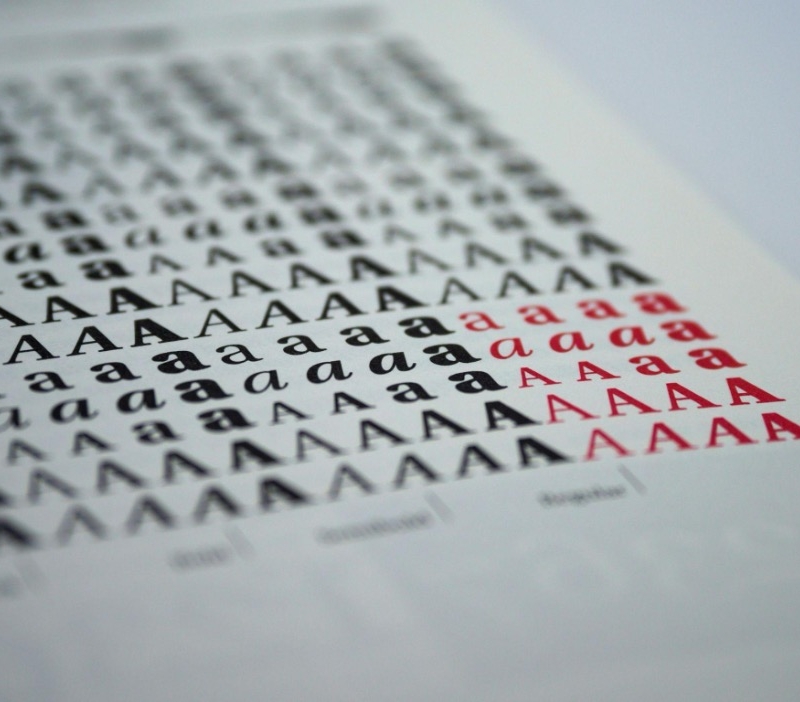
Your design can look fine and still feel… off. Nine times out of ten, it’s the type. A smart font choice can make a landing page feel premium, a poster feel bold, and a resume feel instantly credible.
Even a college essay writer who lives in Google Docs can tell you: typography changes how people judge your work before they read a single word. So, let’s get to seven modern typefaces that show up in branding, UI, and editorial design.
Inter (Modern workhorse for UI and product design)
If you want one font that “just works” in apps, dashboards, and websites, Inter is the safe bet that still looks current. It was built with screen readability in mind, which means it stays crisp at small sizes and doesn’t turn into a gray blur in dense layouts.
Where it shines:
- Product UI, SaaS landing pages, mobile interfaces
- Data-heavy screens (tables, settings panels, pricing blocks)
- Brand systems that need consistency across devices
Practical tips:
- Use 16–18px body text for calm readability.
- Pair with a slightly more expressive heading font if your brand needs personality.
- Give it breathing room; Inter looks best with generous line height.
This is one of those modern sans serif fonts that makes everything feel organized, even when your layout is doing a lot.
Neue Haas Grotesk (Premium minimalism without trying too hard)
If Helvetica is the plain white tee, Neue Haas Grotesk is the version that fits perfectly and somehow looks expensive. It’s structured, restrained, and confident. It’s also a favorite in brand identities that want to look timeless but still contemporary.
Where it shines:
- Brand wordmarks and identity systems
- Editorial headlines with strong hierarchy
- Packaging that needs quiet authority
Practical tips:
- Use tighter tracking for headlines, then relax spacing for body text.
- Try one weight for navigation and a second weight for CTAs to create subtle structure.
- Don’t over-style it. Let the letterforms do the work.
If you’re building a brand identity and need the best modern fonts that won’t date fast, this one is hard to beat.
Space Grotesk (Modern tech vibe with a human edge)
Space Grotesk feels modern in a slightly nerdy, charming way. It’s geometric but not cold. It has a few quirks that keep it from feeling generic, which is exactly why it pops in tech, creator brands, and modern editorial layouts.
Where it shines:
- Tech startups, creator tools, modern portfolios
- Bold hero headlines
- Posters, covers, and modern social graphics
Practical tips:
- Use it for headings and short bursts of text.
- Combine with a calm body font to keep readability high.
- Apply it to friendly futuristic designs, especially with simple shapes and grids.
It’s one of those cool modern fonts that can carry a design even when your layout is minimalist.
Canela (Contemporary elegance with editorial drama)
Canela is a serif that feels modern because it doesn’t look dusty. It has warmth, contrast, and a fashion-editorial vibe that instantly upgrades the visual tone. If your project needs a little romance without going full “wedding invitation,” this is a strong move.
Where it shines:
- Beauty, lifestyle, boutique brands
- Magazine-style layouts
- Landing pages that need emotional pull
Practical tips:
- Use it for hero headlines, section titles, and pull quotes.
- Pair with a clean sans for body text.
- Keep your color palette simple so Canela stays the star.
This is where modern fonts prove they can be soft, too.
GT America (Brand-friendly, flexible, and quietly confident)
GT America is a “do it all” sans that fits modern branding really well. It has a familiar structure but doesn’t feel like a default system font. That makes it perfect for brands that want consistency across web, print, and product without looking like every other startup.
Where it shines:
- Rebrands and full identity systems
- Web + print consistency (brochures, decks, websites)
- Long-form content that still needs personality
Practical tips:
- Build a simple type scale (H1/H2/H3/body/captions) and stick to it.
- Use fewer weights than you think; two weights often look cleaner than five.
- Make it feel premium with spacing and grid discipline.
If you’re hunting for the best fonts for modern designs for a full brand kit, this one earns its spot.
League Spartan (Bold, modern, and built for impact)
League Spartan is all about punch: strong shapes, clear presence, and a confident tone that works when you need visibility. Think posters, banners, hero sections, and simple brand marks.
Where it shines:
- Headlines, signage, posters, event graphics
- Bold hero sections with short, clear messaging
- Minimal logos that rely on type
Practical tips:
- Keep the copy short. This font is not here to whisper.
- Use contrast: big Spartan headline, calm body font underneath.
- Watch spacing in all caps; tweak tracking so it doesn’t feel cramped.
It’s especially useful when you want a modern look that reads fast.
Editorial New (Modern serif energy with a sharp silhouette)
Editorial New is a serif that has that “high-end publication” vibe, but it’s versatile enough for web and brand work. If you want sophistication without feeling traditional, this is your closer.
Where it shines:
- Premium editorial brands and modern publications
- High-contrast hero headlines
- Elevated product pages (fashion, interiors, design goods)
Practical tips:
- Use it in headlines and subheads to create instant hierarchy.
- Pair with a neutral sans and keep your UI elements simple.
- Let the typography do the decoration. Skip the extra flourishes.
This is a solid option when you want modern design to feel mature, not trendy.
FAQ
What is the most modern font?
The most modern font deserves its title depending on where it’s used, but Inter is a strong default for today’s digital design. It was made for screens, scales well across devices, and looks current without feeling gimmicky. For brand elegance, a modern serif like Canela also reads modern.
What is Gen Z’s favorite font?
Gen Z doesn’t have one official favorite, but the pattern is clear: clean, readable, and meme-proof. Think bold sans choices for headlines and friendly grotesks for everyday use. Also, plenty of Gen Z creators lean into modern calligraphy fonts for socials, invites, and personal brands.
What type of font is modern?
A modern font usually has clean shapes, consistent spacing, and a design that suits today’s screens and minimalist layouts. Most are sans serifs, but modern also includes sharp editorial serifs and structured display styles. You’ll also see modern gothic fonts used for edgy fashion branding and album-style visuals.
What fonts are trendy right now?
Trends shift, but current favorites include crisp UI sans fonts, editorial serifs, and retro-inspired revivals. Designers are also pulling from mid century modern fonts for packaging and posters, then pairing them with neutral sans fonts for balance. The winning combo is contrast: nostalgic headings and modern body text.
The Final Check: Does Your Font Do Its Job?
Modern typography is less about chasing whatever’s loud this month and more about picking the type that matches your job: readability, vibe, and hierarchy.
Inter and GT America help you build systems that scale. Space Grotesk and League Spartan bring personality and impact. Canela and Editorial New add modern editorial polish when you want elegance with edge.
Start with one strong headline font and one dependable body font, then test them in real layouts. A good type doesn’t just look nice. It makes decisions feel easy.