Best Google Fonts for Student Projects and Assignments
It may seem like a small thing to pick the right font, but it can make a big difference in how your project or assignment looks. Fonts are like the “clothes” that your words wear. A messy or hard-to-read font can make your work look unprofessional, even if your ideas are great. On the other hand, a clean, well-chosen font can make your report, essay, or presentation look professional and easy to read.
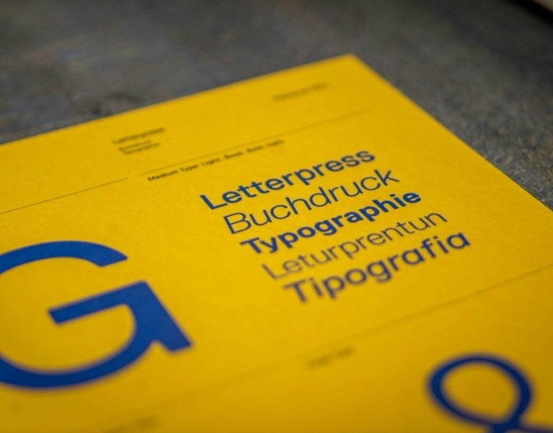
Students can now use hundreds of free fonts in their documents, slides, and design projects thanks to Google Fonts. The right font can make your essay, presentation, or poster stand out.
This article will look at some of the best Google Fonts for student projects and homework, as well as some tips on how to choose the best font for essays.
Why Fonts Are Important for Student Work
Have you ever opened a document that was hard to read or looked full? The font choice probably wasn’t the best. Fonts change how easy it is to read, how professional it looks, and how appealing it is to the eye.
A lot of work is read by teachers and professors. A clear and professional font makes it easier for them to understand your ideas instead of having to deal with the text. Many students also handle several deadlines at once. This can make research and formatting feel harder than expected. At that stage some begin searching online with thoughts like “do my assignment” when they need to manage their time and keep up with other classes. This reaction is easy to understand because presentation still matters in every written task. A readable font supports the flow of ideas and makes each section easier to follow. Good spacing also improves structure and reduces visual stress for the reader. When the page looks balanced the content feels more polished and more serious. Even strong arguments may lose impact if the text appears crowded or uneven. That is why font choice remains an important part of academic work. It helps create a cleaner page and allows the reader to focus on the message instead of the layout.
Here are some reasons why fonts are important:
- Easier to read: Clean fonts make your writing easier to read.
- A good font makes your work look professional.
- Better organization: Using different fonts can help you organize titles and headings.
Imagine getting ready to cook for guests. The way something looks is just as important as how it tastes. Your ideas are the most important thing, but the way you present them with fonts also affects how the reader feels.
The best Google Fonts for essays and other written work
When you write essays or reports, the most important thing is that they are easy to read. You want a font that looks good and is easy to read for long paragraphs.
These are some of the best Google Fonts to use for essays and other writing tasks.
1. Roboto
Roboto is one of the most popular fonts on Google Fonts, and it’s easy to see why. It has a modern, clean look that is great for writing essays.
Why students like Roboto:
- Simple to read
- New but professional
- Good for long documents
People often compare Roboto to Arial, but Roboto feels more modern and balanced.
2. Open Sans
Another great font for schoolwork is Open Sans. Because it is so easy to read, it is used a lot on websites and in documents.
The good things about Open Sans are:
- Letters that are very clear
- Good for long paragraphs
- Looks good in reports
Open Sans can make it easier for your teacher to read if your assignment has a lot of pages.
3. Lato
Lato is a font that looks friendly and a little round, but it still looks smart. It works well for both presentations and essays.
Why Lato is a good choice:
- Style that is clean and modern
- Letters with enough space between them
- Professional but easy to talk to
If you want your document to look simple but stylish, Lato is a good choice.
4. Merriweather
Merriweather is a great choice if you want a more traditional academic look. The letters have small lines at the ends, which is what a serif font is.
People often use serif fonts in books and academic papers because they make reading easier.
Benefits of Merriweather:
- Perfect for long essays
- A classic academic look
- Easy to read on screens and in print
5. Source Sans 3
Adobe made Source Sans 3, a modern font that is easy to read. It was made to be clear.
Why it’s good for students:
- Evenly spaced
- Clear letter shapes
- Tone of voice for business
This font looks good on both digital and printed reports.
The best Google Fonts for posters and presentations
You need to do things differently for presentations and posters than you do for essays. Fonts in slides or visual projects should be bold, easy to read, and look good.
Here are some great Google Fonts for students who want to be creative.
Poppins
Poppins is a modern geometric font. It works great for titles and headings in presentations.
Why students like it:
- Looks good
- Shapes that are easy to see
- Great for slides
It makes your presentation look modern and nice to look at.
Montserrat
People use Montserrat a lot in design and presentations. The letters are big and easy to read.
Best uses:
- Titles for slides
- Posters
- Headings for the project
This font makes your project look professional and draws attention to it.
Raleway
Raleway is stylish and classy. It works best for section headings and titles.
Pros:
- Design that is clean and simple
- Good for creative work
- Great for titles
But it’s better for titles than for long paragraphs.
How to Pick the Right Fonts for Essays
The right font for essays can make them easier to read and make your work look more professional. Here are some useful tips.
Pick Fonts That Are Easy to Read
Always pick fonts that are easy to read. Don’t use fancy or decorative fonts for essays.
There are a few things that make a good essay font:
- Letters that are easy to read
- Spacing that is even
- Design that is easy
Roboto, Open Sans, and Merriweather are all great fonts to use.
Choose the Right Font Size
The size of the font can make it hard to read, even if it’s the best one.
Sizes that are recommended:
- Text in the body: 11–12 pt
- Headings: 14–16 points
Using the right size makes your document look good and easy to read.
Don’t Use Too Many Fonts
If you use too many fonts in one document, it can make your work look messy.
A good rule is to
- One font for the body text
- One typeface for headings
For instance:
- Body: Open Sans
- Headings: Montserrat
This makes the structure neat and tidy.
How to Use Google Fonts Together for Projects
One font isn’t always enough. Using more than one font can make your work look better.
But you should be careful when pairing fonts.
A Simple Way to Pair Fonts
One common strategy is to put together:
- Body text in serif font
- Headings should be in sans-serif font.
Some examples of combinations are:
- Merriweather and Montserrat
- Roboto and Poppins
- Raleway and Open Sans
This mix makes things stand out while keeping the design in balance.
Keep the design the same
The key to making projects look professional is to be consistent.
These are the rules to follow:
- Use the same typeface all over the document
- Make sure all headings are the same size.
- Don’t change fonts too often.
Imagine your project as a uniform. The final product looks more professional and organized when everything matches.
How to Find and Use Google Fonts
You can easily get to Google Fonts for free. Students can use them to make documents, presentations, websites, and design projects.
To look for them:
- Go to fonts.google.com
- Look through the font library
- Look at different styles ahead of time
- You can either download them or use them online.
Google Fonts are already included in many programs, such as Google Docs, Canva, PowerPoint, and Figma, so they are easy to use.
This means you can make your assignments look better quickly without having to buy expensive fonts.
In conclusion
Fonts may seem like a small thing, but they are very important for how your work looks. A font that is easy to read and well-chosen can make your essay easier to read, your presentation more interesting, and your project look more professional.
Roboto, Open Sans, Lato, Merriweather, Montserrat, and Poppins are some of the best Google Fonts for students. These fonts are the perfect mix of style, professionalism, and ease of reading.
When picking fonts for essays, don’t go overboard. Use fonts that are easy to read, keep the design the same, and don’t use too many styles. When you pick the right fonts, they can help your ideas stand out. Think of fonts as the visual voice of your writing.
So, the next time you have to do a school project or assignment, ask yourself if the font you chose makes your work look neat, clear, and professional. If the answer is yes, you’re already one step closer to making a great assignment.