How Typography Builds Brand Authority

Typography is rarely the first thing people mention when they talk about branding. They talk about logos, color palettes, mission statements. But ask any experienced designer where silent persuasion actually lives, and they will point straight to the typeface.
The fonts a brand chooses — and how consistently it applies them — do more to establish credibility than most marketing copy ever will. This is not a stylistic opinion. It is a measurable reality backed by decades of cognitive research, and understanding it can change how you build, present, and grow any professional brand.
Whether you are launching a design studio, a SaaS product, or a regulated financial platform, the typographic decisions you make today are quietly setting the ceiling for how much authority your brand can claim tomorrow.
Why Typography Is a Trust Mechanism
Before a reader processes a single word on your page, their brain has already formed a judgment about the source. Research in cognitive psychology consistently shows that visual presentation shapes the perceived reliability of written content. A page set in a clean, well-spaced typeface feels more authoritative than the same text in an inconsistent or carelessly chosen one — even when the words are identical.
Designers call this the fluency effect. The easier information is to visually process, the more credible it feels. Typography engineers that ease. It works below the level of conscious attention, which is precisely what makes it so powerful.
For brands operating in trust-sensitive industries — legal, medical, financial, or any sector where users are making consequential decisions — this is not a finishing detail. It is the foundation on which everything else rests.
The Three Signals Every Typeface Sends
Every font communicates three things before the reader reads a single word.
Tone — Is this brand formal or approachable? Established or disruptive? The typeface answers before the headline does.
Professionalism — Was this chosen deliberately, or was it the system default? Audiences may not consciously identify this distinction, but they consistently feel it.
Consistency — Does the same typographic care carry through every touchpoint? Consistency signals ownership; inconsistency signals improvisation.
Getting all three right simultaneously is what separates brands with genuine authority from those that simply look busy.
How Competitive Industries Use Typography to Win Trust
Consider what it means to build trust at scale in a high-competition digital environment. Whether you are running an e-commerce brand, a professional services firm, or an online trading platform, your audience is comparing you — consciously and unconsciously — against every other brand they have encountered in your category.
In regulated industries especially, visual credibility is not a secondary concern. It is the product. A brand operating in financial services must communicate reliability, precision, and regulatory seriousness before a user reads a single compliance statement. Typography carries that message first and loudest.
Errante, a regulated online trading platform, illustrates this principle clearly. The brand’s digital presence reflects a deliberate, structured typographic approach — clean hierarchies, disciplined weight choices, and consistent application across every surface — that speaks directly to an audience of experienced traders who equate visual discipline with operational discipline. In a regulated environment where trust is everything, this kind of typographic intentionality is not cosmetic. It is competitive strategy.
This alignment — between how a brand looks and what it is promising — is what design professionals call co-occurrence. The visual signals and the value proposition appear together consistently enough that audiences begin to associate one with the other automatically.
What Trust-Driven Typography Actually Looks Like
Trust-driven typography shares a set of recognizable characteristics across industries.
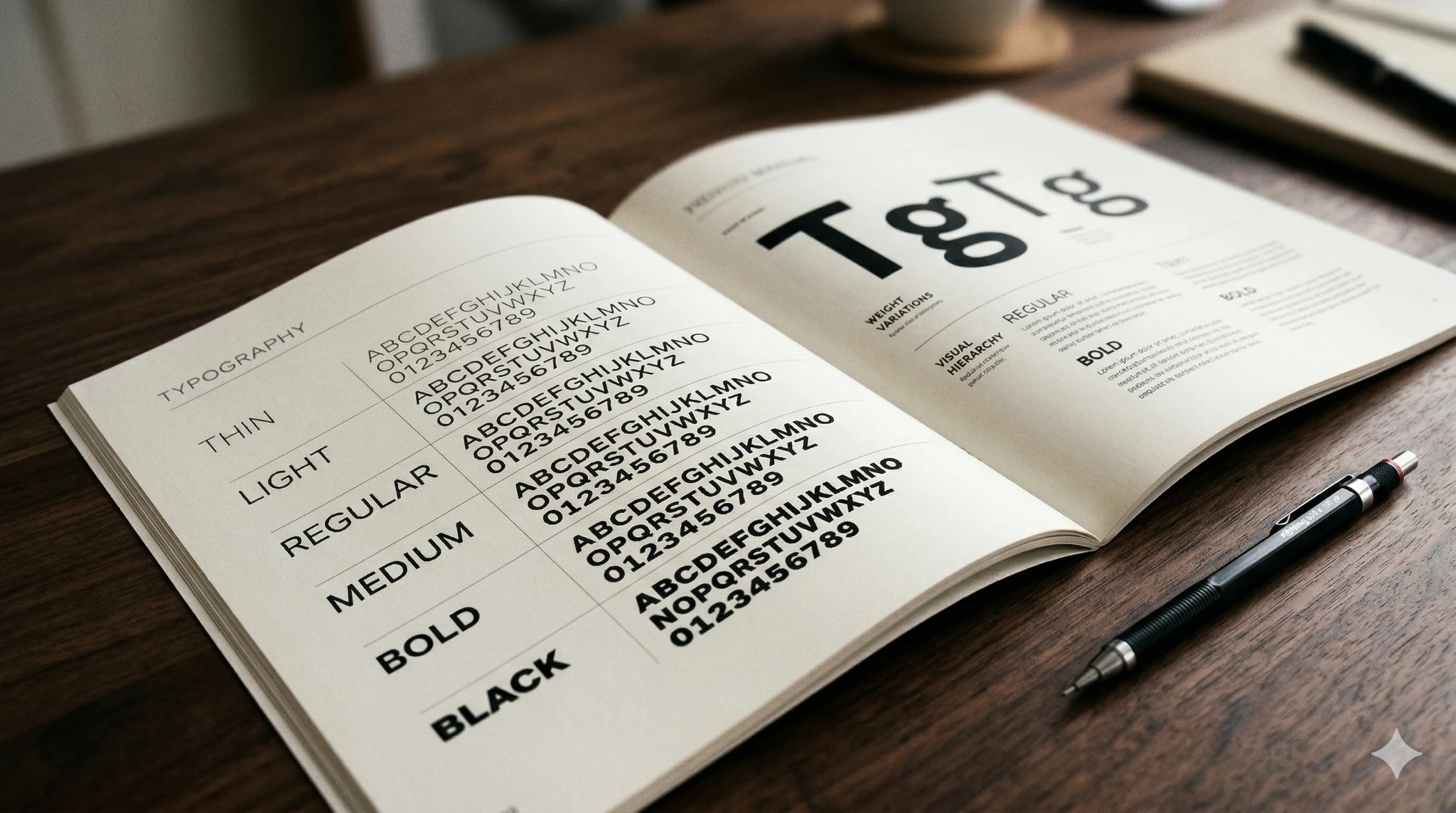
Limited font families. Authority brands rarely use more than two typefaces. One for headings, one for body text. The discipline itself communicates confidence.
Generous spacing. Adequate line height and letter spacing give text room to breathe. Cramped type feels uncertain. Open, well-spaced type feels in control.
Clear hierarchy. Obvious distinctions between heading levels and body text ensure readers never have to decide what to read next. The typographic structure makes that decision for them.
Purposeful weight use. Regular and medium weights carry most of the load. Heavy reliance on bold or ultra-light weights without clear rationale creates visual noise that quietly erodes credibility.
Serif vs Sans-Serif — The Authority Question
One of the most persistent debates in brand typography is whether serif or sans-serif fonts project more authority. The honest answer is that both can, depending on context — but the underlying principles are learnable.
Serif Fonts and Established Credibility
Serif typefaces — those with small finishing strokes at letter ends — carry centuries of association with print, academia, law, and journalism. Brands wanting to evoke heritage, deep expertise, or institutional gravitas naturally gravitate toward serifs. Financial institutions and long-running publications have built entire identity systems on this association.
A well-chosen serif says: this brand has history, or intends to.
Sans-Serif Fonts and Modern Authority
Sans-serif typefaces have become the default language of digital authority. Technology companies, design-forward startups, and modern financial platforms lean heavily on sans-serif systems because they render cleanly across all screen sizes and resolutions, and feel forward-facing rather than retrospective.
The authority here is not borrowed from tradition. It is earned through clarity and intention.
The Hybrid Approach
Many of the most credible brand systems pair a serif headline font with a sans-serif body font. This creates purposeful contrast that reads as considered rather than accidental. The pairing itself signals design literacy — and design literacy signals professional seriousness.
Typography Consistency Across Every Touchpoint
A brand can have a beautifully chosen typeface and still fail to build authority if it is not applied consistently.
Inconsistency is where most brands quietly lose credibility. The website uses one font family. The downloadable PDFs use another. The email templates use a third. The social graphics use whatever was convenient. The cumulative result is a visual identity that feels assembled rather than owned.
Authoritative brands treat typography as a system. Every touchpoint — from the homepage to the invoice to the error message — speaks in the same typographic voice. This requires documentation. A concise brand style guide specifying typefaces, sizes, weights, and spacing rules for each context is one of the highest-leverage investments any brand can make.
Practical Steps for Strengthening Your Brand Through Typography
If you are building or refining a brand with authority as the goal, the following steps offer a clear starting point.
Audit Your Current Typographic Landscape
Before changing anything, catalogue what you currently use across every brand surface. Most audits reveal three to six fonts in active rotation, often without clear rationale. Reducing this number alone has immediate impact.
Choose a Primary Typeface with Purpose
Your primary typeface will carry most of the communicative weight. Choose it based on your audience’s category expectations, how it renders across screen sizes, and whether a full weight range is available. Smashing Magazine’s typography section offers some of the most rigorous practical guidance available for making this decision well.
Build a Type Scale
A type scale defines the size relationships between your heading levels and body text. A well-constructed scale creates visual rhythm and hierarchy that readers feel even when they cannot articulate why.
Test at Real Screen Sizes
Authority requires legibility. What looks refined at desktop resolution can become unreadable on mobile. Test your type choices at the breakpoints your actual audience uses. A 16px minimum for body text is a reliable starting baseline.

The Long-Term Compounding Effect
Typography authority does not arrive with a single redesign. It compounds.
Every consistent touchpoint reinforces the brand signal. Every inconsistency erodes it. Over months and years, brands that maintain typographic discipline build a visual equity that is genuinely difficult to replicate — because it is the product of sustained attention, not a one-time decision.
This is why typography belongs in the strategy conversation, not just the design brief. The brands that understand this — whether they build design tools, digital products, or regulated trading platforms — consistently earn more trust than those that treat type as decoration.
The typeface you choose today is a quiet commitment to what your brand intends to become.