
Choosing the Right Fonts for AI Generated Video Captions
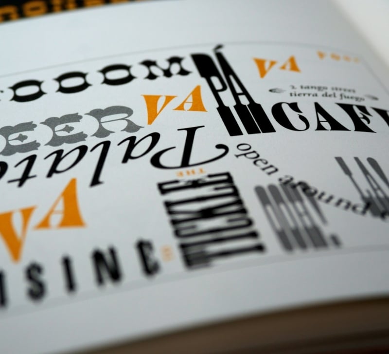
Heavier sans-serif fonts with tall x-heights and strong contrast against any kind of background are the best fonts for AI-generated video captions. For example, Montserrat Bold, Inter Bold, Poppins SemiBold, Proxima Nova Black, and TheBoldFont are some of the most used fonts by performance-driven creative teams. These source typefaces are normally legible even when they’re as small as 9 to 14 pixels on the smartphone screen held at arm’s length, which is the actual viewing condition in which most short-form video is consumed. Thin, decorative, or script fonts almost always perform poorly no matter how clean they seem in your editing software.
Most marketers are not aware that caption legibility is doing the heavy lifting. About 70 – 85 percent of mobile video views on silent vary by platform which means captions are not a backup. They are the primary delivery medium of everything that the script says. If you choose the wrong font, the message simply doesn’t get through no matter how great the hook or the actor is.
What Makes a Font Work for Short-Form Video Captions
What really counts are weight, x-height, and counter space (the empty area inside characters like o, a, and e). A bold or black weight gives letterforms with enough mass to withstand complicated backgrounds and a motion-blurred effect. A large x-height (the size of lower case letters compared to upper case ones) maintains the legibility of individual letters even at very small sizes, which is the reason why font families such as Inter and Poppins do better than geometric classics like Futura for captions. Open, spacious counters will prevent letters from “filling in” and becoming indistinguishable after the video has been compressed on TikTok or Reels.
Another aspect to consider is stroke contrast. Fonts where thick-thin transitions are very pronounced (like Didot or Bodoni) are perfect for posters yet are completely illegible on a phone screen, because thin strokes disappear both in compression and fast on-screen motion. Caption fonts exhibit an even stroke weight at all points of the letterform. This explains, In fact, why almost all viral burned-in captions on TikTok are set in a font that belongs to the Montserrat, Poppins, or Proxima Nova family rather than a serif or a display face.
Font Pairings That Match Different Content Tones
Picking a font for a script is the same as matching a voice to a text. And here, there’s actually a whole lot more variety than most templates expect. As a rule of thumb at performance teams, for direct-response e-commerce ads, the go-to fonts are TheBoldFont, Montserrat Black, or Komika Axis, usually in striking yellow-on-black or white-on-black arrangements and often with a bold contour or drop shadow so that the text is visible against any background. These fonts come across as urgent, direct, and a bit tabloid, which is exactly what the format is designed to do.
When it comes to B2B, SaaS, or any other brand that wants to project a thoughtful image Inter IBM Plex Sans, and Shne are more suitable. They are simpler, quieter, and a product demo doesn’t feel like a commercial. Inter, In particular, has become the standard for tech-adjacent content as it was designed for screen rendering from the start and it performs well across captions, UI, and thumbnails without looking out of place. For lifestyle wellness beauty, and food, a little softer humanist sans-serifs like Poppins, Nunito, or Mulish give off the vibe of warmth without compromising on readability. One big error is to use the same font for all kinds of content just because it is the default in your editing tool. CapCut’s default, Premiere’s default, the avatar in your AI tool’s default – none of these are chosen with your specific brand in mind. They are chosen for the broadest possible audience.
How Caption Style Should Change by Platform
TikTok and Instagram Reels tend to favor a large-sized font, captions located either at the center or lower third, and a heavy weight of the font. Mostly, the font size is between 36 to 48 pixels at 1080×1920. Besides, the captions come with backgrounds or outlines for better contrast. The look on these platforms is quite similar, fea in the industry has associated this looking style with 10 to 20 percent stronger view-through rates compared to plain white captions, but the difference is becoming smaller as the style gets widely used. On YouTube Shorts, it is possible to style the captions a little bit more conservatively as the viewers there are generally older and are more tolerant of having more text. The caption size there can be 32 to 40 pixels with a cleaner style and less noticeable highlighting of keywords. LinkedIn video is quite a different story, where captions that are overly TikTok-styled can actually hurt the post.
A standard white-on-translucent-black at tturing a highlight of each word or a short phrase with a coloured pop of the keyword (yellow, green, or red against white) since that way, the eyes remain fixed on the screen. Creative testinghe bottom, in Inter or Helvetica Bold at 28 to 36 pixels, looks very professional and does not make users want to scroll away as much as flashy captions do on a business feed. When it comes to longer-form video on YouTube or LinkedIn, captions should be displayed on screen for sufficiently long that they are readable at a constant reading pace, which is about 160 to 180 words per minute. AI-captioning tools that cut captions into single words or two-word bursts are good for short-form but seem very hectic for any content over 90 seconds.
Practical Caption Settings Inside AI Video Tools
Caption presets are included in most AI video platforms nowadays, and the default settings are generally okay, but they are hardly ever the perfect match for a particular brand. What you really should be adjusting first are: font family weight size, background style (outline, shadow or filled box), and keyword highlight color. Securing these into a brand-specific template will help you save from 5 to 10 minutes per video and make sure all even team members’ output is consistent, which in fact turns out to be a bigger deal than people realize when you are producing 20 to 50 ads a week.
The other thing worth checking is how the platform handles non-Latin scripts if you’re producing multilingual content. Captions in Cyrillic, Arabic, Thai, or CJK languages need fonts with proper glyph coverage, and many of the popular Latin caption fonts have weak or missing support outside basic Latin. For teams that use AI to create ads at scale across multiple markets, this is where production pipelines often quietly break. A campaign localised into Polish, Greek, and Japanese will render beautifully in English and then fall apart in three other languages because the chosen font only properly supports Latin Extended-A.
Fix this once by picking a font family with broad Unicode coverage (Noto Sans is the gold standard, Inter and Source Sans Pro are also strong) and you’ll save hours of rework across every campaign that follows.
How to Test Whether a Font is Actually Working
Play the video on a very small phone screen, outdoors in bright sunlight, with the brightness set to 60 percent. If the captions are hard to read in such conditions, they’re failing a significant portion of your audience. Another good test is the three-second squint test. Squint at the first three seconds and see if the main words still form legible outlines. If they don’t, the font is either too thin, too small, or competing too much with the background.
Only performance data from your own ads counts as a final result. Doing A/B testing of the caption styles is quite easy on Meta and TikTok, and usually, the differences between two fonts that have been well selected are very small (just a few percentage points on the hook rate). Yet, the differences between a well-chosen font and a poorly-chosen one can be as high as 20 percent, which is the kind of margin that can cover the costs of the whole creative team.
A heavy, high-contrast caption typical of TikTok makes the video look like something designed for the algorithm, which is okay if that’s the intent but it slowly trains the audience to see that style as a paid promotion. Brands that are aiming for long-term recognition may want to go for a relatively milder caption style, thinking that the present one will be considered old-fashioned in 18 months in the same way that the all-caps Impact captions from 2019 look old today.
Choose the font that will be suitable for your future content, and not the one that has been stylish only for the last six months for someone else.