
What Neon Taught Us About Designing With Display Type
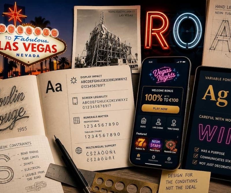
In 1959 a graphic designer named Betty Willis drew a diamond-shaped sign with eight letters spelled out across white circles meant to read as silver dollars. She never copyrighted it, which is why “Welcome to Fabulous Las Vegas” ended up on more fridge magnets than any lettering in American history.
Willis was not designing a typeface. She was solving a display problem — how to make words legible at speed, at night, from a car — and her answer still governs how the entertainment industry uses type.
Seventy years later the same brief moved to a five-inch screen in someone’s hand, and most of the constraints came with it.
The Neon Era Was Hand-Lettered By Necessity
Before phototypesetting, monumental signage was drawn rather than set. Sign shops like Young Electric Sign Company employed designers who worked in glass tubing and sheet metal, which meant every letterform had to survive being bent by hand.
That constraint produced the aesthetic we now file under Googie, named after a Los Angeles coffee shop and characterised by exaggerated angles, boomerang shapes and letterforms that lean into speed. Willis’s own Moulin Rouge script from 1955 is the purest surviving example, all optimism and no restraint.
The craft logic behind it is worth remembering. Neon rewards simple, closed counters and heavy strokes, because thin hairlines are physically difficult to bend and disappear entirely at distance.
Anyone who has watched a delicate display face collapse when scaled down to a mobile navigation bar is fighting the same battle with different tools.
| Era | Dominant treatment | Why it worked |
| 1940s to 1960s | Hand-lettered neon, Googie forms | Built for distance, motion and darkness |
| 1970s to 1980s | Phototype display faces, heavy slabs | Cheap reproduction, print-first campaigns |
| 1990s to 2000s | Digital revivals, bevelled chrome effects | Software could finally imitate metal |
| 2010s onward | Screen-native sans, variable fonts | Legibility across sizes and pixel densities |
The Screen Rewrote The Brief
Moving from a highway sign to an interface flips the priority. On the Strip, type had to be seen; in an app, it has to be read repeatedly without fatigue.
That shifts the whole spec sheet. Larger x-heights, open apertures, unambiguous 1/I/l distinctions and enough weight range to establish hierarchy in a space the size of a postcard.
Localisation is where most projects quietly fail, and it is a typographic problem long before it becomes a translation one. A brand that commissions a beautiful display face covering basic Latin will discover the gap the first time it enters Central Europe.
Slovenian is a clean example. The alphabet drops q, w, x and y but adds č, š and ž, so a site serving the Slovenian market — from a national news portal to a review platform covering casino online Slovenia operators — needs proper caron support, not a fallback font substituting mid-sentence.
Bad diacritics are instantly visible to native readers. Carons that sit too high, collide with ascenders, or come from a different family entirely make a page look machine-translated regardless of how good the copy is.
Numerals Deserve More Attention Than They Get
Entertainment interfaces are mostly numbers, and numbers are where typographic decisions become functional rather than decorative.
Tabular figures matter enormously in any layout where values update in place. Proportional figures cause columns to jitter as digits change, which reads as instability even to users who could not name the cause.
Lining versus old-style is the other choice. Old-style figures are lovely in body text and wrong in a data table, where varying heights undermine scanability.
The best practice is unglamorous. Set the tnum OpenType feature on anything live-updating, keep old-style figures for editorial content, and never let the two mix within a single component.
Motion Is The New Neon
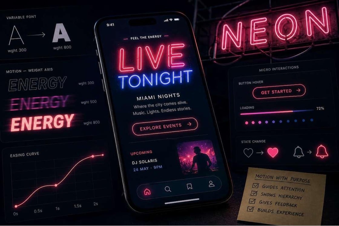
The thing neon had that static print never did was movement. Chasing bulbs, sequenced animation, flicker used deliberately rather than as failure.
Digital design rediscovered this and promptly overdid it. Type that bounces, counters that spin, weight axes animating on hover — all of it borrowed from an era when motion was the only way to compete with the sign next door.
The discipline question is whether the motion carries information or merely decorates. This overview of approaches to gamification is a useful read on that distinction, because gamified interfaces live or die on whether feedback is meaningful or simply loud.
Variable fonts make restraint easier. A single file animating from regular to bold along one axis gives designers the neon-sign effect without the bandwidth cost of loading five separate weights.
Six Rules Borrowed From The Sign Painters
- Test at the smallest size first. Everything survives at 200 points, which is why display faces get chosen for the wrong reasons.
- Check the numerals before the alphabet. If the figures are weak, the family is unusable for anything data-driven.
- Audit diacritic coverage early. Latin Extended-A support costs nothing at licensing time and everything at relaunch.
- Keep one voice per surface. Neon-era signage worked because a single hand drew the whole board.
- Give motion a job. If an animation does not communicate state, it is noise with a render cost.
- Respect legal minimums. Regulated industries mandate minimum sizes and contrast for licensing and age notices, and those constraints belong in the type system rather than bolted on afterwards.
The Craft Outlived The Medium
Most of the great Vegas signage is now in a museum yard, sitting in rows and rusting handsomely for photographers. The letterforms outlived their function, which is the usual fate of good display type.
What survived is the thinking. Design for the conditions the reader is actually in, respect the physical limits of the medium, and remember that legibility is a courtesy rather than a constraint.
Betty Willis understood that with a pencil and a sheet of glass tubing. The tools have changed considerably, and the brief has not changed at all.