Why High-Resolution Imagery Is the Backbone of Professional Typography
Your type may be perfect. If the image behind it isn’t, the whole design still reads as amateur. Here’s how modern designers are closing the gap.
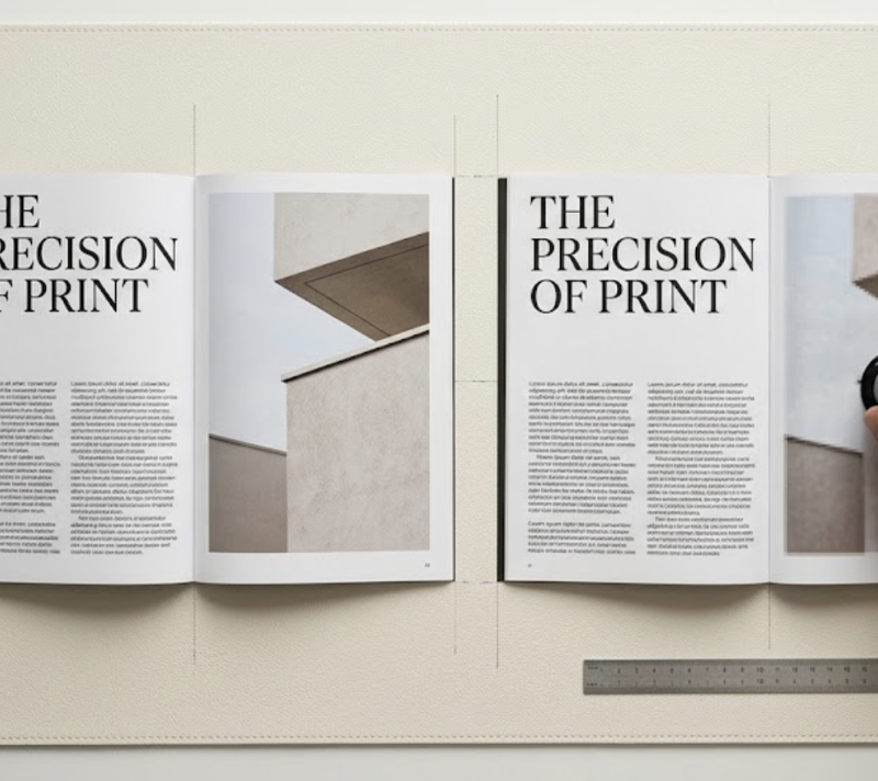
Every designer has felt this moment. You’ve spent an hour pairing a high-contrast serif with a clean neo-grotesque sans. The kerning is dialled in. The hierarchy sings. You drop in the hero image — a stock photo the client approved — and the entire composition collapses. The type still looks great. The photo looks like it’s been slightly out of focus for a decade.
This is the quiet problem at the heart of a lot of otherwise good design work. Typography has never been more accessible: variable fonts, fluid type systems, and vast font libraries mean even small studios can achieve type-setting quality that would have been impossible ten years ago. But the images sitting alongside that type are often pulled from client uploads, legacy brand archives, or low-resolution social exports — and the visual mismatch is jarring.
Until recently, this gap left designers with two uncomfortable options: commission a reshoot (rarely possible given time and budget constraints), or enlarge the image using traditional interpolation and hope nobody looked too closely. Neither answer is acceptable when you care about craft. The newer, better answer is to run low-resolution source material through a purpose-built AI photo enhancer before it ever reaches the layout — rebuilding sharpness, texture, and edge clarity so the image can hold its own next to precisely-set type.
This article looks at why image resolution is inseparable from typographic craft, what “high-resolution” actually means across media, and how AI upscaling changes the workflow for designers who cannot compromise on visual quality.
Scope note: The principles below apply to editorial, branding, packaging, and web work. They do not cover illustration-first projects, pixel art, or deliberately low-fi aesthetics, where grain and compression are part of the design language.
The Perceptual Mismatch Between Type and Image
Typography and imagery are processed differently by the human visual system. Letterforms are highly structured edges — the eye is exceptionally sensitive to any deviation in stroke weight, contrast, and terminal shape. A single slightly blurred letter on a billboard is immediately obvious at 50 metres. Images, by contrast, are tolerated at much lower sharpness, because the brain fills in missing detail from context.
The trouble begins when these two things share a composition. When a razor-sharp headline in a display serif sits on top of a soft, interpolated photograph, the viewer’s eye constantly re-calibrates between the two focal planes. The design feels unresolved, even if the viewer can’t articulate why. Designers who’ve worked in editorial know this intuitively: magazines don’t commission 300 DPI photography for no reason.
Three shifts have made this mismatch more visible, not less, over the past few years:
- Retina and high-DPI displays. Apple’s Retina displays, first introduced in 2010 and now standard across most premium devices, render at roughly 220–264 PPI for laptops and up to 458 PPI on iPhone Pro models. Any image not prepared for this density shows visible softness, while vector type remains crisp at any resolution.
- Variable and high-contrast typefaces. Modern variable fonts such as Inter, GT America, and Editorial New are designed to stay razor-sharp at tiny sizes — which means any softness in the supporting image is now the weakest visual element on the page.
- Closer viewing distances. Phone-first reading means users are looking at compositions from 25–40 cm away, roughly half the distance of print reading. At that distance, image defects that used to be invisible become obvious.
The practical consequence: a design that worked fine at 1x on a 2012-era laptop screen can look unmistakably amateur on a 2024 phone, even if nothing about the typography has changed.
What “High Resolution” Actually Means
“High-resolution” is often used as if it were a single threshold, but designers working across media know it shifts significantly by output.
- Print (standard): 300 DPI at final print size. A full-page A4 magazine image needs roughly 2480 × 3508 pixels.
- Print (large format, viewed at distance): 150–225 DPI is usable for posters and billboards, because the viewing distance compensates.
- Retina screens: Serve images at 2x their intended display size. A 600px-wide hero image should be a 1200px-wide file.
- Standard screens: 72–96 PPI, though this is rapidly becoming obsolete as even budget displays move past 100 PPI.
The challenge for most studios isn’t knowing these numbers. It’s the gap between what clients supply and what the design actually needs. A brand archive built in 2014 for 72 DPI web use is not going to scale cleanly to a 2026 print campaign. A product shot exported as a 600px thumbnail for an e-commerce site cannot simply be enlarged for a billboard. And the stock library photo the client insists on using is often not available at the resolution the layout demands.
The Technical Leap: Why AI Upscaling Outperforms Bicubic
For decades, the default upscaling method in Photoshop and Lightroom has been bicubic interpolation — an algorithm that expands a 4×4 pixel neighbourhood using cubic polynomials to calculate new pixel values. Lanczos resampling, often considered the highest-quality traditional method, uses a larger sampling neighbourhood with a windowed sinc function. Both methods share a hard mathematical ceiling: they cannot create detail that wasn’t in the source image. They can only average, smooth, and guess based on local neighbourhoods.
AI-powered upscaling works on a fundamentally different principle. Neural network architectures such as SRCNN, ESRGAN, and Real-ESRGAN are trained on millions of low-resolution and high-resolution image pairs, learning to predict what plausible detail looks like for a given pattern. When the model sees a blurry edge, it doesn’t just smooth it — it reconstructs what it expects a sharp edge to look like, drawing on the patterns it learned during training.
Independent technical comparisons show this difference is measurable, not just perceptual. Benchmark testing on 4x upscaling typically shows AI methods producing 30–60% improvement on perceptual quality metrics such as SSIM (Structural Similarity Index) and LPIPS (Learned Perceptual Image Patch Similarity) compared to bicubic baselines. The practical outcome: edges stay genuinely sharp, textures are reconstructed rather than blurred, and fine detail — hair strands, fabric weave, leaf veins — looks plausibly like the original was simply shot at a higher resolution.
This matters particularly for typography-heavy work. The same AI models that reconstruct photographic detail also tend to preserve edge sharpness on any letterforms embedded in the image (packaging mockups, signage, product labels), rather than smoothing them into illegibility the way bicubic does.
Working AI Upscaling Into a Typography-First Workflow
For designers whose work lives or dies on typographic precision, the practical question is: where should AI upscaling fit into the workflow? A few principles from working designers who have integrated these tools:
- Upscale early, type-set late. Enhance the base image to its final output resolution before starting typographic composition. Setting type against a low-resolution placeholder and then upgrading the image at the end almost always requires re-tuning kerning, tracking, and contrast — because the visual weight of the composition shifts once the image is sharp.
- Match the DPI target to the medium, not the maximum. A 16x upscale is technically possible but rarely useful. For a 24 × 36 inch poster, you need around 7200 × 10800 pixels at 300 DPI — no more. Pushing beyond what the medium can resolve adds processing time without visible benefit.
- Use a dedicated upscaler rather than a general editor’s built-in. Purpose-built AI enhancement tools tend to give more consistent results for design work than general-purpose filters inside broader editing suites, because they ship with models specifically tuned for edge preservation and texture reconstruction.
- Handle noise and artefacts before upscaling. AI models amplify whatever is in the source. Heavily compressed JPEGs should be cleaned up first; otherwise the upscaler will confidently reconstruct the compression artefacts as “detail.” This is especially important for old brand archives and social-export assets.
A note on limitations. AI upscaling is not a universal solution. It genuinely struggles with:
- Very low-resolution sources (below roughly 128 × 128 pixels for the subject area), where there simply isn’t enough signal for the model to reconstruct from.
- Small text and logos inside images — most general upscalers distort type. Where a brand logo appears in the image, consider replacing it with a vector version rather than relying on upscaling to recover it.
- Heavily stylised photography (extreme grain, film scans, deliberate softness), where the “enhancement” fights the intent of the image.
For those cases, commissioning a reshoot or working with an original high-resolution source remains the right answer. The value of AI upscaling is not that it solves every problem — it’s that it solves the 70–80% of routine cases that used to force uncomfortable compromises, freeing designers to focus attention on the judgment calls that actually matter.
Closing: The Weakest Element Sets the Tone
There’s an old rule in editorial design: the whole composition reads at the quality of its weakest element. A perfectly set headline loses its authority when it sits above a mushy photograph. A beautifully chosen pairing of display and body type loses credibility when the supporting imagery feels like a downsampled screenshot. For years, this was an unavoidable constraint — designers worked with what the client supplied, and typography sometimes had to carry the whole weight of a composition.
That’s no longer true. The tools to bring legacy and low-resolution imagery up to the standards of modern typography are now fast, accessible, and good enough for professional work. For designers who care about craft, it’s worth making image-quality assessment a standard step in the brief review, and folding AI enhancement into the workflow whenever the source material and the output medium are mismatched. Your type deserves it — and so does the design as a whole.