
Which Free Fonts Actually Print Well? A Guide to Choosing Type for Business Cards and Brochures
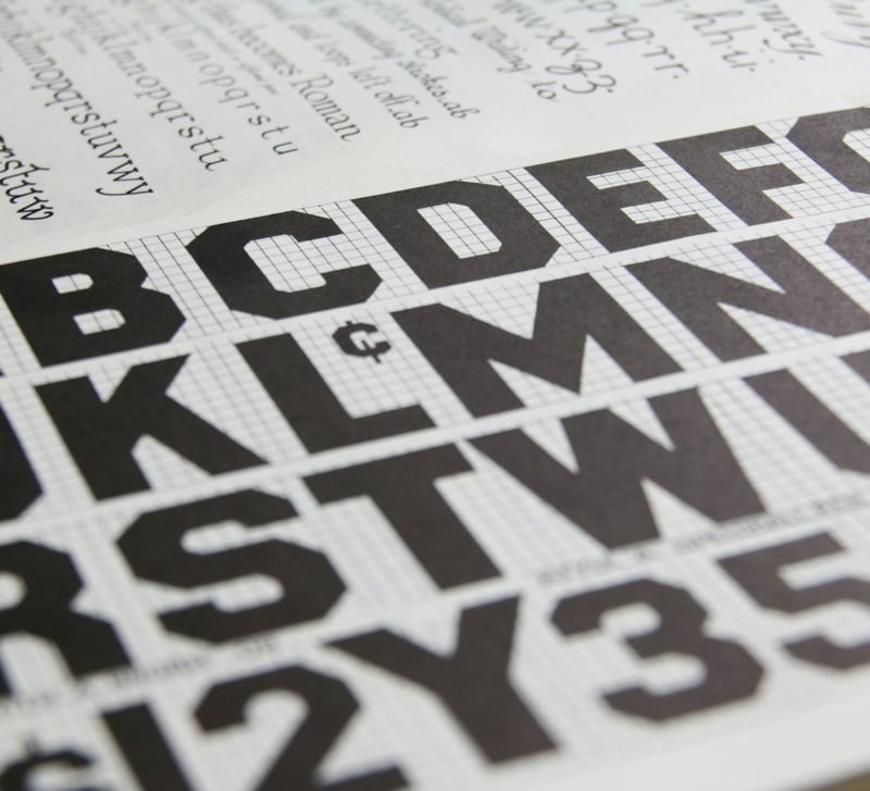
A font that looks sharp on a laptop screen does not always survive the trip to paper. Anyone who has picked a beautiful free typeface for a project, only to see it turn muddy, cramped or oddly spaced once it comes off the press, knows this problem well. Screens and paper are different mediums with different rules, and type that reads perfectly at 100 percent zoom can behave in unexpected ways once it is scaled down to a business card or spread across a tri-fold brochure.
This matters more than most people realise when planning printed materials. Font choice affects legibility, brand tone and even how professional a finished piece looks sitting on someone’s desk. This guide walks through what actually changes between screen and print, how to choose type that holds up in small formats, and where common mistakes tend to creep in before a job goes to press.
None of this requires a design background to get right. It mostly comes down to understanding a handful of print-specific quirks, testing choices properly before a full run, and knowing which small details tend to cause the biggest problems later on. It also helps to work with a custom printing company that pays attention to typography, rather than one that treats every file the same way regardless of the fonts inside it.
Why Screen-Friendly Fonts Do Not Always Translate to Print
Digital screens are backlit and forgiving. Even a thin, delicate typeface looks crisp on a monitor because the light is coming from behind the letterforms. Paper works the other way around. Ink sits on the surface and can spread slightly depending on the stock, which means very fine strokes, tight counters (the enclosed spaces inside letters like ‘a’ and ‘e’) and hairline serifs can lose definition once printed.
This is especially noticeable at small sizes. A font that looks elegant as a website heading might blur or fill in when reduced to 8 point type on a business card. The opposite problem also happens: some fonts that look plain or even a little heavy on screen actually print beautifully, because their sturdier strokes hold their shape at a smaller scale. The only reliable way to know is to test a font in the actual size and format it will be used in, rather than judging it purely from a screen preview.
Serif, Sans Serif and the Question of Legibility on Paper
The serif versus sans serif debate comes up constantly in print design, and the honest answer is that neither is automatically better. What matters more is how the specific typeface behaves at the size it will be printed.
Serif fonts, with their small decorative strokes at the ends of letters, can guide the eye along a line of text, which is why they are often favoured for longer passages of body copy in booklets or reports. But serif details that are too fine will not hold up well on lower-quality stock or at small point sizes, so the specific weight and structure of the font matters as much as the general style.
Sans serif fonts tend to be more forgiving in small formats because their strokes are more uniform, which is part of why they dominate business cards, signage and anything meant to be read quickly. That said, a sans serif font with very tight letter spacing can look cramped once printed, particularly in all capitals. The safest approach is to print a physical test proof of any font before committing to a full run, since colour, spacing and clarity often look different once ink meets paper.
Choosing Type for Business Cards: Small Space, High Stakes
Business cards are one of the most unforgiving formats for type, simply because there is so little room to work with. A name, title, phone number and email all need to fit clearly onto a card roughly the size of a credit card, which leaves almost no margin for error if the font does not perform well at a small scale. This is a case where good business card printing depends as much on the type choice as it does on the paper stock or finish, since even the best-quality card cannot fix text that is difficult to read.
A good rule of thumb is to avoid anything with very fine hairline strokes, ornate scripts, or excessive letter spacing variation on a business card, no matter how appealing it looks in a font preview online. Stick to a typeface that stays legible when printed at 7 to 9 point size, and test how it looks in both the main text and any smaller details like a tagline or address. Bold or semi-bold weights of a font family often perform better than the regular weight in this format, since the added stroke width holds up more reliably in print.
Getting Brochure Typography Right
Brochures give a bit more breathing room than a business card, but they introduce a different challenge: consistency across headings, body copy and captions, often across multiple pages or folds. Reliable brochure printing services can only do so much if the typography itself is inconsistent, so it helps to settle on a small font system before the design work begins rather than adjusting it page by page.
A simple approach that tends to work well is pairing two fonts: one for headings and one for body copy, ideally from font families that are designed to complement each other. Headings can usually carry more personality, since they are printed larger and shorter in length, while body copy should prioritise legibility above all else, particularly if the brochure includes any dense blocks of text such as pricing, terms or product details.
Line spacing matters here too. Text that looks fine on screen at single spacing can feel cramped once printed, especially on glossy stock where light reflects off the page. Adding slightly more space between lines than feels necessary on screen often produces a more comfortable reading experience once the brochure is actually in someone’s hands. The same applies to margins, which often need to be more generous in print than they appear on a digital mock-up, particularly near any folds.
Common Font Mistakes That Delay a Print Job
A surprising number of print delays come down to font issues rather than design problems. The most common one is submitting a file where the fonts have not been embedded or outlined, which means the printer’s system substitutes a default font, changing the spacing and sometimes the entire layout without anyone realising until a proof comes back looking wrong.
Another frequent issue is licensing. Many free fonts are only free for personal use, and using them in a commercial print job, such as a client’s brochure or a business’s branded stationery, can breach the terms of the licence. It is worth checking the licence attached to any free font before it goes anywhere near a commercial print file, since this is one mistake that can cause real problems well after the job has already been printed and distributed.
Finally, mixing too many typefaces in a single piece is a common trap, particularly for anyone assembling a document themselves rather than working with a designer. Two, or at most three, font families are usually enough for a business card, brochure or any other piece of print marketing. More than that tends to make a document look disorganised rather than considered, no matter how good each individual font is on its own.
Quick Checklist: Is Your Font Print-Ready?
Before sending any design off to press, it is worth running through a short checklist:
- Check the size: Test the font at its actual printed size, not just at a zoomed-in preview on screen.
- Check the licence: Confirm whether the licence covers commercial print use, not just personal or digital projects.
- Check the file: Make sure fonts are embedded or outlined in the final file so the printer’s system cannot substitute a default.
- Check a proof: Print a physical proof rather than relying on a screen or a digital PDF preview alone.
- Check the count: Stick to two or three font families across the whole piece, with a clear hierarchy between headings and body copy.
Working through this list before a job is sent to print catches most of the common issues early, when they are still easy and cheap to fix.
Working with a Printer Who Understands Type
Font choice is ultimately a design decision, but a printer that understands typography can catch problems before they become expensive ones. This might mean flagging a font that is likely to print poorly at the requested size, pointing out spacing issues that only become obvious in a physical proof, or simply asking the right questions before a job is sent to press. These are the kinds of details that separate a smooth print run from one that needs a costly reprint.
For anyone managing multiple print jobs, whether that is business cards, brochures or other marketing collateral, using online printing services makes it easier to get an instant quote, upload a print-ready file and move a job along quickly, without needing to visit a print shop in person or wait on back-and-forth emails. This is particularly useful once a font system and template have already been settled on, since reordering the same design with updated details becomes a much faster process the second time around.
Bringing It All Together
The fonts that work best in print are rarely the ones that look most impressive on screen. They are the ones that hold their shape at small sizes, stay legible under different lighting and paper conditions, and remain consistent from a business card through to a full brochure. Testing a font in its actual printed size, checking its licence before commercial use, and keeping a font system simple will save far more time than chasing the newest or most eye-catching free typeface available.
Five Rules Worth Remembering
- Rule one: Judge a font by how it looks printed, not by how it looks on screen.
- Rule two: Favour sturdier strokes and weights for small formats such as business cards.
- Rule three: Pair no more than two or three font families in any single piece.
- Rule four: Always check the commercial licence before a free font goes anywhere near a client job.
- Rule five: Get a physical proof before committing to a full print run.
Good typography in print is mostly invisible when it is done well. Nobody reads a business card and consciously thinks about kerning or stroke weight. They simply find it easy to read, and that quiet clarity is exactly what makes a printed piece feel professional rather than homemade.