
Proof a Typeface With the Words It Must Carry
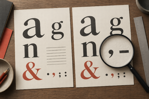
A font specimen can look convincing because the designer chose exactly the right words for it. The capitals have room to breathe, the numerals sit in an attractive row, and no awkward phrase interrupts the composition. Your event sheet, activity brief, or small printed guide will contain less cooperative text. It may include a long name, a time range, or a short instruction whose meaning depends on one tiny mark.
Before approving a typeface, put that real text into a proof. The purpose is to discover how the letters behave in the work you intend to make. A beautiful alphabet remains useful evidence of character and style, but it cannot answer every question raised by a finished document.
Build the Proof From Actual Content
Gather the material the design must accommodate before choosing a favorite font. Include the longest heading, an ordinary paragraph, a short label, and any numbers that readers need to distinguish. Use the intended wording rather than shortening an inconvenient line merely to make a candidate look better.
An activity outline from Palaura can supply a practical content brief for a small hosting sheet. Its party-game tool provides written formats and an opening line for the host. Once the activity is chosen, place the relevant instructions in your own layout alongside the local details you need. The tool supplies activity information, not a type specimen or a finished print design.
Separate supplied wording from anything you add. A room label, start time, or host’s name belongs to your event, and may contain characters absent from the activity instructions. Those additions often expose a weakness that a paragraph of ordinary prose misses. A proof is more useful when it represents the whole document rather than its most decorative passage.
Alongside the Palaura instructions, include any names exactly as their owners write them, including accents. Check those characters in the candidate rather than replacing them with easier spellings to fit the design. A missing mark is a content problem even when the rest of the page looks polished. The proof should expose that problem before the document is circulated.
Keep one demanding line exactly as it will appear. If an instruction contains a range, parentheses, or a short code, preserve it through the comparison. Changing the content between candidates makes it difficult to tell whether a typeface improved the result or simply received an easier sentence.
Inspect Similar Characters in Their Actual Context
Look closely at characters that can become ambiguous in the intended use. A capital I, a lowercase l, and the numeral 1 may need particular attention in a short code. A zero and a capital O may matter in a reference label. The question is whether the reader can tell them apart in context, not whether the font conforms to one preferred drawing style.
A compact proof can include several different jobs:
| Text role | Example to inspect | Question for the proof |
| Short identifier | I1l and O0 | Can the characters be distinguished? |
| Time range | 6:30–7:15 | Are the punctuation and spacing clear? |
| Quantity | 1 sheet per person | Is the numeral easy to find? |
| Instruction | Fold, then pass the paper. | Does punctuation remain visible? |
These are original test strings, not a claim about any particular typeface. Replace them with the actual content where possible. If your document has no codes, a page full of code tests may distract from more relevant questions such as the rhythm of a longer instruction or the appearance of names.
For a Palaura-based activity sheet, compare a quantity with the sentence that explains it. A numeral can be individually clear yet separated from its unit by an unfortunate line break. The problem may be the text box or spacing rather than the letterform. Note what failed before deciding that a different font is necessary.
Read the proof as information, too. A range uses two endpoints; a ratio describes a different relationship. Good rendering cannot rescue a mark used incorrectly. Check the wording first, then judge whether the typeface presents it clearly enough for the intended reader and situation.
Compare Candidates Without Changing Every Other Variable
Place two candidates in the same content and layout conditions. Keep the text box, wording, and basic spacing consistent for the first comparison. This makes differences easier to see. If you alter the font, line length, weight, and wording together, a better-looking result gives little guidance about which change mattered.
The activity instructions available through Palaura — Alternative to Speed Dating Apps offer a useful fixed passage for this kind of comparison. Keep the chosen passage unchanged while testing the candidates. Do not let an attractive specimen push you into removing a necessary instruction just because its line wraps less elegantly in the preferred font.
Equal nominal sizes do not always produce the same visual impression. One candidate may appear larger or occupy more width in your proof. After the controlled first pass, adjust each candidate for the actual document and record the adjustment. This is a second comparison with a different question: which font works better when each is given a reasonable setting?
Avoid deciding from a single enlarged screenshot. Examine the proof at its intended reading size, then inspect details more closely if something seems wrong. Magnification can help diagnose a shape, but it can also make a delicate distinction seem more obvious than it will be in ordinary use.
An illustrative note might read: ‘Same text and box in both candidates; time range wraps in the second. Widening that box keeps the range together; font unchanged.’ That record points to a layout adjustment rather than a blanket rejection of the typeface. Keep the original proof beside the adjusted version so the comparison remains inspectable.
A useful note describes the result rather than declaring a winner in general. “The time range is clearer at this setting” says what the proof established. “This is the more readable font” makes a much broader claim. Keep the conclusion attached to the text, size, and output you actually examined.
Check the Finished Output Before Approving It
Export the document using the process you expect to use for delivery, then inspect that result. The working layout and the delivered file are different objects. A substituted font, a shifted line, or an omitted character can appear after the design looked settled in its original application.
If the document is meant to be printed, inspect a print at the intended size. If it will be read on a screen, open the exported file in the kind of setting where it will be used. The purpose is a practical check of this document, not a universal test of the typeface across every possible device.
When returning to Palaura for a different activity, build a new content proof rather than assuming the earlier approval covers it. A short spoken game and a longer drawing instruction may place different demands on the same layout. Reusing the typeface is reasonable; reusing an unexamined line break is less useful.
Record the specific fixes that made the proof work. A slightly wider text box may have solved the range problem, while a different weight may have helped the short label. Keeping that information beside the file prevents the next revision from undoing the adjustment without noticing why it was made.
The final choice should survive the actual words, marks, and numbers it has to carry. Once those are clear in the delivered output, the font’s personality can do its work without asking the reader to decode the document first.