
How to Design Poster Backgrounds That Make Typography Easier to Read
A poster can feature an excellent typeface and still fail to communicate its message. A dramatic photograph, detailed illustration, or colorful texture may attract attention, but those same elements can compete with the headline. When important letters overlap bright highlights or busy patterns, readers must work harder to understand the design. This becomes especially noticeable on event posters, promotional graphics, and social media announcements viewed on smaller screens.
Changing the font rarely fixes a background that lacks suitable space for text. Designers often need to crop photographs, adjust lighting, or rebuild parts of an illustration before the composition works. Image-generation options such as Nano Banana Pro can support early background exploration through text prompts or reference images, while typography remains under the designer’s control. A reliable workflow combines intentional composition, careful font selection, and readability testing.
Start With the Message, Not the Background
Before choosing imagery, identify the information that viewers must notice first. For an event poster, this might be the event name, followed by its date and location. A product announcement may prioritize the product name and one defining benefit. Establishing this hierarchy early prevents decorative elements from taking over the space needed for essential text.
Write the complete copy before creating the background. Separate it into a primary headline, supporting details, and optional information. Estimate how much space each section requires at its intended size. A short headline might fit comfortably across the upper third, while a longer title could need nearly half the composition.
Next, sketch a simple layout using empty rectangles for text. Consider where the viewer’s attention will naturally travel and reserve sufficient breathing room around the headline. The background should support that reading order rather than determine it accidentally.
Choose Backgrounds That Support Clear Typography
Different visual backgrounds create different readability challenges. A photograph featuring a person may provide emotional appeal, but placing large letters across their face can weaken both the image and the message. Landscapes often provide useful open areas, although bright skies and irregular horizons can complicate contrast.
Illustrated backgrounds offer greater flexibility because their composition can be planned around typography. A simple geometric illustration might direct attention toward a central headline, while a restrained textured surface can add character without introducing distracting objects.
Evaluate potential backgrounds using three practical criteria:
- Visual density: Avoid excessive detail where important text will appear.
- Contrast stability: Check whether the proposed text color remains readable across its entire area.
- Composition: Look for natural open space that accommodates the headline without awkward cropping.
A useful test is to shrink the background to the approximate size at which the finished poster will appear. If small objects and bright patches dominate the thumbnail, simplify the image before adding text.
Generate Backgrounds Around the Layout
Image generation becomes particularly useful when available photographs do not leave enough room for typography. Instead of producing a finished poster with embedded lettering, create a background specifically designed to accommodate editable text.
Start with the intended dimensions and a clear composition description. Specify the subject, color palette, lighting, and location of the empty area. Instructions such as “dark botanical illustration concentrated along the lower corners, muted green palette, soft lighting, spacious upper center reserved for a headline, no text” communicate more useful design constraints than simply requesting an attractive poster.
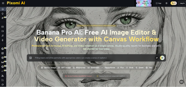
For this exploration stage, Nano Banana Pro offers an image-generation option within Pixomi’s broader creative platform. Designers can describe a background or work from a reference image, then inspect the generated composition before placing typography in separate design software. Check whether the requested empty space actually exists, whether important subjects remain unobstructed, and whether the colors suit the intended message.
Generate alternative compositions by changing one variable at a time. Moving the subject from the center to the right, for example, provides a meaningful layout comparison. Changing the lighting, illustration style, and composition simultaneously makes it harder to identify which adjustment improved readability.
Match Typeface Choices to the Visual Mood
Once the background provides adequate space, select typography that communicates the message without competing with the illustration. Typeface personality matters, but readability should remain the first consideration.
A condensed sans-serif can accommodate a long headline within limited horizontal space. A sturdy geometric sans-serif may suit contemporary promotional graphics, while a serif with distinctive letterforms can establish an editorial or traditional tone. Decorative display fonts work better for brief headlines than for detailed event information.
For most posters, begin with two complementary typographic roles: a display face for the headline and a readable face for supporting information. Avoid introducing additional font families unless they perform a clear function. Differences in size, weight, and spacing can establish hierarchy without increasing stylistic complexity.
Test the actual headline rather than relying on a font’s sample alphabet. Words with repeated narrow letters, unusual punctuation, or long uppercase sequences may expose spacing problems that are not obvious in a generic preview.
Fix Readability Problems Before Exporting
Even a carefully selected background may require adjustments once typography is placed over it. Review the complete composition rather than evaluating individual elements in isolation.
If letters disappear against the image, first try relocating the text to a calmer area. When repositioning is impossible, introduce a subtle gradient, reduce background brightness locally, or place a restrained translucent shape behind the copy. Heavy outlines and shadows should be reserved for situations where simpler adjustments cannot provide sufficient separation.
Check the poster at its intended viewing size. A design that looks balanced on a large monitor may become difficult to read as a mobile thumbnail. Pay particular attention to thin letter strokes, secondary text, and closely spaced lines.
Also verify practical production details. Confirm that the chosen fonts permit the intended use, retain editable text in the working file, and check image resolution against final output dimensions. For print projects, review bleed, margins, and color settings according to the printer’s specifications.
Finally, ask someone unfamiliar with the design to identify its main message after a brief glance. If they notice the illustration but cannot identify the headline, the visual hierarchy needs another adjustment.
Build a Repeatable Typography-First Workflow
A dependable poster process begins with content hierarchy, reserves space for typography, and only then develops the supporting imagery. Background selection, font pairing, and contrast adjustments should work together rather than become separate decorative decisions.
For the next project, prepare the headline and supporting copy first, sketch two possible layouts, and test a small selection of backgrounds against both. Keep the text editable and review the composition at realistic viewing sizes before exporting.
The finished poster should reward attention without demanding unnecessary effort. When typography remains clear and the imagery reinforces the message, the design can be both visually distinctive and immediately understandable.