
How to Make AI Video Templates Look On-Brand: A Designer’s Workflow
A small candle brand needs three clips this week: one for a new autumn scent, one restock announcement, and one for the holiday gift set. Nobody on the team edits video full-time, and nobody has a spare afternoon to build each clip from an empty timeline.
So they open a template, like most small teams do now that short-form video is part of every launch, restock, and promotion. The template is rarely the problem. The problem shows up when the finished clip could belong to any shop selling anything.
AI video templates are a sensible place to start. Making them look like your brand takes a handful of deliberate decisions, and most of those decisions are about type.
Spot What Makes Template Videos Look Generic
It’s usually not the transitions or the motion. It’s what the team left untouched.
The default font is the most common giveaway. A template’s title face was picked to look good in a preview, not to match your packaging. If viewers have already seen that headline style on other accounts, your video feels borrowed.
Color comes next. A neon accent bar that looked lively in the demo sits awkwardly beside a muted kraft-paper label.
Then there’s hierarchy. Product name, price, caption, and call to action often arrive at similar sizes and weights, so the eye has nowhere obvious to land.
And rhythm. Plenty of template videos cut to the template’s music rather than to what the product needs. A candle gains nothing from half a second on screen.
Choose a Video Template That Fits the Job
Pick the structure before you customize anything. A product showcase video needs room for close-ups and a clear name card. A travel template is built around wide shots and movement. A TVC-style template assumes a short ad arc with a defined ending. Pour your footage into the wrong structure and you’ll spend more time fixing it than the template saved you.
Check where the text sits. On vertical platforms, interface elements cover the bottom of the frame and a strip down the right side. A template that places its headline low can leave your product name behind a like button. Good video templates for social media keep key text in the upper and middle parts of the frame.
Look at the media slots, too. If a template expects eight lifestyle shots and you have three product photos, you’ll be stretching footage instead of designing.
Start From NemoVideo’s Template Gallery
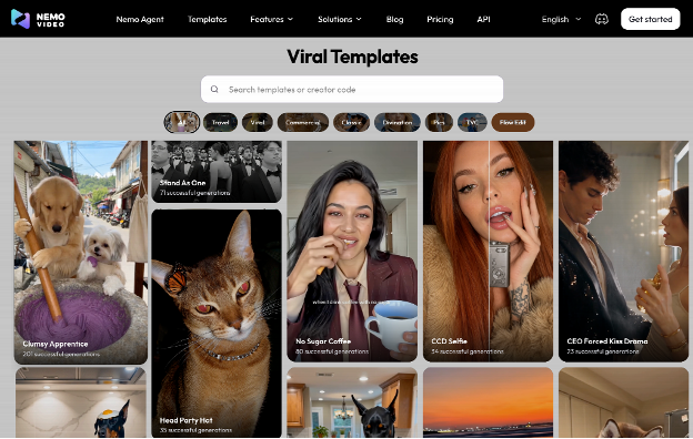
NemoVideo’s gallery offers ready-to-use AI video templates grouped by scenario, including Viral, Commercial, Travel, and TVC. The site presents them as reusable creative workflows and visual styles rather than fixed finished videos. That distinction suits the approach here: you borrow a structure and a pace, then replace everything that belongs to the brand.
Browsing the gallery, you’ll find names like Scan Reveal, No Sugar Coffee, Mischievous Pet, and Meme Duo Dance, which gives a fair sense of the range, from product moments to trend-driven formats.
For the candle brand, the Commercial category is the obvious place to look for the gift-set clip, since those templates are built around presenting a product, and something like Scan Reveal is worth previewing for that job. The restock announcement could start from one of the viral video templates, where the opening hook matters more than detailed product shots. That gives one brand two structures, with a single visual system laid over both.
Make AI Video Templates Yours: A Step-by-Step Workflow
- Swap in your own material first. Replace the sample footage with your product shots before you touch fonts or color, because those choices depend on what’s actually on screen. A warm amber candle against cream linen changes which accent color reads well.
- Ask the agent for brand changes. Nemo Agent works through chat, so you can request adjustments in plain language: “Change the title font to our brand font,” “Use our dark olive for all headline text,” “Slow down the product close-ups.” Make one request at a time and check the result. You’ll see exactly what changed.
- Add captions that match the type system. Smart Caption generates captions in one click and offers a library of styles. Pick one whose letterforms sit comfortably beside your title font (rounded with rounded, geometric with geometric), not the loudest style on offer.
- Add voiceover and music. SmartAudio can add a voiceover and background music. Do this after the captions are timed, so you can hear whether the cuts land with the beat or against it.
- Export a version for each platform. A 9:16 cut for TikTok, Reels, and Shorts, 1:1 for feed posts, and 16:9 for YouTube or your product page. Recheck the text in every version. A headline that sits safely in a vertical frame can get cropped in a square one.
Set Typography Rules That Keep Template Videos Consistent
This is where brand consistency in video is won or lost. If you only have time to get one thing right, make it the type. A few rules do most of the work.
Use two typefaces at most. One display face for titles, one workhorse for captions and prices. Often a single family is enough. Rubik, for example, runs from Light to Black with matching italics, so one family can cover the headline, the price, and the captions.
Before any font goes into a template, make sure its license covers commercial video. A typeface marked “free for personal use” can’t appear in an ad. FontsArena’s guide to font licenses explains what OFL, Apache, and the other common licenses allow. If your brand font was licensed for print or web, confirm that video is included as well.
Build contrast with weight, not just size. Pair a Bold or Black headline with Regular captions. Set every line in Medium and the hierarchy flattens, even when the sizes differ.
Set a minimum size, then test it on a phone. Around 40px on a 1080×1920 frame is a reasonable floor for captions and prices. Watch the export on an actual phone at arm’s length. Anything you squint at should get bigger or get cut.
Choose one legibility treatment. A thin outline or a soft, low-opacity shadow keeps text readable over moving footage. Heavy outlines thicken letterforms and make a carefully chosen typeface look like a default caption. Pick one treatment and use it everywhere.
Lock the system across the series. Same title position, same letter case, same color for prices, same caption style. Write it on a single page and keep it next to your brand guidelines. Good short-form video design means viewers recognize your series before they’ve read a word.
Three clips, one type system: the autumn scent, the restock, the gift set — each one recognizable in the first second. If you want to see how a starting point behaves, preview NemoVideo’s template gallery and picture your own font sitting on top.