
Beyond the Box: How Typography and Visual Design Make Gift Packaging More Memorable
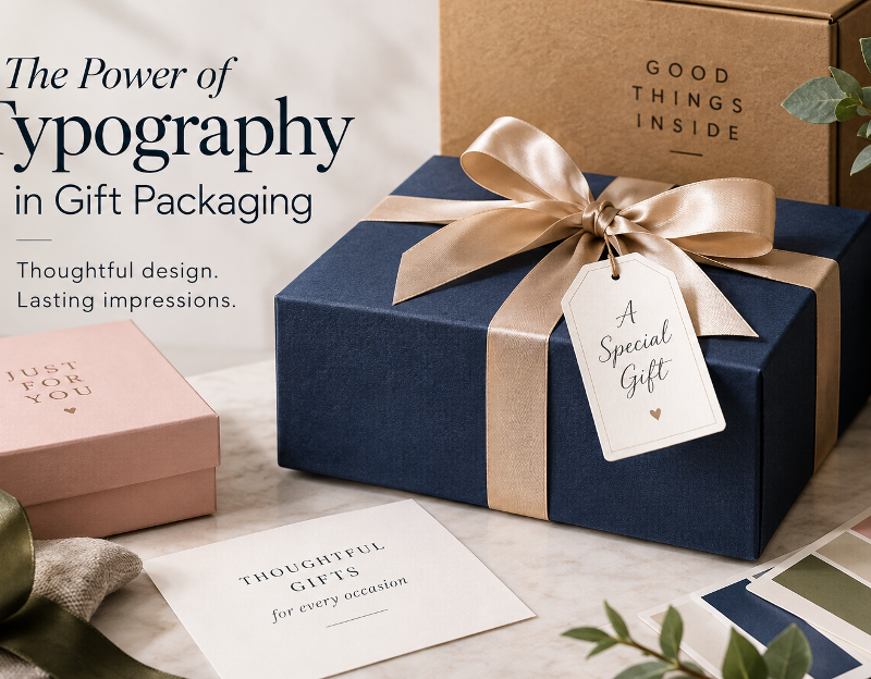
A gift often creates its first impression before the recipient even opens it. The colors, lettering, textures, and arrangement of a package can communicate thoughtfulness, celebration, elegance, or simplicity in just a few seconds. Although the gift itself remains the main attraction, the design surrounding it helps establish the mood and build anticipation.
Typography plays a particularly important role in this experience. A refined serif font can make a presentation feel timeless, while a clean sans-serif can communicate a contemporary, understated style. A handwritten typeface may suggest a personal touch, making it suitable for birthdays, anniversaries, and other meaningful occasions.
For designers, understanding the relationship between typography and gift packaging offers an opportunity to turn ordinary boxes into memorable visual experiences. The same principles apply to greeting cards, product labels, ribbons, gift tags, and even the digital pages where customers discover presents. With thoughtful choices, designers can create packaging that looks attractive while remaining practical, readable, and consistent.
Why Typography Matters in Gift Packaging
Typography is more than a way to display words. It helps establish a visual identity, communicate emotion, and guide attention. On gift packaging, where space is often limited, every design element needs a clear purpose.
Creating an Emotional First Impression
Different typefaces can suggest different moods. Traditional serif fonts often evoke heritage and sophistication, while rounded sans-serif styles can feel friendly and approachable. Script fonts may introduce a sense of intimacy, particularly when used for short messages such as “With Love” or “Congratulations.”
These associations are not universal rules. Cultural context, color, material, and the surrounding design all influence how a typeface is perceived. Nevertheless, selecting a font that supports the intended occasion can make the entire presentation feel more coherent.
Consider three examples:
- A wedding gift: Elegant serif lettering, restrained colors, and generous spacing can create a formal, romantic appearance, much like the styling you see on wedding gift baskets.
- A birthday present: Bold display lettering and brighter colors can communicate excitement and celebration, which suits a birthday wine basket from DC Wine & Spirits given as a festive surprise.
- A corporate gift: Clear typography, a limited color palette, and consistent branding can convey professionalism without looking impersonal.
The goal is to create a visual impression that suits both the recipient and the occasion.
Establishing a Clear Visual Hierarchy
A package may contain several pieces of information, including a brand name, product description, occasion, recipient’s name, and personal message. If every element uses the same size and weight, the design can become difficult to scan.
Visual hierarchy solves this problem by giving each element a different level of importance.
A practical arrangement might include:
- Primary element: The gift name, brand mark, or main message.
- Secondary element: The occasion or collection name.
- Supporting details: A short greeting, product information, or sender’s name.
Designers can establish this hierarchy through font size, weight, spacing, alignment, and contrast. Decorative typefaces are often most effective in short headings, while simpler fonts make supporting text easier to read.
Choosing the Right Font for Different Gift Styles
There is no single typeface that works for every gift. The most suitable choice depends on the audience, the occasion, the packaging material, and the intended personality of the design.
Serif Fonts for Classic Elegance
Serif fonts feature small finishing strokes at the ends of many letterforms. Their visual character can suggest tradition, refinement, and established craftsmanship.
They work particularly well for formal celebrations, premium gift boxes, anniversary packaging, and products with a heritage-inspired identity. A restrained serif paired with a neutral background can create a sophisticated result without requiring elaborate graphics.
However, very thin strokes may become difficult to reproduce on textured paper or at small sizes. Designers should test the selected typeface in its final print size rather than relying entirely on an enlarged screen preview.
Sans-Serif Fonts for Modern Simplicity
Sans-serif typefaces omit the finishing strokes found in serif designs. Their clean appearance makes them useful for contemporary packaging, minimalist gift sets, and corporate presentations.
Fonts such as Montserrat, Lato, and Open Sans offer different personalities within the broader sans-serif category. Montserrat can provide a strong geometric presence, while Lato and Open Sans are versatile choices for supporting information and readable text.
A simple sans-serif can also balance a more expressive display font. This combination allows a package to feel distinctive without making every line compete for attention.
Script Fonts for Personal Messages
Script fonts imitate aspects of handwriting and can bring warmth to gift tags, greeting cards, and personalized packaging. They are especially useful when a short message should feel intimate rather than formal.
The main limitation is readability. Elaborate letter connections and decorative flourishes can make longer phrases difficult to decipher, particularly when printed at a small size.
For a balanced result, use a script font for the recipient’s name or a brief greeting, then pair it with a clear serif or sans-serif for the remaining text.
Display Fonts for Seasonal Collections
Display typefaces are designed to attract attention. Their distinctive shapes can support holiday packaging, limited-edition collections, and playful celebration themes.
They should generally be used selectively. A bold display font may work beautifully on the front of a box but become tiring when repeated across every label, insert, and information panel.
Before choosing a typeface, consider whether the packaging needs to remain relevant beyond one season. A versatile design system can accommodate seasonal colors and small graphic changes without requiring a complete redesign.
How Packaging Materials Influence Typography
A font never exists in isolation. The material beneath it changes its appearance, clarity, and perceived quality.
Match Letterforms to the Surface
Different materials create different design opportunities:
- Matte paper: Supports restrained typography and subtle, low-gloss finishes.
- Textured or kraft paper: Works well with sturdy letterforms that remain visible against an uneven surface.
- Rigid gift boxes: Can accommodate carefully positioned typography, embossing, or foil accents.
- Glossy surfaces: May produce strong visual contrast, although reflections can affect readability.
- Fabric ribbons and tags: Benefit from short messages and letterforms that remain recognizable at small sizes.
The production method matters, too. Fine strokes may disappear during printing, while intricate lettering can lose detail when embossed or foil-stamped. Requesting a physical proof is a useful way to identify these problems before producing a large batch.
Use White Space Intentionally
White space refers to the unoccupied areas around text and other design elements. It does not need to be white; it simply provides visual breathing room.
On gift packaging, generous margins can make a design feel calm and considered. Crowding a logo, message, and decorative elements together can have the opposite effect, making even expensive materials appear less refined.
A simple design with well-spaced lettering often communicates more effectively than one filled with unnecessary decoration. White space also helps direct attention toward the most meaningful part of the package.
Building a Cohesive Gift Presentation
Good typography should work alongside the other elements of a package. Colors, illustrations, materials, and finishing details need to support the same visual direction.
Limit the Number of Typefaces
Using two complementary typefaces is a practical starting point for most gift designs. One can provide personality for headings, while the other handles supporting information.
For example, a classic serif paired with a clean sans-serif can balance elegance and readability. A handwritten accent can be introduced when the occasion genuinely calls for it, but adding more fonts simply for variety can make the package feel inconsistent.
Designers should also establish a repeatable system for font sizes, weights, and spacing. This becomes especially important when creating several products within one collection.
Coordinate Color and Typography
Color influences how people perceive type. Dark lettering against a light background generally provides strong readability, while metallic accents can add a celebratory detail when used carefully.
A few combinations worth exploring include:
- Navy with ivory for a traditional, composed appearance.
- Forest green with cream for a natural, understated style.
- Black with muted gold for a formal presentation.
- Soft pink with warm gray for a gentle, contemporary look.
These are starting points rather than fixed formulas. Contrast, accessibility, and the recipient’s preferences should guide the final decision.
Personalize Without Overcomplicating
Personalized gifts can feel more relevant to their recipients. A name, short message, meaningful date, or custom gift tag may be enough to create that connection.
The design should give these details room to stand out. If every surface contains a message, the personal element may lose its impact. A restrained approach usually makes the customization easier to notice and appreciate.
Applying Design Principles to Gift Selection
Packaging design is also useful for understanding how people choose gifts. When someone browses an online catalog, product photography, typography, colors, and layout help communicate the style of a gift before the package arrives.
For example, someone looking for a present for a colleague may prefer an understated presentation, while a close friend might appreciate something more playful or personalized. The design should make the product’s intended mood clear without relying on exaggerated claims.
When planning a special occasion, shoppers can order wine gift baskets online from DC Wine & Spirits, with options to suit different recipients and celebrations. A coordinated arrangement of products, packaging, and a personal note can help make a gift feel considered. The most appropriate choice depends on the occasion, the recipient’s preferences, delivery requirements, and any applicable age restrictions.
For designers, this is a reminder that visual presentation is part of a broader customer experience. Product images should show important details clearly, descriptive text should remain readable on mobile devices, and the design should communicate what the customer can reasonably expect.
A Practical Checklist for Designers
Before approving a gift package, review the following points:
- Does the typography match the occasion and intended audience?
- Can the main message be understood at a glance?
- Are the supporting details readable at their actual printed size?
- Do the typefaces complement the colors and packaging materials?
- Is there enough space around the logo and message?
- Have the fonts been tested in print as well as on screen?
- Are the necessary commercial font licenses in place?
- Does the design remain consistent across labels, tags, inserts, and product images?
This final review helps balance visual appeal with real-world usability.
Frequently Asked Questions
What is the best font for gift packaging?
There is no universally best font. Serif typefaces suit many classic designs, sans-serif fonts work well for modern presentations, and script fonts can add a personal touch. The right choice depends on the message, recipient, materials, and print size.
How many fonts should a gift package use?
Two complementary typefaces are usually enough. A third accent font may work for a specific purpose, but every additional typeface should have a clear role.
Are script fonts suitable for professional gifts?
Yes. Script fonts can add warmth to professional gifts when used for short greetings or names. Pairing them with a readable font for essential information helps maintain a polished appearance.
Why should designers test fonts before printing?
Fonts can look different when reproduced on textured paper, fabric, or other physical materials. Print tests reveal issues with thin strokes, small text, contrast, and spacing before full production.
Does packaging design matter for online gift shopping?
Yes. Clear product photography, readable descriptions, and consistent visual styling help customers understand a gift’s presentation before purchasing. The digital experience should accurately represent the physical product.
Conclusion
Thoughtful gift packaging brings typography, materials, color, and emotion together. A carefully chosen font can make a message feel elegant, friendly, contemporary, or personal, while a clear visual hierarchy ensures that the message remains easy to understand.
The strongest designs are not necessarily the most elaborate. They are the ones in which every element has a purpose, from the typeface on the front of the box to the smallest detail on a gift tag. By testing fonts at realistic sizes, respecting material limitations, maintaining consistent styling, and leaving room for important messages, designers can create presentations that feel both beautiful and functional.
Ultimately, good typography helps transform packaging from a simple container into a meaningful part of the gifting experience. When the visual details work together, the presentation feels intentional before the gift is even opened.