
When Specimens Move: Image-to-Video for Type Cards and Brand Stills
A finished type specimen already implies a reading order. Contrast pulls the eye down a hierarchy; tracking opens or closes a line; one accent color tells you where to look next. The newer production question is narrower: how much of that card should actually move when the deliverable is a five-second reel—and how do you keep the licensed face intact when a model would happily invent new terminals?
FontsArena readers already have strong pieces on kinetic type and type-poster motion, plus institutional Seedance museum teasers. This article does not retell those. It centers one production rule: AI may move light and camera around the message; exact spelling, spacing, and the licensed face stay a separate typeset layer.
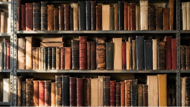
The archive shelf above is the mood for that rule: treat the still as art you already stand behind, then ask only for camera and light—not for a new alphabet.
Why image-to-video fits designers better than blank prompts
Text-to-video invents a scene when you have none. Brand and foundry work usually starts from art you already own: a specimen PNG, a packaging flat, a moodboard frame, a photoshoot still with empty negative space reserved for a headline. Image-to-video is built for that case. The composition and palette stay rooted in the reference; the prompt directs motion and camera instead of redrawing the identity.
Tools that treat the still as an anchor—including MixVio—are closer to directing a short take than to “generating a poster.” You describe what should move (“slow push-in; window light drifts across paper; no new lettering”) and what must not. Formats such as 9:16, 16:9, and 1:1 can be set before the run so the loop matches the channel instead of forcing a crop that clips a descender.
A designer’s split workflow
- Finish the static design first. Export a high-resolution still with sturdy weights (Regular or Medium over hairlines) and generous margins.
- Decide the motion’s job. Camera orbit around a type card, paper shadow crossing a tabletop, fabric on a merch mockup—one modest action beats five competing ones.
- Generate background or ambient motion from an owned photo when the headline will be composited later. Prefer prompts that ask for no readable lettering in the generated plate.
- Typeset the real words in your editor. Tracking, line breaks, and optical size come from the original layout and the font’s EULA, not from a model’s guess.
- Preview on a phone. Thin strokes and cramped date lines fail at social size even when they look fine on a desktop canvas.
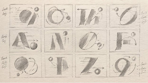
Storyboard the motion before you generate: one modest camera job per cell. Letter studies stay abstract so the model is not asked to invent a real face.
This split matches how kinetic-type tutorials already advise designers to protect counters and apertures: motion blur belongs in the environment, not inside the bowls of /a/, /e/, or /g/. Plan the take on paper (or a quick grid like the one above), then animate only what that plan allows.
Where multi-reference packs help
When a brand pack needs the same product, person, and room held together, a single start frame may not be enough. Reference-to-video routes accept several owned images (and, on some models, short video or audio cues) so the new scene tries to keep those references recognizable. Use that when consistency across a teaser matters. Still review logos and fine type—identity can drift—and composite critical lettering after the fact.
Tools worth comparing, not worshipping
Design teams rarely standardize on one engine:
- Adobe Firefly sits naturally beside Photoshop and Illustrator workflows.
- Runway pairs generation with editing for teams that live on a timeline.
- Multi-model workspaces let you run one still across several video models. MixVio’s image-to-video tool, for example, can compare routes such as Seedance, Kling, Veo, and MiniMax on the same owned image, shows the credit quote before each submission, and keeps uploads private to the workspace. Failed runs release reserved credits, which makes iteration less painful when you are hunting for a single usable five-second plate.
Whatever you pick, read commercial terms before a client deliverable. Paid plans on several platforms (MixVio among them) are where commercial use of outputs typically sits; free-plan exports are often evaluation-only.
Licensing belongs in the brief, not the caption afterthought
Confirm that the font EULA covers motion graphics or social embedding before the reel ships. If the face is a free alternative listed on a catalog, keep the foundry credit in the caption when discovery matters to your audience. Motion should not become a way to obscure where the letters came from.
Judgment calls that stay with the designer
Not every still wants motion. A specimen meant to prove micro-detail may be clearer as a static crop. Archival or culturally sensitive material needs the same clearance you would seek for any other promotional use. And a model that “improves” a logo is usually vandalizing it.
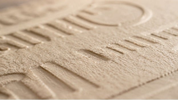
Detail check before you ship: emboss, paper tooth, and stroke weight should survive the loop. Composite exact lettering in your editor; do not trust a model to invent terminals.
Treat AI motion as a lighting and camera assistant for art you already stand behind. If the loop makes the hierarchy clearer and the type still looks like the type you chose, keep it. If the letters only look right when you squint, regenerate the plate—or leave the card still.
Closing frame
End social teasers on a readable still card whenever you can: full name of the face or product, weight list, and a hold long enough to scan. Motion earns the click; typography earns the trust. Image-to-video is most valuable when it respects that order.