
Clearview vs Highway Gothic: Which Road Sign Font Helps You React Faster in California
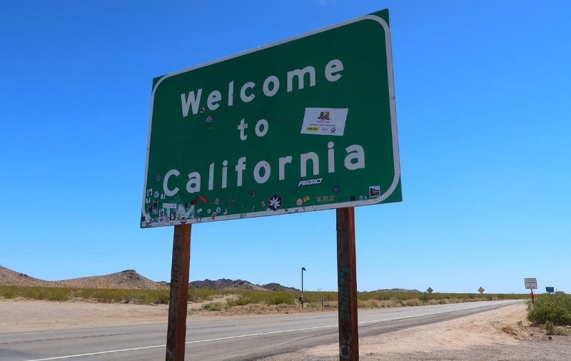
If you’re like most people, you probably pass a ton of road signs every single day—usually without giving them much thought. But here’s a thing: the font on those signs can actually shave off precious fractions of a second from your reaction time. Clearview’s bigger counters and those taller lowercase letters? They generally make words pop out at a distance, so you’re more likely to spot and act on important directions a bit faster than with Highway Gothic, at least in a lot of California driving situations.
Let’s dig into how these two fonts stack up when it comes to your reaction time on freeways and city streets. We’ll also touch on the weird history and policy battles that shaped how they’re used, and consider real-world stuff like how reflective a sign is or how aging eyes deal with glare. And if you ever find yourself dealing with the aftermath of a crash because you missed a sign, well, getting legal advice could help sort things out.
Comparing Clearview and Highway Gothic for Reaction Time
Clearview bumps up the lowercase x-height and opens up the counter spaces, which helps cut down on that annoying glare (halation) and generally makes words easier to read when you’re zipping by. Highway Gothic, on the other hand, sticks with narrower letters and tighter spacing; it’s still the go-to standard for the FHWA when it comes to traffic signs.
Key Design Differences Affecting Readability
Clearview’s got a noticeably bigger x-height and wider counter spaces in letters like a, e, and o. That extra white space inside the letters? It really helps keep reflective glare from turning the whole thing into a blurry mess, especially on those ultra-bright, retroreflective signs.
Highway Gothic (the FHWA Standard Alphabets for Traffic-Control Devices) uses several widths (A–F) and keeps things pretty tight.
But those tighter strokes and smaller counters can start to blur together under headlights or when you’re moving fast. Not ideal.
Letter spacing and the way the ends of strokes are shaped are different, too. Clearview spaces the letters out a bit more and softens the terminals, which helps with quick recognition.
Highway Gothic’s more condensed versions can cram more info onto a sign, but you might need an extra split-second to actually read it all.
Scientific Findings on Driver Response and Legibility
Researchers have run all sorts of legibility and reaction-time tests on both fonts, using positive and negative contrast and different background colors.
Most of the time, Clearview comes out ahead, with drivers able to pick out letters in less time, especially in tricky lighting.
Older drivers seem to get the biggest boost from Clearview’s larger x-height and open counters—it just makes the letters easier to tell apart, so they read a bit faster.
That said, some later studies have poked holes in the early research, which led the FHWA to rethink its approvals for a while, though they eventually brought back optional use in certain cases.
Honestly, the reaction time improvements aren’t huge—usually just fractions of a second—but on the highway, even a small edge can matter for stopping distance.
It’s worth noting that contrast, sign size, and where the sign is placed often have as much (or more) impact on how fast you react as the font itself.
California Road Sign Usage and Standard Practices
California sticks to the Manual on Uniform Traffic Control Devices, but the state still makes its own calls about when and how to swap out signs or pick a font.
A lot of signs around here still use Highway Gothic, partly because that’s what’s always been used, and the FHWA has backed it for ages.
Some agencies in California have switched to Clearview for new or replacement signs, especially in areas with more older drivers or where glare from retroreflective materials is a problem.
Usually, they’ll make the change during regular sign replacement cycles—nobody’s ripping out every sign just to swap fonts.
Traffic engineers tend to look at sign size, mounting height, and contrast first, then worry about the font.
The state’s main goal is sticking to the traffic-control device standards, but they do allow for Clearview in places where the data or local needs make it the better pick.
Font Development, Policy, and Accessibility Impacts
Let’s take a quick look at how highway sign lettering has changed over the years, how federal rules shaped what states do, and which designers helped make road signs easier for everyone to read—especially when you’re flying by at 70 mph.
History and Evolution of U.S. Highway Fonts
Back after WWII, traffic manuals started standardizing a set of sans-serif alphabets to keep highway signs consistent as driving speeds ramped up. The FHWA Standard Alphabets—what most folks call Highway Gothic—came in a bunch of widths (A–F), so agencies could pick what worked for different sign sizes and word counts.
As reflective sign materials got brighter and the average driver got older, researchers and designers started rethinking letter shapes to cut down on glare and help with word recognition for aging eyes. That’s where Clearview comes in: developed in the 1990s, it has those bigger counters and taller lowercase letters to keep things readable under harsh, reflective lighting.
States didn’t all jump on board at the same time. Some started swapping in Clearview during routine sign updates, while others stuck with Highway Gothic—maybe because of cost, habit, or just not being convinced by the research.
FHWA’s Role and Regulatory Changes
The Federal Highway Administration has always set the technical rules for traffic sign lettering and had the final say on approving new fonts. The whole saga of Clearview’s interim acceptance and later pullback shows just how much federal policy can swing when studies don’t all agree.
In 2004, the FHWA gave the green light for states to use Clearview on guide signs, but only when replacing old signs—not for a total overhaul. Then, in 2016, they pulled back that approval, wanting more solid research. Later, they brought back conditional approval, so now states can choose Clearview in certain situations if they follow the design rules.
All these policy shifts have made life complicated for transportation agencies, since swapping out every sign can get really expensive and takes a ton of planning. Municipal budgets and maintenance schedules definitely feel the impact when the rules change.
Designers and Innovations in Environmental Graphic Design
Don Meeker and James Montalbano were at the forefront of design projects that connected the nitty-gritty of letterform anatomy to how drivers actually see and process road signs. Meeker did a lot of hands-on work out in Oregon, while Montalbano’s background in type design zeroed in on making words easier to spot and understand from a distance—think about barreling down a highway and trying to read signs in a split second.
They didn’t just tweak typefaces for fun; their strategy involved things like opening up the counters, bumping up the x-height, and fiddling with how the strokes ended. Then they tested these changes in the real world, running legibility trials with older drivers and under different lighting conditions—because, honestly, who hasn’t struggled with a sign at dusk? Environmental graphic design firms took those results and hammered out guidelines for stuff like contrast, spacing, and letter widths, all to make sure messages don’t blur into the background when you’re moving fast.
After that, agencies and manufacturers got in on the action, experimenting with materials, reflectivity, and even how the signs are mounted—always alongside the type tweaks—to cut down on glare and make sure drivers can catch important info in time. The back-and-forth between designers and transportation officials turned what could have been just academic theory into real, practical standards. Now, those ideas are baked into sign programs in states all over the country.