Creating Better Baseball Content: Why Fonts Come First
When people think about creating great baseball content, they usually jump straight to highlights, player photos, or video clips. But one of the most overlooked elements, the one that quietly shapes how everything else is perceived, is typography.
Fonts set the tone before a fan even processes the image or presses play. If you get them right, everything else becomes more impactful. If you get them wrong, even great content can feel off.
Fonts Set the Identity Instantly
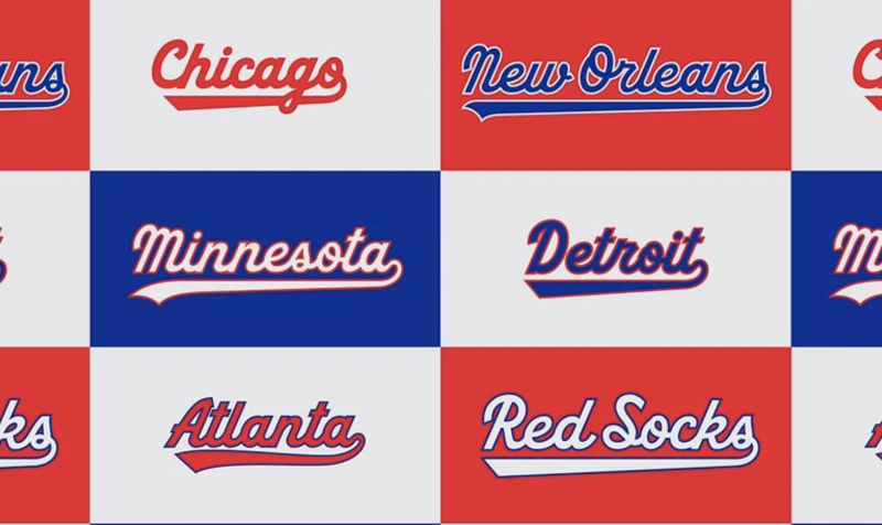
Baseball is a sport built on tradition, nostalgia, and recognizable aesthetics. Fonts play a huge role in reinforcing that identity.
Think about the difference between a clean, modern sans-serif and a bold, slab-style font that feels like it belongs on a scoreboard. One feels tech-driven; the other feels like baseball.
Choosing the right font helps answer key questions instantly:
- Is this content serious or playful?
- Is it analytical or fan-driven?
- Is it modern or rooted in tradition?
Before a user reads a stat or watches a clip, the font has already told them what to expect.
Readability Wins Every Time
Baseball content often includes stats, lineups, scores, and quick-hit updates. If your font isn’t easy to read, especially on mobile, you lose attention immediately.
Clean spacing, strong contrast, and simple letterforms matter more than stylistic flair. A good rule: if someone can’t scan your graphic in two seconds, it’s not working.
This is especially important for:
- Score graphics
- Player stat cards
- Game previews and recaps
Fonts Create Consistency Across Platforms
The best baseball brands, from teams to media pages, are instantly recognizable. That consistency often comes down to typography.
Using the same font system across:
- Instagram posts
- YouTube thumbnails
- Website articles
- Highlight graphics
…creates a cohesive identity. Fans begin to recognize your content before they even see your logo.
Then Comes Video: Movement and Emotion
Once your typography is dialed in, video becomes the next layer.
Short-form clips, highlight reels, and behind-the-scenes footage bring energy and emotion to your content. But even here, fonts still matter, especially in overlays, captions, and thumbnails.
Strong typography in video helps:
- Reinforce branding
- Improve accessibility (captions)
- Increase engagement on silent autoplay
Photography Brings Authenticity
Photos are where baseball content becomes real.
Whether it’s a dramatic in-game MLB photo, a candid dugout shot, or a clean portrait, photography adds authenticity that graphics alone can’t replicate.
The key is pairing strong visuals with the right typography. A powerful photo with weak text overlay feels unfinished. A great font can elevate even a simple image into something shareable.
Storytelling Ties Everything Together
Fonts, video, and photography are tools, but storytelling is what makes content memorable.
Good baseball content doesn’t just show what happened. It frames it:
- The comeback story
- The breakout performance
- The rivalry moment
Typography helps guide that story. Headlines, captions, and stat highlights all rely on font choices to direct attention and emphasize key moments.
Don’t Ignore Layout and Spacing
Even with great fonts, poor layout can ruin everything.
White space, alignment, and hierarchy determine how easily your content is understood. The best designs feel effortless because they guide the viewer naturally from headline to detail to call-to-action.
Last Tips
Creating better baseball content isn’t just about having access to great footage or photos. It starts with the fundamentals, and fonts are at the core of those fundamentals.
They define your identity, improve readability, and bring consistency across every platform you use.
Once that foundation is set, video, photography, and storytelling all become more effective. Skip it, and everything else has to work harder than it should.
In a space as competitive as sports content, small details make a big difference. And more often than not, it starts with the font.