
Designing Typography That Survives Multilingual Localization
A brochure that looks polished in English can become awkward the moment its copy is translated. A short heading expands, a price label wraps, a product name collides with an image, and a carefully balanced page suddenly feels crowded. The translation may be accurate, yet the design no longer communicates with the same confidence.
Typography carries part of the meaning in any visual asset. Size, weight, spacing and placement tell readers what to notice first and how different pieces of information relate. Multilingual localization therefore needs to treat type as part of the content system from the beginning. Designers who prepare flexible layouts can preserve hierarchy across languages and spend far less time repairing each regional version.
Begin with text expansion
English is often compact, especially in buttons, badges and product specifications. German may require longer compound words. French and Spanish can expand a sentence significantly. Chinese and Japanese may use fewer characters while demanding different line-breaking decisions. Arabic introduces a right-to-left reading direction and changes the flow of the entire composition.
A layout built around one exact line length has very little room to adapt. Leave breathing space around headlines, avoid placing essential copy inside narrow decorative shapes, and test the design with longer sample text before it is approved. Flexible text boxes and responsive spacing provide a better foundation than shrinking every translated line until it fits.
The hierarchy should remain recognisable even when the words change. A translated headline may need a smaller size, but it should still feel dominant. Supporting copy should remain clearly secondary, and calls to action need enough contrast and surrounding space to stay visible.
Choose typefaces for the complete language set
A brand typeface may look excellent in Latin characters and offer limited or uneven coverage elsewhere. Missing glyphs trigger font substitution, which can change width, weight, x-height and tone within a single design. The problem becomes particularly obvious in product images and promotional banners where typography is tightly integrated with photography.
Check the supported scripts before a campaign enters production. Review numerals, punctuation, currency symbols and accented characters alongside the alphabet. If the main brand font lacks a required script, select a companion family with compatible proportions and stroke character. A planned pairing looks intentional; an operating system fallback rarely does.
Licensing also deserves attention. Confirm that the font licence permits the intended web, print, app and advertising uses in every market. Keep font files and licence records with the source project so regional teams are not forced to improvise.
Build hierarchy with more than font size
Designers sometimes preserve hierarchy by making the translated headline progressively smaller. That approach can work for a modest length change, but repeated reduction eventually weakens the composition. Weight, color, spacing, alignment and placement can share the job.
A long headline might move onto two deliberate lines while retaining its weight. A label can use a stronger color instead of becoming larger. Supporting details can shift below an image rather than squeezing into a narrow column. These choices preserve readability and keep the localized version connected to the original visual system.
Line height needs its own review. Scripts with taller marks or different vertical proportions may feel cramped when they inherit settings created for English. Optical alignment should be checked rather than assumed, especially around icons, baselines and mixed-script product names.
Treat text inside images as editable content
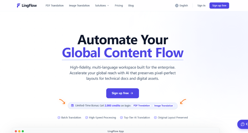
Product images, display ads and social graphics often contain copy baked into the artwork. Rebuilding every regional version by hand turns a small wording change into a design task. An AI localization platform such as LingFlow can support a workflow that moves from image upload and AI translation to online editing and review. For ecommerce teams working through many product graphics or campaign variations, this gives designers a practical first draft while keeping the translated visual available for checking and adjustment.
This can shorten the first pass, particularly when a campaign contains many product graphics. The output still needs a designer’s eye. Review line breaks, letter spacing, brand terminology and the relationship between the new text and the surrounding image. Background reconstruction should also be checked at full size, since gradients and textured surfaces can reveal artifacts that are easy to miss in a thumbnail.
Keep a clean source version whenever possible. Separate text layers, generous text areas and consistent naming make both automated and manual localization easier.
Protect typography in brochures and PDFs
PDF catalogs, lookbooks and product guides create a different challenge. Text may sit inside columns, tables, captions and diagram labels, with every element tied to a fixed page. Extracting the words into a plain translation interface removes the visual context that helps translators and reviewers understand them. Rebuilding the document afterward can take longer than the language work itself.
Lingflow is also designed for visual materials such as PDF product manuals, where translated copy must return to a complex page structure. Its workflow helps teams translate and review the document without rebuilding every page from a blank file, reducing repeated typesetting work during multilingual production.
Preservation does not remove the need for quality control. Inspect tables, captions, page breaks, footnotes and text positioned close to images. Watch for overflow, clipped characters and unexpectedly small type. Technical terms, product names, legal language and calls to action should be reviewed by someone who understands the target market.
A useful review compares source and localized pages side by side. First confirm meaning and terminology, then check hierarchy, alignment, font behavior and visual rhythm. Separating linguistic and design checks makes feedback more precise.
Create a repeatable localization handoff
Multilingual design becomes easier when the handoff contains more than a final PDF or flattened image. Provide editable source files, approved fonts, a terminology list, minimum type sizes and notes explaining which elements may move. Identify copy that must remain unchanged, including model names, trademarks and regulated statements.
File names should show the market, language and status clearly. Keep source, machine-generated draft, reviewed version and final export separate. When a correction affects several assets, record it in the terminology list so the same issue does not return in the next campaign.
Automation can handle detection, translation and much of the initial layout work. Designers retain responsibility for how the message feels on the page. The strongest localized typography respects the reading habits of the new audience while preserving the hierarchy and character that made the original design effective.
Final review checklist
- All required scripts, numerals and symbols render in approved fonts.
- Headlines and calls to action remain prominent without cramped spacing.
- Text expansion has not caused clipping, awkward wrapping or overlap.
- Right-to-left content follows the correct reading order where required.
- Translated text inside images remains editable and visually integrated.[1]
- PDF tables, captions, diagrams and page breaks have been checked.
- Terminology, product names and legal copy have received human review.
- Final exports have been inspected at their real display or print size.
Good multilingual typography grows from flexible source files, appropriate font coverage and a review process that sees language and layout together. When those foundations are in place, localization can move faster without flattening the personality of the design.