
How to Choose the Right Fonts for Flyers and Leaflets
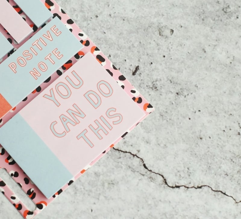
Fonts play an important role in how people notice and read printed marketing materials. Through a nicely crafted flyer or leaflet, it is possible to capture attention, convey information and make the reader act. Nonetheless, good content may become ineffective when the text is hard to read, or the font selections are disjointed.
Flyers and leaflets remain useful tools for businesses in Singapore to promote special offers, events, and services. Selecting the appropriate fonts helps make these materials understandable, appealing, and readable by the target audience.
Understand the Purpose of Your Flyer
Whatever you want your flyer or leaflet to accomplish, decide this before choosing fonts. The message should be backed by the design as opposed to being distracted.
The promotional flyer might require a headline which is bold and easily noticeable. The restaurant leaflet may need some clear descriptions, prices and opening hours. An event flyer should make key details, such as the date, location, and registration instructions, easy to find.
Take your audience into account, as well. Young adult materials can be done in a contemporary visual style, whereas professional services can be more traditional-looking.
After knowing the purpose, select fonts that will fit the message and enable readers to locate the essential information fast.
Explore Different Font Styles
Understanding common font styles can help you make better design choices.
Serif Fonts
Serif fonts contain minor ornamental lines at the terminations of letters. They can be very standard or formal and could be applicable to educational resources, business services and high-end products.
Sans-Serif Fonts
Sans-serif fonts do not have such adorning strokes. Their neat look makes them popular in modern advertisements, retail advertising, business announcements, and information leaflets.
Script Fonts
Script fonts are similar to handwriting or calligraphy. They are able to provide personality to invitations and innovative promotions. Nevertheless, the elaborate scripts can prove hard to use, especially when dealing with long paragraphs or small writing.
Display Fonts
The purpose of display fonts is to appeal through unusual shapes and styles to draw attention. They suit short headings only but can decrease readability when applied to a vast section of text.
Make Readability a Priority
The font that most appeals to the eye does not necessarily mean it would be the best to use when the readers are not able to comprehend the message. Readability must be kept as one of the priorities during the design process.
Select fonts that have well-defined shapes of letters, particularly for phone numbers, prices, dates and instructions. Do not use typefaces that confuse characters that look alike.
The font size is also important. The headlines must emphasize supporting text and body copy should be easy to read at the ultimate printed size. The same text when printed on a computer screen will be readable; however, when printed on paper it may be too small.
In case the design looks too cluttered, rather than decreasing the font size, the copy can be shortened or the information can be rearranged. View the layout in its actual size before acceptance of the final artwork.
Match Fonts to Your Marketing Goals
Your message, audience, and amount of information will help you choose the right font.
In promotional campaigns, a solid headline will be used, which can summarize the primary offer in a short time. Stick to bare details so that readers can get an idea of the promotion at a glance.
In the case of corporate materials, opt to use professional fonts that have even spacing and distinct letterforms. A modulated design is capable of conveying reliability and simplifying business information.
In the case of food, lifestyle, or creative promotions, fonts can create a personality. Nevertheless, the text must be legible in the background, and the visual elements are to be used in short runs.
When preparing artwork for flyer printing, consider how the fonts will look on the finished product, not just on your computer screen.
Pay Attention to Spacing and Alignment
Typography is not just about font choice. Space and alignment will assist readers in moving through information in a natural manner.
Line spacing: Have sufficient space between lines, which makes paragraphs easy to read. Crowded text may seem daunting.
Letter spacing: This should be done with caution, particularly with big headlines. Over-spacing may result in words being hard to identify, but letters that are too thick may appear congested.
Paragraph spacing: Leave spacing between paragraphs. The brief paragraphs assist readers to scan through the material rapidly.
Alignment: Consistently use alignment in the design. Left text is usually a simple one-read, whereas centred text can be applied to brief headings and announcements.
Choose Colours That Improve Contrast
Text should be easy to read with its font colour. An exquisite typeface will not help if the words merge into the background.
Text on a light background is a reliable option for informational content. Light text can also be used on a dark background when the contrast is high.
It is best not to place text on professional photographs that have busy backgrounds unless you change the background to ensure the text is readable. Readability can be enhanced with a solid-colour or plain area panel.
Create hierarchy by use of colour instead of adorning all the lines. As an example, a brand colour can be used as a headline, whereas the primary text is a neutral colour.
Look at the colour mix prior to printing since the final output may not be the same as on the screen. Businesses preparing printed marketing materials can explore CUSTA’s product options and check the artwork requirements before placing an order.
Conclusion
The decision on fonts to use in flyers and leaflets involves a trade-off between style, legibility and purpose. Each of the serif, sans-serif, script and display fonts has a variety of benefits, yet the correct decision depends on what you are saying and to whom.
Keep the font mix simple, build a clarity hierarchy, make appropriate spacing and ensure that contrast is checked. Lastly, but most importantly, see the design at the actual printed size. Considerate typography makes your flyer easier to understand and it will offer readers a more enjoyable experience.