
The Vegas Look Online: Why Gold Letters, Neon Fonts, and Giant Numbers Never Left
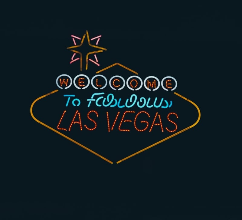
Most digital products have spent the last decade getting quieter. Interfaces went flat, palettes turned pastel, and plenty of brands swapped their logos for a tidy geometric sans. Online game lobbies went the other way. Open almost any of them, and you’ll find shiny gold lettering, glowing outlines, and numbers big enough to read from across the room.
That isn’t a lack of taste. The style comes from a long history of physical signage, and it still solves real design problems on small screens.
It Started With Signs, Not Screens
In the 1940s and 50s, Las Vegas and Reno filled their main roads with neon tubing because a sign had one job: get noticed from a moving car at night. Sign shops bent glass into thick script lettering, starbursts, and arrows, and the brightest sign on the block usually won.
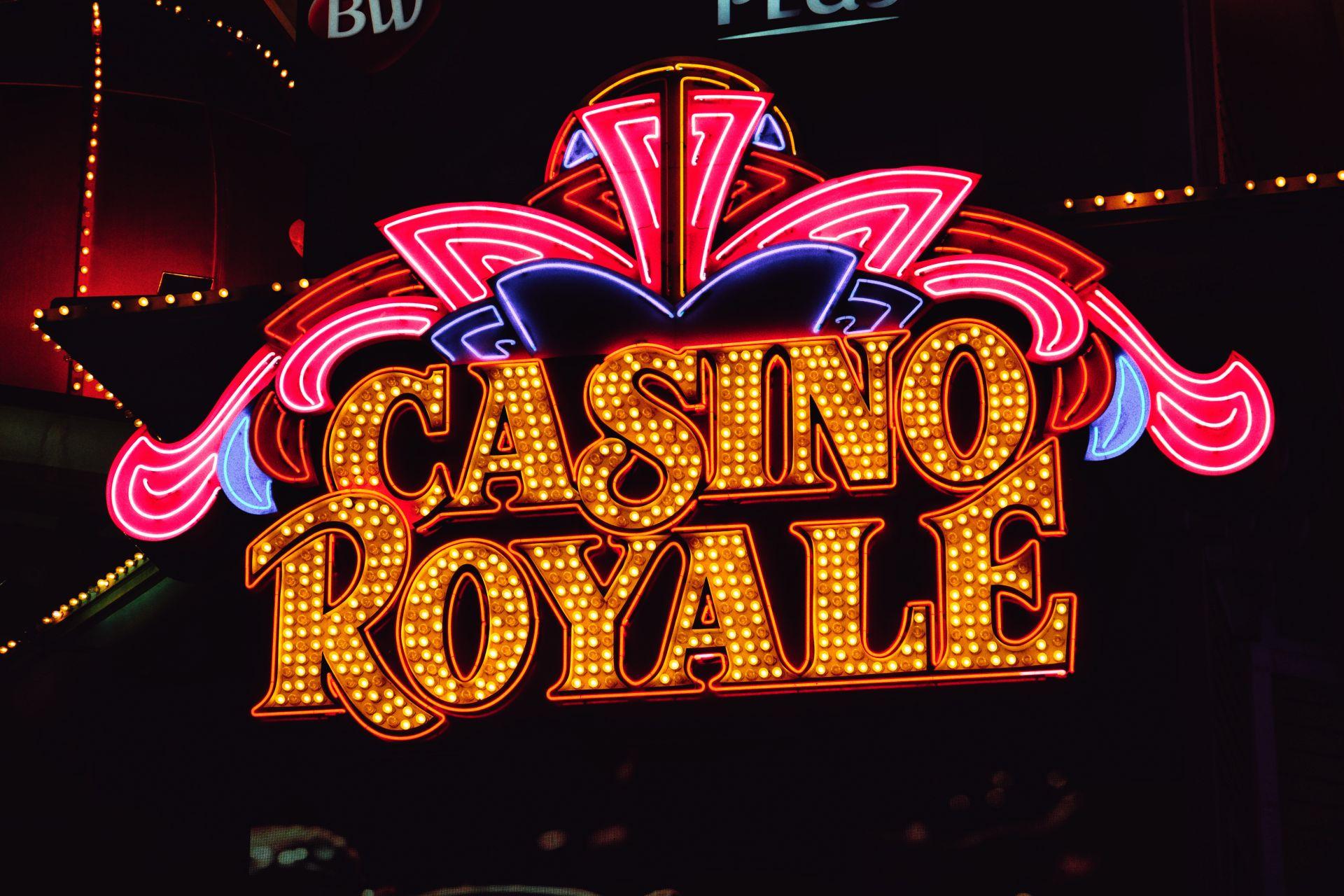
Photo by Ricardo Olvera on Pexels
Many of those originals now sit at the Neon Museum in Las Vegas, in an outdoor “boneyard” of retired signs. Few of the letterforms are actual typefaces. Most were hand-drawn by sign painters, so they have rounded ends, even stroke widths, and generous spacing, all traits the glass tubes needed to bend cleanly and glow without bleeding together.
When gaming moved online, designers borrowed that visual language wholesale. Players already linked it with a night out, so recreating it in pixels was a shortcut to the same feeling.
Why Gold Still Means “Win”
Gold lettering carries meaning before anyone reads the word. Trophies, medals, and coins have trained us to read gold as value and achievement. A “Jackpot” headline in flat gray would feel like a spreadsheet. The same word in a beveled gold gradient feels like a prize.
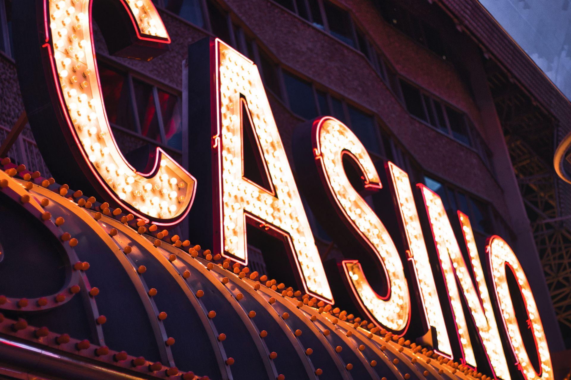
Photo by Chemapro Hd Ecco on Pexels
Typefaces that pair well with gold tend to be heavy, high-contrast serifs or Art Deco display faces, often set in all caps. Thin strokes simply can’t hold a gradient, a highlight, and a drop shadow at once.
The common mistake is applying gold to everything. When every button and banner shines, nothing stands out. Well-designed lobbies keep gold for reward moments, like a win or a bonus, and use plain white or light gray for the rest.
Neon Fonts Are Really About Contrast
Neon-type online is mostly a lighting trick. The font is often a simple monoline face with rounded terminals, and the glow comes from layered shadows in the same hue against a very dark background. The dark canvas matters as much as the glow: it makes saturated pinks, cyans, and purples look brighter than they would on white.
A few practical rules if you’re using neon type yourself:
- Keep it for headlines and short labels. A paragraph in glowing script is tiring to read.
- Check contrast without the glow. The base letter color still needs to stand out on its own. The WCAG contrast guidelines are a sensible baseline.
- Pick a font with open counters. Letters like “a,” “e,” and “g” fill in quickly once a blur is added.
Giant Numbers Do the Selling
In most interfaces, numbers are supporting details. In game lobbies, they’re the hero. Jackpot totals, multipliers, and countdown timers often get bigger type than the game title itself. A large number is easy to grasp at a glance, and since many of these figures change in real time, big type keeps that motion legible on a phone.
This is where font choice gets more careful. Live numbers should use tabular figures, meaning every digit has the same width. Without them, a total jumps sideways each time a 1 turns into an 8. Condensed, industrial sans-serifs handle this well. For a free option with that engineered, signage-like feel, FontsArena’s roundup of the free DIN font and alternatives is a good start, since DIN was originally designed for road signs and technical labels.
Why the Style Survived the Move to Mobile
You might expect such a loud style to fail on a 6-inch screen. In practice, bold display type with strong contrast holds up at small sizes far better than delicate, thin fonts do.
It also does a lot of brand work. Sites that list and compare online casinos show dozens of game thumbnails side by side, and each one needs to be recognizable in a tile the size of a postage stamp. A gold wordmark or a neon number reads instantly at that size, while a subtle logo disappears.
How to Borrow the Look Without Making a Mess
Event posters, bar menus, retro product launches, and YouTube thumbnails can all use a bit of this showmanship. A few habits keep it under control:
- Use one display font, not three. Pair it with a quiet sans for everything else.
- Give each effect a role. Gold for rewards, neon for atmosphere, big numbers for the key figure.
- Design on dark first. These effects were made for night and lose impact on white.
- Test at thumbnail size. If the main word can’t be read at 100 pixels wide, simplify it.
- Preview before you commit. A quick run through a text generator shows how different display fonts handle your actual words.
Final Thoughts
Gold letters, neon glow, and oversized numbers can look like excess, but each one answers a practical problem: being seen from a moving car, signaling a reward instantly, or keeping a live figure readable on a small screen. The online versions kept those reasons and dropped the glass tubes. When the goal is to make a moment feel big, type is still the fastest way to do it.