
Typography Designers Understand Something About Email That Most People Miss
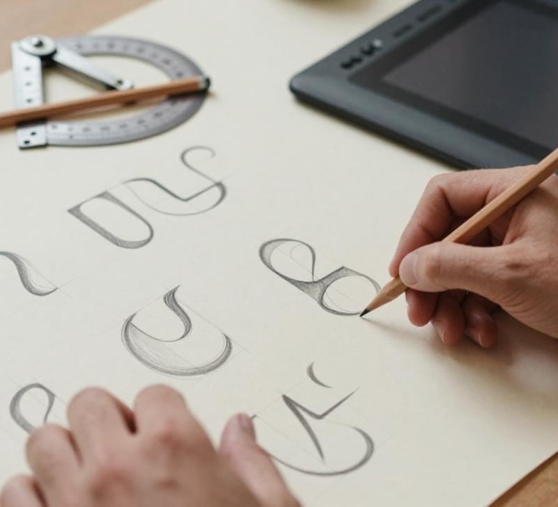
Designers, perhaps more than any other professional group, understand a deceptively simple principle: the medium is never neutral. A typeface is never just letters; it’s tone, era, class, intention. Choosing Garamond over Helvetica over Comic Sans is never an accident; it’s a statement about who’s speaking and who’s being addressed. Nobody in this community would hand a client’s rebrand to a default system font and call the work done.
Which makes it strange how many designers, people professionally devoted to intentional choices, run their studios, client correspondence and licensing negotiations through a free email account that was chosen, essentially, by inertia. The mailbox is the typographer’s most frequently published work: thousands of messages a year, each one arriving in someone else’s inbox wearing your studio’s identity. And for most of the industry, that identity is a commodity template with advertising infrastructure on the back end.
The inbox as unexamined composition
Take the designer’s view of it. A conventional email client renders your message inside chrome you didn’t choose, on infrastructure whose incentives you didn’t examine. It’s the equivalent of delivering a beautifully kerned poster inside a frame someone else sells ads against. Designers notice this kind of thing instinctively in every other medium. Email escaped scrutiny because it predates the professionalisation of interface thinking.
And yet the free email account is, functionally, the studio’s front door. First contact with prospective clients. Contract delivery. Licence terms. Font files in transit, actual intellectual property, sometimes unreleased, sometimes under NDA. Invoices. For freelance typographers and small foundries, the inbox carries the entire commercial lifespan of their work, and its default configuration deserves the same critique any other default would receive in a design review.
What’s underneath the interface
The critique runs deeper than chrome and into economics. Conventional free email is an advertising product. Its revenue derives from knowing users precisely enough to sell their attention, and the inbox, the studio’s complete commercial record, is precisely the raw material that makes the profiling valuable. The Electronic Frontier Foundation’s Surveillance Self-Defense guide documents how metadata alone suffices to reconstruct relationships and behaviour patterns; for a designer, that means the client roster, the negotiation timelines and the project rhythm of the studio are all faintly legible in the exhaust of a conventional mailbox.
A privacy-first free email provider operates on inverted economics: no advertising model, no structural incentive to examine correspondence, and, in the strongest implementations, end-to-end encryption that leaves stored messages unreadable to the provider itself. The free tiers of such services carry transparent limits rather than covert costs, and the honest constraint is precisely what makes the arrangement trustworthy. Designers, of all audiences, should appreciate a business model where the incentives and the stated values actually align.
The typography of the situation
There’s an irony here. Fonts are unusually concerned with security: embedding permissions, licensing restrictions, licence scopes distinguishing desktop from web from app use. Foundries think carefully about who may copy, redistribute or derive from their IP. An entire legal and technical apparatus exists to control the circulation of letterforms.
Yet the letters themselves travel, as attachments, drop links and download URLs, through mailboxes that treat the contents as processable data. Sending an unreleased typeface to a client via a conventional free account routes the studio’s most valuable asset through advertising infrastructure. An encrypted email setup, or at minimum a provider with no economic stake in reading, is the logical extension of licensing discipline: controlling not just the rights to the work but the integrity of the channel it travels through. The font you license carefully shouldn’t ride in an envelope someone else is holding up to the light.
The professional polish layer
Beyond privacy, there’s the presentation argument, and designers respond to it immediately. A custom domain on a serious mail provider signals a studio at a glance. Correspondence from studio@yourdomain.com lands differently than the same portfolio arriving from a consumer address with a string of digits from the mid-2000s. Deliverability improves too: consumer freemail domains carry the accumulated spam reputation of their worst millions of users, while properly authenticated custom domains with SPF, DKIM and DMARC arrive reliably, meaning the proposal, the licence PDF and the invoice actually reach the client rather than the junk folder.
Migration is less dramatic than feared. Importing archives, forwarding from the legacy address during a transition period, and staging the switchover service by service mirrors exactly how designers already rotate tooling, hosts and portfolio platforms throughout a career. Nobody closes the old studio on Friday and opens the new one Monday. And before you move, it’s worth checking on Have I Been Pwned whether the old address has already appeared in a known breach.
The bottom line
Typography as a discipline exists because someone, somewhere, decided that the default wasn’t good enough, that the way words looked deserved deliberate choices. The mailbox carrying those words deserves the same deliberateness. It’s the most-read composition most studios produce, and it’s the one piece of the identity system that still ships as a default. Choose it the way you’d choose a typeface for the studio’s flagship rebrand: knowing exactly what it says, to whom, and what it quietly costs.