What Font Does Twitch Use? Everything You Need to Know Today
When it comes to Twitch, every small detail can make a difference. You want your channel to be perfect, so you certainly need to cover each aspect. And while often overlooked and ignored, the truth is that fonts can and will enhance your visitors’ experience.
Now, what font does Twitch use and how can you make the most out of it? Here’s what you need to know.
What Font Does Twitch Use
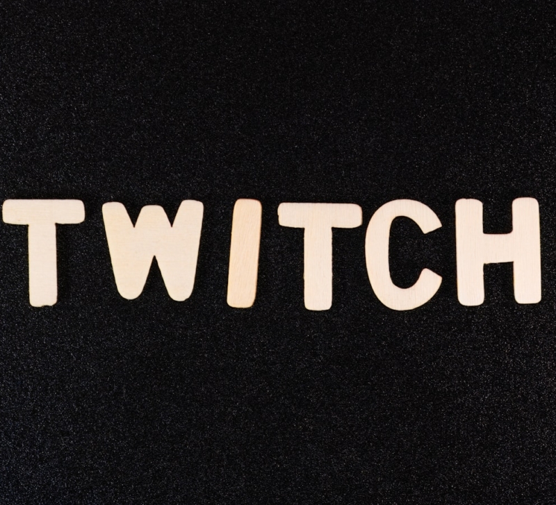
So, what font does Twitch use? Generally speaking, the primary option is Roobert. It’s a sans serif type of font, which you’re probably familiar with from all the menus, let alone the chat room. The font wasn’t the original choice though. In fact, it was introduced in 2019, when Twitch rebranded itself. It was an effort to refresh and modernize the platform’s visual identity.
Changing the font was just part of multiple improvements. Most of them affected the overall design and appearance.
Roobert has a clean appearance and it’s easy to read, hence its popularity. It was created by the Alphabet Agency and while popular, it’s most commonly known for its association with Twitch.
Now, why is the font so important for Twitch?
Keeping Things Clear
Most of your viewers need to be able to read everything at a glance. People have no patience these days, especially over the Internet. Even when you’re after the best chat bot for Twitch, make sure the font is readable and clear.
Whether it comes to classic chat, an announcement or just some captions, a problematic font can make small details get lost. The Twitch font, Roobert, has been praised for its clean and geometric design, which supports good readability in menus and chat.
Your Brand Identity
The identity of your brand is just as important in the process. It covers more aspects, such as your profile and picture. However, the font is just as important. While you can change the classic Roobert, make sure to stick to something that’s still easy to read.
From this point of view, your font is a critical component or your visual brand. It communicates values, style and even personality. Use a strong font that’s slightly different from the rest, but make sure it’s alright to understand and complement Twitch’s overall aesthetic.
Your Engagement
Your stream is obviously the first thing people look for. It’s the thing that draws attention and gets people to follow you. But then, how you present yourself is also important. The font you choose should align with the overall aesthetic profile of your stream.
It’s a small detail, but it matters. You want the font to go hand in hand with the stream, only to come up with a cohesive element. The better you choose it, the more immersive the experience becomes for your viewers.
Not only does it help with the engagement and experience, but it also makes your work more memorable. It helps viewers instantly identify your channel and build a stronger connection with you and your audience.
Become More Accessible
This is another aspect a lot of streamers don’t pay attention to. They pick the right font, they create an immersive experience, and they blend it in perfectly. But then, is the font suitable for everyone who might watch your stream?
Here’s something you’ve never thought about. Contrast and clarity will make your stream and content way more accessible to everyone. There are all sorts of viewers out there, including those with visual impairments or sensitivity issues.
So choosing the fonts with clear and strong contrast against backgrounds helps ensure everyone can easily read your text.
Overlooking this category can leave many potential followers out. And if you think about it, in a world where everyone spends hours a day looking at screens, pretty much everyone has some sort of vision problems.
A Professional Approach
Fonts are often picked to match the stream. If you play an aggressive RPG, for example, you want the font to match it. If you stream a retro game, you want a pixelated font. But then, have you thought about its professional appearance?
Choosing the font requires some strategy. You want your stream to look great with the font, but you also want it to be professional. It may sound challenging, but it’s totally doable. Trial and error might be needed to get the perfect mix. Once you get it right, you’ll be able to set your channel apart.
Must Complement Your Content
Last, but not least, the font must complement your content. That’s why it’s important for these two elements to blend. You don’t want a font that’s too much because it will detract from the content. You don’t want a font that’s too little either, as no one will pay attention to it.
From colors and style to graphics and size, you’ll have to come up with a visual strategy to make everything look perfect. Once again, it may take a while to find the perfect option, but that’s what brings good results.
Bottom line, what font does Twitch use? While focused on Roobert after a style rejuvenation process from 2019, Twitch also allows adjusting fonts for certain parts, whether for your profile or even your chat room. Take advantage of this opportunity and make your work stand out with the right alternative.