
Free Font Heroes Die When The Loop Outruns Download
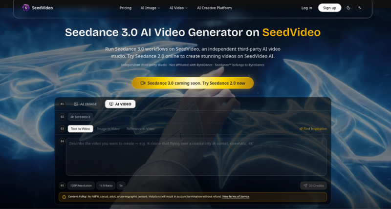
A free-font research page has one job in the first scroll: prove the face is worth the download button. Readers do not arrive for a trailer. They arrive to compare terminals, width, and whether the free alternative still feels like itself under a short move. When the hero loop runs longer than that decision, the page starts selling cinema instead of type. That is the failure mode tools around Seedance 3.0 can expose quickly if you treat the create panel as a web crop studio rather than a mood film desk.
FontsArena-style pages are ads-free and research-led, so the hero cannot hide behind banner clutter. The loop either keeps the specimen word readable behind the headline, or it steals attention and sends the wrong signal. SeedVideo is useful here as a short-draft lane: lock a conservative ratio and duration, give the specimen one job, and only then ask whether motion helped the download case.
What A Free Font Hero Must Prove Fast
Free-font traffic is impatient in a specific way. People open a tab to answer “is this alternative close enough,” not to watch a brand film. The first two seconds have to show the wordmark or sample string large enough that a designer can judge the family. If the camera is still hunting for atmosphere at second four, the download CTA is already competing with fog.
That is different from a foundry launch film. Launch films can earn length. Research heroes cannot. The page already carries comparison notes, license lines, and alternative lists. Motion is a proof strip, not the article. A useful mental model is the old type specimen PDF: big word, clear contrast, minimal theater. If your loop needs a narrator to explain what face is on screen, the crop failed.
Open-startup research desks feel this pressure weekly. Each new free alternative card has to ship without a media team. That constraint is a feature. It forces short tests and honest stills. It also means a soft AI hero can quietly train readers to distrust the whole alternatives index.
Why Cinematic Prompts Bury The Download
The usual bad brief reads like a commercial: volumetric light, slow orbit, city bokeh, “premium type in motion.” Those words push the model to invent set dressing around the letters. The specimen becomes a prop in someone else’s commercial. On an ads-free research page, that looks like spam with better lighting.
Teams then waste an afternoon swapping adjectives while the crop was wrong from the start. The specimen was too small. The ratio was vertical on a horizontal article header. The duration was long enough for a plot. None of that helps a reader decide whether to click download.
Short Draft Studio Beside Planning Pages
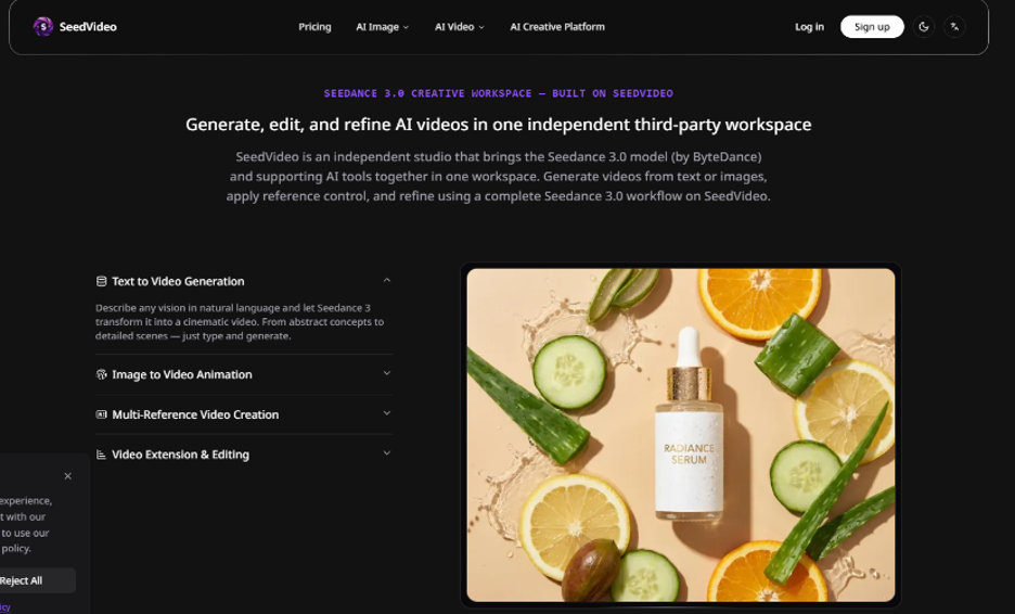
SeedVideo presents itself as an independent third-party studio with Seedance 2 available for runnable drafts and Seedance 3.0 planning content sitting beside the workspace. For free-font heroes, that split is clarifying. You can read planning guides about prompts and reference roles, then run a small Image to Video or Reference to Video pass on the specimen you already approved as a still.
Modes include Text to Video, Image to Video, and Reference to Video. Text to Video is a weak fit when the whole point is a specific free face already drawn. Image to Video or a single-role reference pass keeps the letters in charge. Guide language around a Seedance 3.0 AI Video Generator workflow keeps repeating the same discipline: one image, one job—identity, product shape, scene, style, first frame, or continuity.
Starter Panel Settings That Match Web Crops
Public create defaults beside a short clip—720P Resolution, 16:9 Ratio, 5s, and a visible credit preview such as 30 Credits—are unusually well matched to article heroes. 16:9 fits most research headers. Five seconds is long enough to show a slow push and short enough that the download button still owns the scroll. Start there. Do not open with a vertical nine-sixteen reel when the page chrome is horizontal.
One Product Shape Job For The Specimen Word
Treat the sample string as product shape. The letters are the object that must not melt into a softer cousin. If you need mood, add it later as a separate style pass after the word still reads. On pass one, forbid extra logos, forbid background posters, and forbid “luxury lobby” scene references that shrink the type.
How The Create Path Stays Small Enough
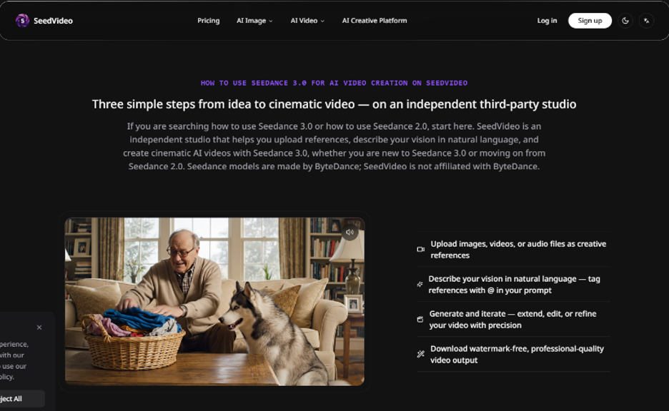
Use a fixed test protocol before anyone argues about cinematic taste. Export a high-contrast specimen with the word filling most of the frame. Open the draft and the source still at the exact hero crop, then scrub the first two seconds for readability and the rest for warp. If the word is weaker than the still, the draft is discarded even when the lighting looks expensive.
- Crop one clean specimen still with no UI chrome fighting the letters.
- Choose Image to Video or a single product-shape reference role.
- Write a production brief: keep letters, slow push, no new marks, 5s, 16:9.
- Generate once at the starter panel settings and review like footage.
- Revise one variable—camera or duration—not a new pile of mood words.
Readable First Two Seconds Beat Pretty Seconds Four
Observable fails show up early. Around second 2, thin strokes fatten and the free alternative starts looking like a generic display face. Counters close. A second word appears that nobody typeset. Those are hard stops for a research hero, because the page’s promise is honest comparison, not vibes. If second 4 looks glamorous while second 1 is muddy, the hero still fails the scroll test.
Revise Camera Before Revising Mood Words
When a draft almost works, change one camera path or shorten the action line. Do not add “premium,” “editorial,” or “cinematic fog” to rescue soft letters. Mood words usually shrink the specimen and invent floors. Free-font research pages cannot afford that trade. Keep SeedVideo in the lane of small, repeatable checks rather than open-ended style exploration on pass one.
Review The Loop Like A Spec Sheet
Designers already know how to judge a specimen sheet. Apply the same cold eye to motion. Ask whether the free alternative still shows its width contrast, whether the sample string stays the same spelling, and whether any “helpful” background stole contrast from the letters. If you would reject the still for soft terminals, reject the loop for the same reason.
That single discard should happen before anyone schedules the homepage swap. Research brands lose trust when a weekly free-font card looks prettier and less accurate than yesterday’s PNG. Credits are the cheap part of the mistake. A reader who stops believing the alternatives list is the expensive part.
Static Specimens Still Win Some Pages
Motion can stay optional. If the family is delicate, or the article is a dense alternatives matrix, a sharp still can beat a soft loop. The platform does not obligate every card to move. Use motion when a tiny camera move helps readers see rhythm or weight. Skip it when the loop makes the free face look less distinct than the PNG.
- Dense alternatives table: prefer stills for scan speed; loop only the featured face
- Single free-font deep dive: still if terminals are fragile; short loop if weight needs motion
- Homepage hero: still when type must stay sharp; 5s 16:9 only after a clean pass
- License explainer: keep stills—text carries the load
Paid exports are described as watermark-free on paid usage. That matters for an ads-free research brand that will not ship a logo stamp across a specimen word. Keep tests short first; pay for the clean export only after the still comparison passes.
Keep The Download Button Louder Than Fog
Free-font heroes fail when they outrun the decision they exist to support. Steal the create panel’s short defaults, assign the specimen one product-shape job, and kill any loop that softens the reason someone would download. Save the winning brief next to the article slug. Next week’s free alternative should start from that package, not from another cinematic adjective pile.
If the loop cannot beat the still in two seconds of reading time, publish the still. The download button is the product. Motion is only allowed to serve it.