
How to Choose the Right Fonts for Candle Packaging Design?
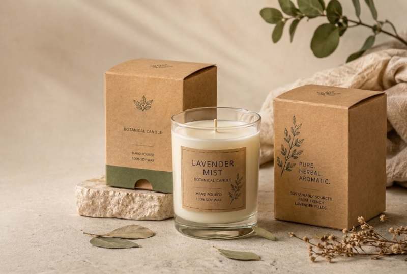
Fonts are much more than just the letters inside a box. They also help identify who you are purchasing your products from. A soft, thin font may appear as calming and friendly while a bold, heavy font will likely look modern or powerful. Selecting the correct font allows a candle company to share their message prior to a customer opening the package.
This concept has been researched. A study was conducted by researchers regarding packaging design which focused on typography as it relates to consumer purchase decisions. The research studied tea bag packaging and utilized survey information collected from 490 consumers.
In addition to identifying that color and layout influenced consumer perceptions of brands, the study identified that typography had an influence on the feelings consumers have toward a particular brand. Thus, selecting the appropriate font for a product is not simply choosing a minor aspect of the overall design.
It can ultimately determine if a customer feels confident in purchasing a product.
Fonts and Custom Candle Boxes
For many small candle companies, custom candle boxes are particularly meaningful to pack and protect the candles. The brand wants this box to be special and memorable. When you have such a limited amount of space, your font choices become very important when it comes to custom candle boxes. A brand can select a variety of different fonts that fit with its overall personality and style.
Serif vs. Sans-Serif Fonts
Sans-Serif Fonts are smooth, do not contain small line elements (serifs) at the end of letters. Sans-serif typefaces can provide an impression of being modern, clean, straightforward and easy to read. Many high-end candle companies use serif fonts to evoke a timeless feeling. Conversely, many wellness or minimalist companies prefer to utilize sans-serif font styles.
Readability Matters More Than Style
While a particular type of font may appear aesthetically pleasing to the eye, it is important for readability. In an article by International Journal of Research and Innovation (2024), researchers studied legibility on the web. The results indicated that the legibility of text is affected by font selection, letter spacing and the overall size of the text.
Additionally, the age and eyesight of the individual reading will influence their ability to read the selected font. Therefore, it would be wise for a candle manufacturer to select a font based upon its printability prior to placing an order.
Matching Fonts to Candle Scents and Moods
Scented candles can evoke many different moods depending on their fragrance (example: a candle with lavender will typically use a flowing or soft script font while a citrus-scented candle would likely have a bold and playful script).
A connection is created by the relationship between fragrance and typography that allow’s the consumer to “feel” the mood before they smell the candle.
Font Pairing for a Balanced Look
Most candle labels have more than just one font. Brands may use a larger font (bold) to represent their brand name and smaller font (lighter) to display other information like scents. When it comes to which fonts look good with each other, researchers studied how best to pair them. They also determined what looks nice when they are paired together as well.
Font Size and Label Space
Often there is very little room on candle labels to work. At this size long or elaborate fonts are difficult to read; therefore simple, readable fonts typically do well in this area. Always make sure that your brand name is the most readable text. Details such as burn time or ingredients may then be printed using a less prominent and/or smaller font.
Consistency Builds Trust
Brand consistency helps customers trust brands. The way that brands use the same font throughout their business products can help build trust with their customers. Using different types of fonts for each product will create confusion in a customer’s mind.
Using the same type of font across all products creates a sense of professionalism and stability for a brand. Regardless of how many items a company produces (5 candles, 500 candles) using the same type of font to develop branding will be beneficial.
Testing Fonts Before Final Printing
Many print companies send their designs to small sample boxes before they print large quantities. The purpose of this is to see what a design looks like outside of a computer monitor (screen) and to be able to view how colors will appear, light reflects off different materials etc.
Doing it early on in your process will help you save money on future prints that may need to be redone due to poor design.
Planning Fonts for Bigger Orders
Font choice becomes an issue to be dealt with further down the line with increased volume of prints. Today this is especially true as many small candle businesses are expanding. For the most part it is related to brand companies purchasing candle packaging boxes wholesale in large quantities.
The use of clean and simple fonts help avoid costly errors by the printer and produce identical looking boxes from one batch to another. Identical looking boxes become that much more important as orders increase over time.
Cultural and Regional Font Preferences
Where consumers reside may affect how font styles are perceived. Some cultures favor bold, decorative typefaces for specialty items, while other cultures prefer straightforward, minimalistic fonts that convey a sense of humility and honesty.
Knowing about this preference will allow international candle brands to be successful in their respective target markets. It is especially helpful for those who plan to enter into new foreign markets.
Avoiding Common Font Mistakes
Most of these newer candle brands do not even realize they are making simple font errors. Too many font styles will often ruin an appearance with clutter. Fonts that are too thin will generally render the text unreadable.
Poor letter spacing is another element in overall readability issues. More often than not, if you carefully select your elements (fonts) for the best overall appearance, you will end up with better looking packaging.