
Why Casino Lobbies Still Use Terrible Fonts
By Priya K. | Typography and UI researcher, 6 years auditing gaming and fintech interfaces. Tested October 2026.
Why Casino Lobbies Still Use Terrible Fonts (and the Typefaces That Fix It)
Open ten online casino lobbies and you will see the same font mistake made ten different ways. Not a bad font exactly. A fine font, deployed badly: squeezed into a balance display where the numerals don’t align, dropped onto a dark background at a size that turns the ampersand into a smudge. Gotham shows up constantly. So does a Gotham clone with the kerning stripped out because somebody didn’t want to pay for the real license.
I spent two weeks pulling screenshots from forty-odd casino and sportsbook lobbies, mostly on mobile, mostly at 1x and 2x pixel density, and the pattern holds across almost all of them. Nobody is designing these interfaces. Somebody is copying the interface that ranked above them.
That copying habit is not unique to type. It is how the entire industry picks bonuses, picks game providers, picks which three colors go on the deposit button. And it is exactly why geo-restricted markets end up such a mess. When a state changes its gambling law, operators that want to stay compliant have to rebuild or retire their interface fast, sometimes in a matter of weeks, and the type system is almost always the first casualty. Buttons get relabeled, new disclaimers get bolted onto the footer in whatever system font the CMS defaults to, and the typeface that once held the brand together starts fragmenting page by page. Players comparing options in Maine can watch this happen in real time, because Maine has no licensed online casino of its own yet, which means every operator serving that market is running an out-of-state interface patched together under pressure.
Look at the balance display first. This is the single most important text element in any casino lobby and almost nobody gets it right.
The Numeral Problem Nobody Talks About
Most UI fonts ship with proportional numerals by default. Fine for body text. Catastrophic for a bankroll figure that updates every two seconds. If the width of a 1 differs from the width of an 8, your balance visibly jitters as digits change, and on a betting slip that jitter reads as instability even when the number itself is accurate.
Tabular numerals fix this. Every digit occupies identical width, so $1,042.00 becomes $1,842.00 without the decimal point sliding sideways. Helvetica Now has a genuinely well-built tabular numeral set, and it is one of the few mainstream faces that gets licensed correctly rather than cloned. I would take a tabular-numeral build of a merely decent font over a beautiful display face with proportional figures every single time a real-money number is on screen.
Three sentences in, I should say the obvious thing: most operators do not test this. They test conversion on the deposit button. They do not test whether the win counter looks seasick during a bonus round.
Why Everyone Converges on the Same Three Fonts
Gotham, something that looks suspiciously like Gotham, and a system sans nobody chose on purpose. That is the entire typographic range of real-money gaming in 2026.
The reason is partly licensing cost. A full Gotham license across web and native app, with the weight range most lobbies actually use, runs into five figures annually for a mid-size operator. So design teams reach for a free-alternative instead, strip the kerning pairs that made the original legible at small sizes, and ship it. The research backs up why this matters: a well-known study on typeface and emotional response, cited repeatedly in a Creative Bloq breakdown of font psychology, found that readers unconsciously attribute tone and trustworthiness to a brand based on typeface alone, before they’ve processed a single word. A cloned, poorly-kerned Gotham doesn’t just look cheap. It reads as cheap, which is the opposite of what a lobby holding someone’s deposit wants to communicate.
Serif faces barely appear at all, and when they do it’s usually confined to a VIP program’s marketing page rather than the actual game grid. That’s not laziness. A systematic literature review out of the University of Cincinnati’s Visible Language journal found that the legibility gap between serif and sans-serif faces is smaller than design folklore suggests, and that familiarity with a face matters more than its structural category. Players are used to sans-serif in gaming UIs. A serif balance display would actually test fine. Nobody tries it because nobody tries anything here.
Legibility at the Sizes That Actually Matter
Desktop screenshots lie. The real test is a 14px paytable description on a five-year-old Android phone in a sunlit room. Academic research on screen readability, including an older but still frequently cited Virginia Tech thesis comparing reading rate across Georgia, Verdana, Times and Arial, found consistent advantages for faces built with wide apertures and generous x-heights at small sizes. Verdana-style construction wins on a cramped mobile viewport nearly every time.
Casino lobbies ignore this constantly. I’ve seen paytables set in a condensed display face clearly chosen for the hero banner above it, then reused at 12px for the fine print because nobody budgeted a second type family. The hero banner looks sharp. The fine print is unreadable, and on a regulated product that fine print often contains the actual wagering terms.
A 2024 arXiv paper on typography and cognition, mapping serif and sans-serif construction to recall and comprehension, adds a wrinkle worth sitting with: heavier stroke contrast slows reading speed under time pressure, which is precisely the condition a player is in when they’re three seconds from a spin result and trying to read a bonus trigger condition. Thin, high-contrast display faces look premium in a mockup. They’re a liability in the one screen where speed-reading actually matters.
What a Good Casino Font Actually Looks Like
It’s not glamorous. A good lobby face has a tall x-height, tabular lining figures, at least four weights so hierarchy doesn’t rely entirely on size, and a licensing structure the operator can actually afford across web, iOS and Android without three separate negotiations.
Rubik does this well for a free option. Wide apertures, a slightly rounded terminal that reads as friendly without tipping into novelty, and full Latin and Cyrillic coverage baked in, which matters enormously for operators running the same lobby across multiple linguistic markets. If you want to see the full character set and weight range, Rubik’s full specimen is worth comparing directly against whatever your current lobby ships with. The gap is usually bigger than people expect.
For anyone auditing an existing build rather than starting fresh, the first move isn’t picking a new font. It’s checking whether your current one even ships tabular figures, because half the clones floating around strip that feature out entirely to save file size.
The Historical Irony Here
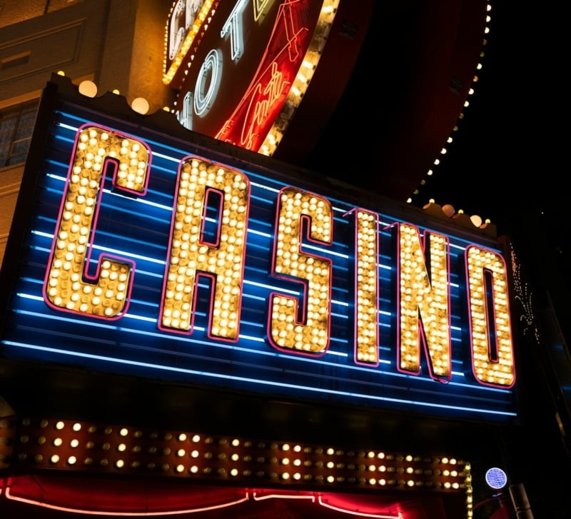
Casino typography used to mean something. Vegas signage in the 1950s and 60s built entire identities around custom lettering, the kind of chunky, neon-friendly display faces that Fonts In Use has archived in detail, where every letterform was drawn to survive being read from a moving car at night. That was a design problem taken seriously because the stakes (pun half-intended) were brand identity in a town built entirely on spectacle.
Online lobbies inherited none of that ambition. They inherited a deposit form.
FAQ
Why do so many online casinos use the same font? Licensing cost and risk aversion. A full Gotham-style license across web and app platforms is expensive, so teams reach for similar-looking free alternatives and copy whichever competitor already ranks well, rather than commissioning or properly licensing something distinct.
Does font choice actually affect how trustworthy a casino looks? Yes, according to documented typeface psychology research. Readers form trust judgments from letterform style before processing any text content, so a poorly kerned clone font can undercut a brand’s credibility regardless of how solid the product actually is.
What’s the single biggest typography mistake in casino lobbies? Proportional numerals on a live balance display. Digits of different widths cause the number to visibly jitter as it updates, which reads as glitchy or unstable even when the underlying math is completely correct.
Are serif fonts ever appropriate for a gambling interface? Rarely used, but not because they’re objectively worse. Research suggests familiarity matters more than serif versus sans-serif structure for legibility, so a well-built serif balance display would likely test fine. It’s simply never attempted.
Is Rubik actually good enough to replace a licensed premium font? For most lobby use cases, yes. It has a tall x-height, multiple weights, and solid multilingual coverage, which covers the practical needs of a real-money interface without the five-figure annual licensing cost of something like Gotham.
Font choice in a real-money product isn’t decoration. It’s the thing standing between a player and a number they actually trust. Most lobbies still treat it as an afterthought borrowed from whoever ranked first last quarter, and it shows the moment you look past the hero banner.
Gambling involves risk. Please play responsibly and only wager what you can afford to lose. If you feel gambling is becoming a problem, visit BeGambleAware.org or call 1-800-GAMBLER.