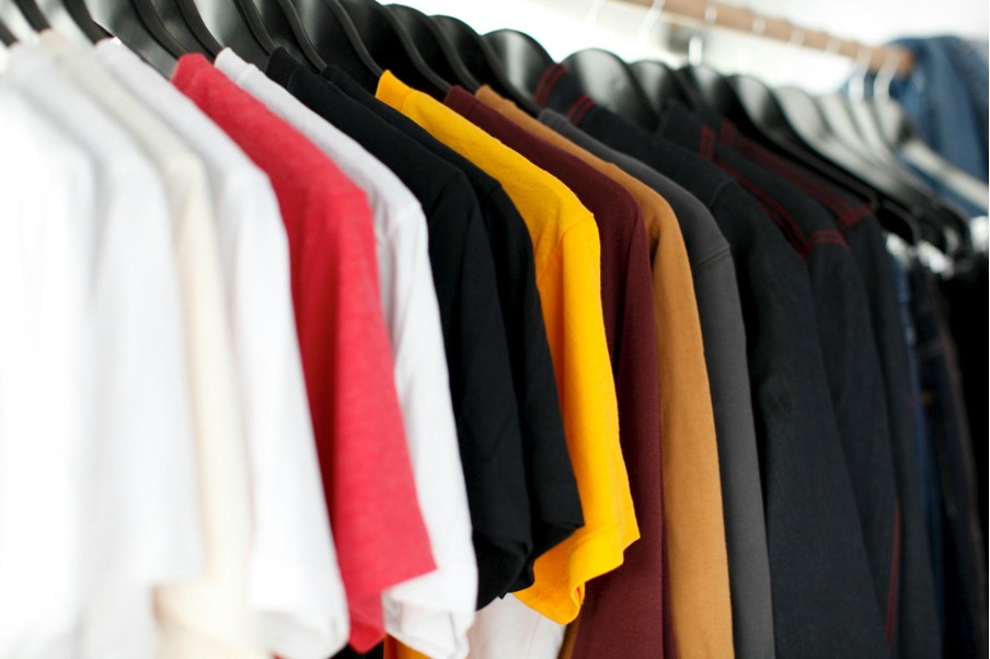
8 Best T-Shirt Colors for Your Custom Designs

You must have lots of great T-shirt design ideas, right? But choosing the perfect color is as hard as picking the best ice cream flavor. Don’t worry, I’m here to share eight amazing colors that will make your designs shine. Let’s work together to make your T-shirts sell like hot cakes!
8 Best T-Shirt Colors for Your Custom Designs
White
White T-shirts look fresh and sharp, and are an ideal base for any design. White looks amazing with dark graphics, bright colours, or even complex patterns. T-shirts are one of the most effortless pieces of clothing to match with other items; hence, these cotton tees can also work with casual or semi-formal looks.
The versatility of white tees is enhanced by the ability to print shirts on demand, allowing for endless personalization that keeps their fresh, minimalist appeal in high demand around the world.
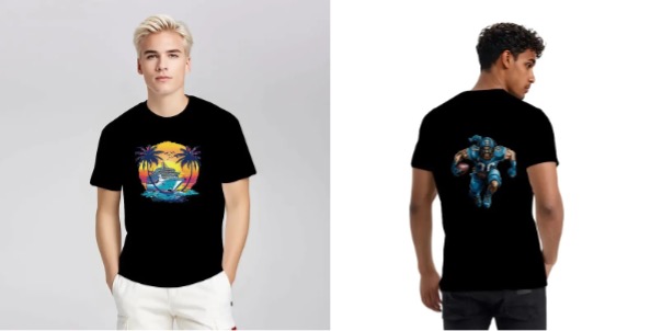
Black
Black T-shirts are classic and can never be out of fashion. This versatility allows them to be used in everything from bright logos to minimal graphics. Bold colors (white or neon colors) contrast nicely.
Black also gives a great backdrop that keeps the artwork popping and allows your design to always take center stage. Black tees are associated with a smart casual style and apply to both male and females.
Custom Gildan 5000 Unisex T-shirt Double Sided Customized Services – Print on Demand Fulfillment
Navy Blue
Navy blue has that professional elegance but still evokes timeless style, and navy is a great alternative to wear instead of black or gray. Its deep, subdued tone makes it appropriate for casual and more formal designs alike.
Artworks in lighter colors — think cream, gold, or silver — also look lovely on it, providing a contrasting effect that’s high-impact yet still subtle. Navy is selected for that versatile nature as well as serene vibe as a nice choice for corporate branding or clean, minimalistic designs.
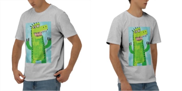
Gray
Gray – One of the most neutral and common colors for custom T-shirts. It’s gentler than black but still provides a great backdrop for a lot of different aesthetics. Heather gray, especially, has a little texture to the fabric that gives it a slightly more modern, cozy look.
No matter if you’re using bright and colorful graphics or muted tones, gray will fit into almost any design. Gray tees are neutral, easy to style and make a great outfit in everyday situations while allowing your custom artwork to take centre-stage.
Custom Men’s Combed Cotton Short-Sleeved T-Shirt – Print on Demand Fulfillment
Red
Red is strong, lively and eye-catching. It’s great for designs that want to say something. Be it bold, white font or vivid, graphic artwork, red makes for a perfect background that ensures your designs are seen.
Great for statement pieces, especially for special events, festivals, or marketing campaigns. Red has a high-energy vibe that rings youthful, and it is attractive to people who want to stand out.
Forest Green
Psychologically, forest green is calming and reminiscent of nature, making it perfect for designs that have an outdoorsy or earthy aesthetic. It’s ideal for logos, simple graphics, or nature-themed elements, particularly surrounding white, yellow or other soft tones.
The story Target tells with its clothing line is one of adventure, who want the natural in their clothing. Forest green can add depth to any design while still giving it a grounded, serene feel that suits outdoor apparel or sustainable fashion lines.
Maroon
Maroon has a sumptuous and low-key quality that is both deep and rich. Whereas red can be used to strike a bold attitude, maroon imparts an air of sophistication and elegance, making for a classic, timeless choice.
Maroon pairs especially well with gold, beige and other soft, warm tones for cascading prints, giving the shirt a high-end and refined look. It’s great for fashion-savvy clients who want a bolder, but less in-your-face, color that still makes a statement.
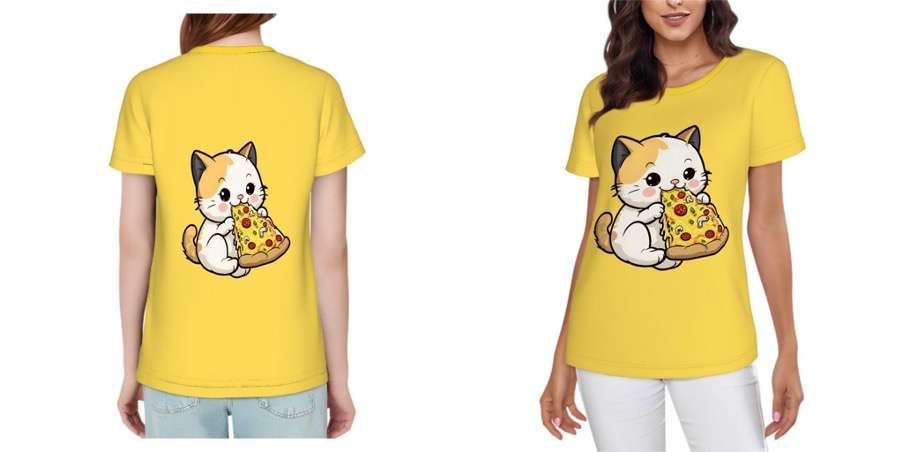
Mustard Yellow
Mustard yellow is an eye-catching, stylish color that adds a bright, vintage-inspired feel to your designs. This complements darker tones such as navy blue or black beautifully to create a stunning contrast.
The warm, golden color has an earthy but playful feel, great for quirky designs, vintage looks or playful graphic prints. Young customers loved mustard yellow, an offbeat color for a well-crafted T-shirt.
Print on Demand Women’s Short-Sleeve T-Shirt – Women’s Clothing
How to Choose the Best T-Shirt Colors for Your Designs
Know Your Audience
Think about who’s buying your shirts. Teens might love bold colors like red or yellow. Adults often pick neutral tones like black or gray for everyday wear. Match colors to what your customers like. This keeps them interested and ready to buy.
Match the Design
Your design decides the color. Bright graphics pop on white or black T-shirts. Subtle logos look great on navy or maroon. Test how your artwork looks in different colors. Make sure the design stands out clearly so buyers notice it right away.
Consider Trends
Stay updated on what’s popular. Colors like mustard yellow or forest green are trendy now. Check social media to see what people wear. Choosing on-trend colors draws younger buyers or fashion fans. But stick to classics like white for long-term sales.
Think About Versatility
Pick colors people can wear often. Black, white, and gray go with anything, so customers grab them first. Bold colors like red are fun but less versatile. Offer a mix of both to appeal to more shoppers. This way, you cover all tastes.
Test and Adjust
Try a few colors and see what sells. Use your print-on-demand platform to track which T-shirts move fastest. If the navy sells better than green, focus there. Keep tweaking based on what your customers love. You’ll find the perfect colors in no time.
Tips on Matching T-Shirt Colors and Fabrics
Start with fabric weight
Thin cotton or polyester blends work best for light colors like white, cream, or pastels. These fabrics let bright designs stand out without looking heavy. For example, a soft pink tee in lightweight cotton keeps summer designs airy. Darker colors like black or navy need thicker fabrics (like 100% cotton) to hide sweat stains and prevent designs from fading after washes.
Match colors to fabric texture
Rough fabrics like slub cotton or linen add grit to earthy tones (olive, rust, mustard). A charcoal gray tee with a textured finish gives vintage logos an authentic feel. Smooth fabrics like tri-blend or jersey, stick to bold, solid colors like red or royal blue—they make crisp graphics look professional.
Avoid color bleed with dark fabrics
Deep colors like burgundy or forest green often bleed dye during washing. Pre-wash these shirts before printing, or use fabrics with color-lock technology. If you’re printing a white design on a black tee, pick ringspun cotton—its tight weave keeps ink from cracking over time.
Use fabric sheen wisely
Glossy fabrics (like polyester) boost neon or metallic designs but can look cheap in muted tones. Matte fabrics (organic cotton, hemp) work better for neutral colors like beige or slate gray. A matte oatmeal tee makes minimalist logos feel premium.
Test for opacity
Light-colored fabrics (yellow, light blue) can show through darker prints. Always print a sample to check if the fabric hides the shirt’s base color. For instance, a red design on a heather gray tee might need an extra layer of ink to avoid a “ghost” effect.
Conclusion
So, you’ve made it through the rainbow of options. Choosing the right T-shirt color isn’t just about picking what looks good; it’s about what feels right for your vision.
Whether you’re launching a passion project or scaling a brand, those colors aren’t just fabric deep—they’re storytelling. So go ahead, pick that palette, hit print, and watch your ideas wear well. You’ve got this.