Best Casino Fonts for Logos Posters and Casino Night Designs
Casino fonts are built to create atmosphere fast. The right font can make a poster feel like a Las Vegas marquee, a poker logo feel sharper, a casino night invitation feel more premium, or a gaming graphic feel instantly more exciting.
The challenge is that casino typography can easily become too loud. Cards, dice, neon lights, gold effects, 3D shadows, and vintage letter shapes all compete for attention. Designers need to create that lucky feeling without sacrificing readability, originality, or brand trust. For casino-adjacent projects where readers may compare promotions, bonus codes, or rewards, Fair Gambling can help them check current code drops, partner casino opportunities, and reward features where available before a visual promotion influences a decision.
That balance is what separates the best casino fonts from novelty lettering. A bold retro font can work beautifully for a casino night poster. A refined serif can support an upscale logo. A playing cards font can help a poker flyer feel on-theme. A clean sans-serif can make supporting details easier to read.
This guide explains how to choose a casino font, which styles work best, what mistakes to avoid, and how to use casino typography in a way that feels polished rather than gimmicky.
What makes casino fonts feel instantly recognizable
Casino fonts usually borrow from visual worlds people already associate with luck, nightlife, and entertainment. Think vintage Las Vegas signs, playing cards, poker tables, dice, royal flush symbols, theater posters, carnival lettering, nightclub signage, and gold-trimmed hotel branding.
A casino font often includes one or more of these traits.
| Design trait | Why it feels casino inspired |
| Bold display letters | They feel confident and easy to see from a distance |
| Inline strokes | They echo vintage signage and showtime lettering |
| 3D shadows | They add depth and promotional energy |
| Neon or bulb accents | They suggest nightlife, marquees, and Las Vegas signs |
| Card suit symbols | They connect quickly to poker and casino games |
| Elegant serif details | They create a premium or royal casino look |
| Retro curves | They suggest vintage posters and classic entertainment |
The trick is using these elements with control. A font does not need every casino symbol at once. One strong visual cue is often enough.
For example, a bold serif with a subtle diamond accent can look more professional than a crowded wordmark filled with cards, dice, stars, gradients, and shadows. The best casino fonts feel intentional. They do not force the viewer to work hard to understand the word.
Best casino fonts and styles for different projects
There is no single best casino font for every design. The right choice depends on where the font will appear, how long the text is, and what mood the project needs.
| Casino font style | Best use | Design caution |
| Retro casino font | Vintage posters, Las Vegas graphics, event branding | Avoid too many decorative effects |
| Bold serif font | Casino logos, premium brands, royal casino fonts | Test small-size readability |
| Neon or bulb font | Signage, nightclub posters, showtime designs | Keep glow effects controlled |
| Playing cards font | Poker graphics, card room branding, themed invitations | Use symbols as accents |
| Dice inspired font | Game night flyers, casual casino themes | Avoid a childish look |
| Script font | Elegant invitations, luxury accents, burlesque themes | Use for short phrases only |
| Sans-serif font | Apps, menus, captions, digital interfaces | Pair with a stronger display font |
A casino font family with several weights or effects is especially useful. If the typeface includes regular, bold, inline, outline, and shadow versions, you can create different designs while keeping the typography consistent.
For logo design, choose structure first and decoration second. For poster design, choose visual impact first but keep hierarchy clear. For web or app use, prioritize legibility, loading, and licensing.
What makes a good casino font logo?
A good casino font logo should be memorable, readable, and scalable. It should also match the brand’s tone. A fun casino night fundraiser needs a different font style from an upscale resort, poker training brand, gaming review site, or crypto casino community.
Before choosing a logo font, ask five practical questions.
| Question | Why it matters |
| Does the font match the brand mood? | Fun, classy, vintage, bold, or modern styles create different expectations |
| Can the logo work in one color? | Strong letter shapes should not depend entirely on effects |
| Is the word readable at small sizes? | Logos appear in favicons, social icons, and mobile headers |
| Are the numbers and symbols strong? | Casino projects often use dates, odds, codes, or card symbols |
| Is the license suitable for logo use? | Some free fonts are not allowed in commercial branding |
The best casino logos usually use one clear typographic idea. That might be a vintage inline typeface, an elegant serif with a gold accent, or a bold uppercase display font with a small playing card symbol.
A simple test helps. Remove the glow, gradient, outline, and background texture. If the wordmark still feels recognizable, the font probably has enough structure for a logo. If the design falls apart without effects, choose a stronger base typeface.
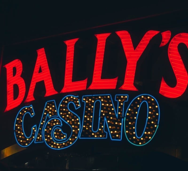
Retro casino fonts for vintage Las Vegas designs
Retro casino fonts remain popular because they instantly suggest old Las Vegas, classic hotel signage, show posters, lounge branding, and mid-century entertainment.
These fonts often use wide letterforms, playful curves, inline details, strong shadows, or slightly exaggerated serifs. They are especially effective for casino night posters, themed invitations, apparel, social graphics, and event flyers.
The main risk is overdesign. A retro font already carries a lot of personality. If you add distressed textures, gold gradients, neon outlines, dice icons, and starbursts on top, the design can feel crowded.
A better approach is to pair one decorative retro headline with a simple support font. Let the casino font handle the mood. Let the support font handle the details, such as event time, venue, ticket information, or terms.
Showtime and marquee fonts for neon poster work
Showtime fonts are made for spectacle. They bring to mind theater entrances, bulb signs, carnival posters, movie titles, casino floors, and nightclub graphics.
This style works best in short, high-impact text. “Casino Night,” “Poker Party,” “Royal Flush,” or “Lucky Draw” can all work well in a marquee font. Longer sentences usually become harder to scan.
Neon and bulb fonts are also useful for promotional materials. They can make a flyer or poster feel energetic before the viewer reads a single word. The design challenge is contrast. Glow effects can blur letters if the background is too bright or the strokes are too thin.
When using showtime lettering, test the design without effects first. If the alphabet is readable before the glow, it will probably survive the final treatment. If the font needs heavy effects to make sense, choose a stronger base typeface.
Playing cards poker dice and royal flush font styles
Poker and casino designs often use symbols from playing cards. Hearts, clubs, diamonds, spades, chips, crowns, and dice can all create an immediate casino style.
Fonts such as Retro Signed, Showtime, Hoyle Playing Cards, Playing Cards, Tumblin Dice, and Royal Flush show the range of styles designers often look for in this category. Some are better for headlines. Others are more like decorative symbol fonts or novelty display faces. The important point is to check the license and test your actual wording before using any font in a client project.
A playing cards font can work well for poker tournaments, card room flyers, social banners, or casino night invitations. A dice inspired font may suit casual game night designs. A royal flush style can work for premium visuals if it avoids looking too busy.
Use symbols carefully. Replacing too many letters with icons can hurt readability. A small spade inside a badge may look better than turning several letters into card suits.
Casino font examples by design goal
The best casino fonts should be selected by project goal rather than by appearance alone. A typeface that looks exciting in a font preview may not work once it has to carry a real brand name, numbers, or legal copy.
| Design goal | Recommended style | Example direction |
| Casino night poster | Retro display or marquee font | Big headline with simple supporting details |
| Poker logo | Bold serif or playing cards style | Sharp uppercase letters with subtle suit accents |
| Luxury casino brand | Elegant serif or refined sans-serif | Minimal decoration with strong spacing |
| Nightclub promotion | Neon or bulb font | Dark background with controlled glow |
| Game night invitation | Dice or carnival inspired font | Playful title with readable event copy |
| Gaming interface | Sans-serif with display accent | Clear buttons, menus, and small text |
This is why designers should not choose fonts only from preview images. Type your actual words. Test the numbers. Check punctuation. Look at uppercase letters and lowercase letters. Then place the font in the real layout.
How to choose the right casino font for your project
Start with the project format. A logo needs a different font from a poster, and a poster needs a different font from a mobile interface.
For logos, focus on structure and memorability. For posters, focus on impact and hierarchy. For websites, focus on readability and performance. For event invitations, focus on mood and clarity. For apparel, focus on how the letters print at different sizes.
Next, define the visual tone. Casino typography can be fun, vintage, elegant, gothic, flashy, geometric, premium, or playful. A royal casino font may use a sharp serif and gold accent. A casino fancy font may use decorative curves or calligraphy. A modern betting app may use a cleaner sans-serif with just one display accent.
Then check technical details. Does the font include the full alphabet? Are the lowercase letters usable? Are the numbers clear? Does it include punctuation, currency symbols, or accented characters? These details matter more than many designers expect.
Finally, review the license. A font may be free for personal use but not for commercial logos, apps, websites, broadcast graphics, or merchandise. FontsArena’s font licensing guide is a helpful internal resource for understanding common font license terms before you publish or deliver final files.
Casino font logos not a good fit?
A casino font logo is not always the best choice. Some brands need a cleaner identity and can use casino typography only in campaigns.
For example, a casino review website might use a modern sans-serif logo but use retro casino fonts for article graphics. A poker training brand might use a strong serif wordmark but save playing card symbols for badges and social posts. A casino night event could use a decorative headline while keeping the date, location, and ticket information in a plain font.
This approach gives the brand more flexibility. Decorative fonts are excellent for mood, but they can become limiting if used everywhere.
A good typography system may include the following.
| Role | Font choice |
| Main logo | Clean serif or sans-serif |
| Campaign headline | Casino display font |
| Supporting copy | Readable sans-serif |
| Small details | Simple text font with clear numbers |
| Accent graphics | Playing cards, dice, or neon elements |
This keeps the design themed without making every part of the brand feel like a novelty poster.
Where to find casino fonts for download
When looking for casino fonts to download, do not stop at the preview image. A font preview is designed to look attractive. Your actual project may reveal spacing issues, missing characters, weak numbers, or awkward letter combinations.
Before downloading or using a casino font, check the following.
| Download check | What to confirm |
| License | Personal, commercial, logo, webfont, app, or merchandise use |
| Character set | Alphabet, numbers, punctuation, symbols, and accents |
| File formats | Desktop, webfont, or design software compatibility |
| Readability | Clear at large and small sizes |
| Style range | Regular, bold, outline, inline, or 3D variations |
| Attribution rules | Whether credit is required |
For commercial work, licensing is not a small detail. It affects whether a font can be used in ads, websites, apps, printed products, videos, or client branding. A safe download is one that fits both the visual style and the legal use case.
Common casino font mistakes designers should avoid
Casino designs can become messy quickly because the style is naturally bold. Most mistakes come from adding too many effects or choosing a font that looks good only in a large preview.
| Mistake | Why it hurts the design | Better choice |
| Using too many decorative fonts | The layout becomes chaotic | Use one display font and one support font |
| Copying famous casino or game logos | It can create legal and brand confusion | Create an original wordmark |
| Ignoring licensing | The design may be unsafe for commercial use | Check terms before download |
| Overusing 3D effects | Text can look heavy or dated | Save 3D for short headlines |
| Poor contrast | Neon and gold effects can blur | Test on mobile and in grayscale |
| Replacing letters with symbols | Words become harder to read | Use icons as accents |
A good casino design should feel exciting, not exhausting. The font should invite attention while still making the message easy to understand.
Responsible design notes for real gambling brands
If a project is connected to real-money gambling, typography should support clarity as well as excitement. Bonus terms, age restrictions, wagering requirements, and responsible gambling messages should not be hidden in tiny text or low-contrast colors.
Readable small print matters. Honest hierarchy matters too. A large promotional headline should not overwhelm important conditions to the point that the offer becomes unclear.
GambleAware advises people to set spending limits, set time limits, and avoid chasing losses. Designers are not responsible for player behavior, but they can avoid layouts that create pressure, confusion, or unrealistic expectations.
This is also where practical offer comparison can help. If a reader sees a casino promotion, they should be able to check what is current, what applies at partner casinos, and what reward terms may be relevant before depositing. Fairgambling can help readers review current bonus code drops and wager share opportunities where available, instead of relying only on a flashy banner.
How to pair casino fonts with colors and design elements
Casino fonts often work best with a controlled color palette. Red, black, gold, cream, emerald, and deep navy are common because they connect to cards, tables, chips, luxury interiors, and classic signage.
Neon colors can work too, especially for nightclub or modern gaming designs. Pink, blue, purple, and yellow can create an energetic look when used on dark backgrounds.
The font should guide the rest of the design. A royal serif may suit black and gold. A retro style may work better with cream, teal, orange, or faded red. A neon font needs enough darkness around it for the glow to stand out.
Design elements should support the letters, not compete with them. Cards, dice, chips, crowns, bulbs, stars, and vector ornaments can all work, but they should not crowd the word. Give the type room to breathe.
What font does New Vegas use?
Designers often ask this because Fallout New Vegas has a memorable retro-futuristic look. For original projects, the safer choice is not to copy the exact game branding. Instead, use a licensed retro, western, or mid-century inspired casino font that captures a similar mood.
Look for wide letterforms, vintage signage influence, and theatrical details. The goal is inspiration, not imitation.
What font do the Las Vegas Raiders use?
The Las Vegas Raiders identity is a protected sports brand, so designers should not copy its typography for casino, poker, or gaming projects. If you like that bold athletic feel, choose a licensed block serif, sports display font, or shield-friendly typeface that creates its own identity.
This is especially important for logo design. A project can feel bold and Las Vegas inspired without looking like a team imitation.
Casino fonts FAQ
What are good casino fonts for gaming or poker?
Good casino fonts for gaming or poker usually have bold shapes, readable numbers, and strong display value. Serif fonts, playing card fonts, retro inline fonts, and sharp uppercase display faces work well for poker logos, tournament posters, and gaming graphics.
What fonts do casinos commonly use?
Casinos commonly use display fonts for logos and promotions, serif fonts for upscale branding, sans-serif fonts for navigation, and decorative retro or neon fonts for themed campaigns. Many professional designs combine a distinctive headline font with simpler supporting typography.
What makes a good casino font logo?
A good casino font logo is readable, memorable, scalable, and aligned with the brand mood. It should work in one color, stay clear at small sizes, and avoid depending entirely on shadows, gradients, or glow effects.
How do I choose the right casino font for my project?
Choose based on format, audience, mood, readability, and licensing. A casino night poster can use a decorative headline font, while a website, app, or review brand needs cleaner typography for menus, buttons, and body copy.
What are some popular casino font styles?
Popular casino font styles include retro Las Vegas lettering, neon signage fonts, 3D display fonts, elegant serif fonts, script accents, playing cards fonts, dice inspired fonts, carnival fonts, and showtime marquee lettering.
What are some examples of casino themed fonts?
Casino themed font examples include styles inspired by playing cards, royal flush graphics, dice, bulb signs, vintage hotel signage, poker rooms, circus posters, and upscale lounge branding. Always check the license before using any specific font commercially.
Where can I find casino fonts for download?
You can find casino fonts on font libraries, type marketplaces, free font directories, and design resource sites. Before using any download, confirm whether the font is allowed for commercial use, logo design, web embedding, apps, merchandise, or only personal projects.
Are there different variations of casino fonts like 3D or marquee?
Yes. Casino fonts come in many variations, including 3D, inline, outline, neon, bulb, vintage, gothic, script, serif, sans-serif, and marquee styles. Some families include multiple effects so designers can keep a consistent look across different layouts.
What is a good poker font?
A good poker font has strong letter shapes, readable numbers, and a confident gaming mood. Sharp serifs, bold slab styles, card suit accents, and clean uppercase display fonts often work well.
What designers should remember
Casino fonts work best when they combine atmosphere with discipline. They should suggest luck, nightlife, poker, glamour, vintage signage, or Las Vegas energy, but they still need to do the basic job of typography. They need to make words clear.
For logos, keep the concept simple. For posters, build hierarchy. For downloads, check the license. For real gambling campaigns, make terms and responsible gambling information visible. For themed projects, use cards, dice, neon, and 3D effects with restraint.
The best casino fonts do not just look lucky. They make the whole design feel intentional, readable, and ready for the audience it needs to reach.