Best Fonts for Kids Learning to Read and Write (Teacher-Approved List)
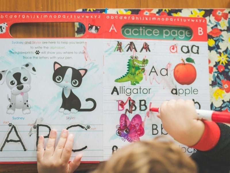
The first time a child reads a book, they have the chance to decode a complex symbol system. An early child’s learning can hinge on a letter’s “architecture,” which determines whether they succeed or fail. To build a bridge to literacy, you can use special fonts at home or access an online reading program for clear learning instructions.
In this article, we’ll cover both concerns. Learn which fonts are best for early literacy development and how typographic features can boost reading confidence.
Why Typography Matters in Early Literacy Development
Researchers on how kids learn to read and write usually talk about the “visual noise” of fonts. It is easy for an adult to read serif fonts with decorative flourishes. For example, a “double-story” lowercase ‘a’ (like the one in this sentence) looks nothing like the kindergarten-taught circle-and-tail ‘a’.
Teachers can reduce the “decoding gap” by using visual learning tools that mimic the handwriting kids actually practice.
What Are the Top 5 Teacher-Approved Fonts for Early Readers?
Font Name |
Category |
Best For |
Why Teachers Love It |
| Sassoon Primary | Sans Serif | Reading & Handwriting | A font designed especially for kids, this font features slight “exit strokes” at the end of letters. Having these tiny tails helps children’s eyes flow between letters, which is critical when learning cursive. |
| Century Gothic | Geometric Sans | Worksheets | This font features a single-story ‘a’ and ‘g,’ which look like a circle with a tail. This is because the shapes match exactly how children are taught to write their first letters. |
| Andika | Sans Serif | Literacy Materials | In areas where reading materials are scarce, SIL International developed this for literacy programs. No matter how poor the print quality or how small the screen, it is designed to be extremely clear and legible. |
| KG Primary Penmanship | Handwritten | Tracing & Writing | Many kindergarten classrooms use the “ball and stick” method. This font perfectly replicates that method. Kids can use it to bridge the gap between reading and writing since it looks exactly like the letters on their practice worksheets. |
| Lexend | Variable Sans | Dyslexia/Fluency | Specifically designed to reduce visual stress and improve speed. |
What Makes an Effective Literacy Font
In choosing the best fonts for early readers, teachers look for a few specific “rules” that make letters easier to recognise. What makes a font work are:
- Single-story letters like ‘a’ and ‘g’. These are the simple, round shapes children learn to draw by hand. It can be confusing for a beginner to use adult fonts because of their “double-story” shapes (like the ‘a’ in this text).
- A “large x-height” means that the lowercase letters are tall. The words appear much clearer this way, especially when viewed on a screen or on a small piece of paper.
- Unique shapes: Many kids struggle with “mirroring,” in which a ‘b’ looks exactly like a ‘d’ flipped over. Good fonts add tiny differences to these letters. As a result, children are able to distinguish between them and are prevented from reading backwards.
Note! There is a lot of Comic Sans used in schools, but it can look messy. In recent years, experts have recommended using fonts like Lexend or Century Gothic. Kids can read them just as easily as usual, but they look much cleaner, helping them stay focused.
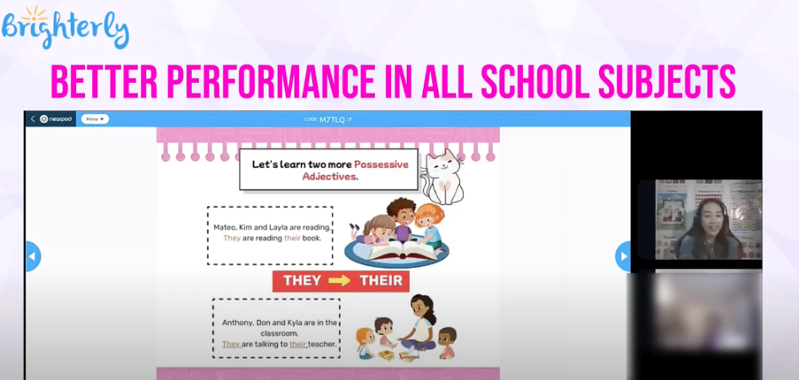
Enhancing Visual Learning: How Brighterly Supports Early Literacy?
The font you choose is only half the battle; the environment where those fonts live is equally crucial. Brighterly is an educational platform serving grades K-12 and known for its holistic approach and careful integration of all learning elements.
Brighterly is one of the most effective literacy programs available today due to:
- Typography that is Kid-Friendly: They use simple, clear fonts that children can easily recognize. By doing this, children are more likely to focus on the meaning of words rather than trying to figure out complex letter shapes.
- With Reading Through Play, kids’ reading confidence gains through engaging prompts and short stories in colorful, high-contrast environments.
- With their clean, bright interface, learners can focus entirely on phonics and form, thanks to a distraction-free learning environment.
Comparing Font Styles for Education
Different fonts are like different handwriting styles. Some are formal, some are friendly, and some are designed specifically for developing brains. In order to help you pick the right font style for your home practice, here is a breakdown of several of the main font “personalities”:
1. Simple and round styles (e.g., Century Gothic, Futura)
In these fonts, circles and straight lines are used as basic shapes. It looks very clean and “friendly” to a child. They are great visual learning tools because they don’t have extra “feet” or hooks on the letters.
- Pros. A kid won’t feel overwhelmed reading them.
- Cons. The shapes of some letters are so perfect that they look identical. The lowercase “L” (L) and the uppercase “I” (i) might seem identical.
2. Styles designed by the teacher (e.g., Sassoon Primary, Andika, etc.)
They are considered to be the “gold standard” for schools. They were designed in collaboration with literacy experts. Children’s pens take the same path when they learn to write as the letters do.
- Pros. To help kids move from reading words to writing them, these are the best resources.
- Since they are specialized, you often have to pay a license fee to use them.
3. ‘Steady’ types (such as OpenDyslexic and Lexend).
Children who have trouble reading letters that appear to “jump” or “float” on the page will love these. Each letter in these fonts has a slightly thicker base, called weighted bottoms.
- Pros. Adding weight to the letters makes it much harder for a child to mix them up or flip them over.
- Due to their unique, heavy shapes, some readers may find the letters to be clunky or unusual. For standard books with long blocks of text, they may not be the best choice.
Note! You can also check this article to discover the best fonts for dyslexia, as kids with the condition require a particular approach.
Final Thoughts
It is impossible to pick a “perfect” font, but there is a “right” font for each stage of a child’s development. Preschoolers should be exposed to simple, “single-story” characters. In preparation for adult literature, introduce more traditional book-style fonts to children in primary school. Choose the font wisely or seek a tutor’s help for guidance.