Can Strong Typography Increase Content Views Over Time
Typography Shapes Reader Engagement
Typography is not merely a matter of choosing the fonts and changing the font size. It affects the perceptions, reading, and interactivity of the content of the users and determines the overall engagement. Typographic hierarchy is useful since it directs the focus and makes digesting information easier. The visually structured content, which is eye-friendly, would be more likely to be approached by the readers. In addition to the aesthetics, typography conveys tone, trustworthiness, and credibility. Spacing, line height, and font pairing can both affect the reading performance and level of understanding greatly. A professionally designed typography may result in increased content memory, increased time spent during sessions, and frequent revisits to your content.
The impact of typeface selection on the retention of the reader
The choice of the typeface has a memory effect and makes the reader attentive through the long readings of the articles :
- The use of the same fonts in the headings and paragraphs also ensures familiarity to recurring visitors.
- Moderate changes in weight and style introduction experimentation keep the eye entertained.
- Readable fonts lessen the load on the eyes, and more time is dedicated to digital material.
- Line spacing is done appropriately to be readable on a variety of devices and screens.
Good typography will directly influence improved engagement metrics, which the search engines will take into account in ranking pages and help you get your content discovered by more people. The readability of the fonts, the contrast between the colors, and the strategic focus draw attention to the crucial information. Headings and subheadings are well designed and divide the contents into readable chunks. Adoption of a responsive font size will make it readable on mobile devices and increase the audience coverage. Visual hierarchy gives the utmost importance to the best ideas, thus holding the attention of the readers. The consideration of typographic details prompts the user to scroll more and forward the content to other people. Even minor modifications in kerning and spacing between letters can make big pieces of text more palatable.
Visual Techniques of Hierarchy in Attention
- Naturally attract attention to important points through font size differences to make the eye flow.
- The usage of bold and italic should be with a purpose to prevent the distraction of the reader.
- A difference in the sizes of headings produces hierarchical parts, which are easy to scan.
- Add white space between paragraphs and enhance understanding.
- Illustrate the most important statistics or information with slight text color differences or boxes.
- Keep the text in line with each other to have a professional and organized presentation.
Color Opposition And Readability Maximization
The choice of colors adds to typography by increasing the readability and attractiveness. The contrast between the text and the background is high, which makes it accessible to everybody who reads it. Headings and body text are done in complementary color which keeps the hierarchy without overwhelming the eye. Do not use too many color matches, which may interfere with reading. The calls-to-action or significant lessons in the content can be highlighted by contrast manipulations. Shades or background colours added in a subtle way help to focus attention on certain areas. The tools of accessibility can reproduce the appearance of the content to various types of vision. Good color contrast results in increased time of viewing and understanding.
Typography and Mobile-Friendly Design
Users on mobile devices prefer bigger and readable fonts, which automatically adjust to the size of the screen.
- Responsive typography prevents horizontal scrolling and preserves the layout.
- Adequate paragraph spacing makes the text readable on small devices without any crowding of the text.
- Phones should not have headings and body text that are similar.
- Dynamically changing the height of the line enhances the reading experience of devices.
- Do not use tiny fonts that make one strain their eyes when zooming.
Data Insights On Typography Engagement Impact
- Research indicates that readable fonts can increase average session duration by 15 percent.
- Proper heading structure improves content scanning and boosts user interaction metrics.
- Visual hierarchy can lead to a 20 percent increase in content sharing.
- Attention retention drops significantly when text density exceeds comfortable limits.
- Typography improvements correlate with higher SEO visibility through engagement signals.
- Users are more likely to revisit sites that offer clear, readable content consistently.
Key Typography Factors and Effects
This table will break down what specific typography adjustments (like font size, spacing, contrast) do to the user experience and engagement.
| Typographic Element | Effect on Engagement | Source Insight |
| Font size 16px+ | Better readability, up to +25% engagement | Larger fonts aid text clarity |
| Consistent hierarchy | Improves scanning, reduces bounce | Organized structure boosts focus |
| Color contrast | Enhances accessibility | Screen readability research |
| Line spacing | +20% comprehension improvement | Adequate spacing reduces eye strain |
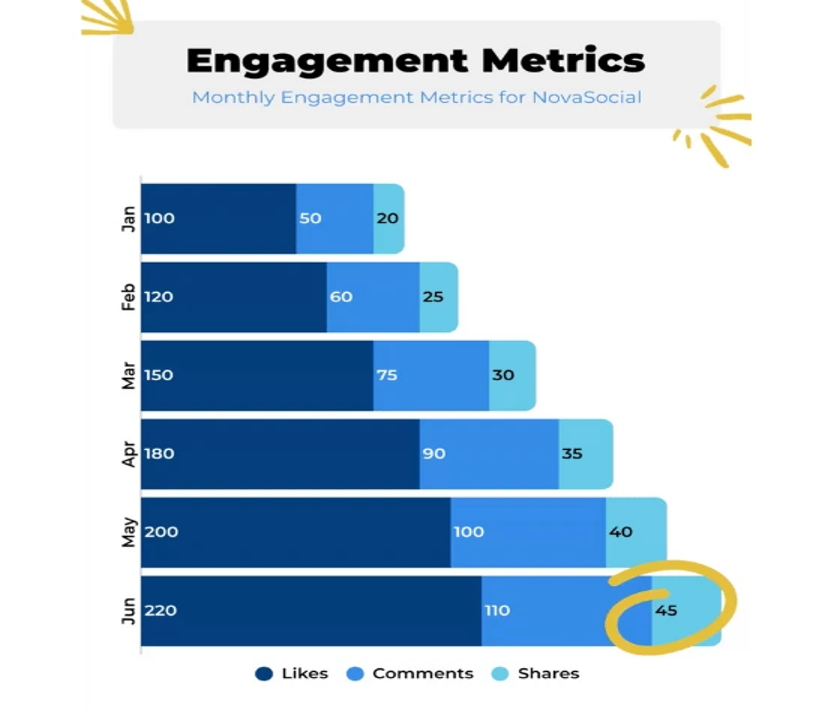
These visual templates demonstrate the common layouts of bar graphs that you can customize to present the engagement measurements, such as readability, retention, or the duration of sessions, that increase with effective typography. All you would need to do is substitute the defaulted information with your particular figures on your content research (e.g., readability increases, engagement enhancements).
Boost Long-Term Views
One of the primary strategies that will help you interact better with users and get your content discovered by more people is strong typography. Having clarity, hierarchy, and visual consistency motivates the reader to go back to the content again and again. The variation of color contrast and responsive design in combination with typography is more accessible and easier to use. A closer consideration of finer adjustments of spacing, font, and section organization makes reading less stressful. With analytics monitoring, improvements can be made based on the behavior of users. In the long run, these tactics lead to an increase in engagement measures, improved search engine visibility, and long-term traffic.
FAQ
Q: Can typography alone improve content views?
Typography influences the readability and retention of the users, which in turn will enhance the number of views when used with good content.
Q: Which font types prove to be the most useful in digital articles?
Sans-serif (such as Arial or Open Sans) and serif (such as serif) fonts increase the clarity and formal sound, respectively.
Q: What is the effect of color on content readability?
Text and background contrast is high and enhances readability and lessens the straining of eyes.
Q: Is mobile typography different from desktop typography?
Yes, responsive fonts and spacing adjustments ensure readability across all devices.
Q: Can visual hierarchy increase engagement?
Organized headings and emphasized key points guide the reader’s attention and encourage longer interaction.