Designing a Modern Bar Experience: Typography, Materials, and the Hidden Infrastructure That Shapes the Space
Why “Good Design” in Hospitality Is More Than Logos and Menus
When people talk about bar or restaurant design, they usually mean surface-level elements: a stylish logo, a photogenic menu, a distinctive neon sign, or a curated Instagram aesthetic. But memorable hospitality design isn’t built on visuals alone — it’s the result of systems thinking: how space, signage, materials, and operational realities work together.
A well-designed venue feels effortless because all the moving parts — from queue flow to lighting temperature to service speed — have been considered early. That’s why the most successful hospitality concepts treat design as a combination of:
- Visual identity (type, color, layout)
- Spatial design (movement, zones, sightlines)
- Industrial design (visible hardware and touchpoints)
- Operational infrastructure (what makes service smooth behind the scenes)
FontsArena readers know that typography can carry a brand. The interesting part is how typography behaves in the real world — on glass, metal, tile, lightboxes, chalkboards, digital displays — and how “non-design” constraints can quietly dictate what’s possible.
Typography in Physical Spaces: Legibility Is a System, Not a Choice
Typography in hospitality has a job: communicate fast, clearly, and under imperfect conditions. Unlike a website or a printed poster, bar signage faces real-world challenges:
- low light or colored lighting
- reflective surfaces and glare
- distance viewing (back bar menus, overhead boards)
- movement (crowds, queuing)
- mixed languages / short attention spans
This is why many venues shift from purely expressive typography to high-performance type systems: typefaces that remain readable under noise.
Practical typography decisions that consistently work well in hospitality:
1) Use a two-font hierarchy (not five “cool” fonts)
A reliable approach is:
- Primary: a strong sans for navigation and pricing (clarity)
- Secondary: a warmer serif or display face for accents (character)
2) Build a consistent scale for real surfaces
Designers often choose a type size in Figma and forget the physical translation. Good systems define:
- viewing distance (1m, 3m, 5m)
- minimum x-height and stroke weight
- contrast ratio against real materials
3) Design for “worst-case readability”
If your type is readable:
- at night,
- under warm lighting,
- behind reflections,
- from 4 meters away,
…then it’s readable anywhere.
A clean typographic system reduces friction. When patrons don’t need to squint at menus, service speeds up, and the space feels “premium” even before anyone tastes a product.
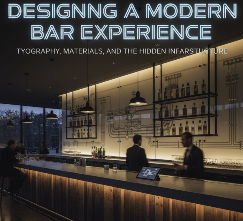
Materials and Finishes: Where Brand Touchpoints Become Physical
Fonts and layouts are only half the story. In hospitality, materials are brand language.
- Brushed stainless steel signals durability and industrial minimalism.
- Polished brass reads as upscale and vintage.
- Matte black finishes feel modern and “tech-forward.”
- Ceramic and stone communicate craftsmanship and warmth.
Designers can think of surfaces as “substrates” for typography:
- how ink behaves on matte paint vs glossy tile
- how vinyl signage reads on textured walls
- how laser-etched letters handle reflections
The point: typography doesn’t exist in isolation. It lives on surfaces that carry mood, and those surfaces influence legibility, contrast, and perceived quality.
Space Planning: Why Layout and Operations Decide the Visual Rhythm
A bar counter looks like a simple plane. In reality it’s a high-density operational zone. The best-looking spaces are often the ones where operational constraints were respected early — so the design didn’t have to “fight” the function later.
Key spatial considerations:
- clear zones for ordering vs pickup
- accessible service routes for staff
- hidden storage that doesn’t ruin the back-bar symmetry
- cable/line routing that doesn’t force awkward counter depths
When you plan infrastructure too late, you get compromises that harm design:
- signage shoved into corners
- menus placed where glare destroys readability
- “random” objects on the counter that break the clean rhythm
- asymmetry created by equipment that had to be placed last-minute
Design thrives when it’s not improvising around unplanned constraints.
Industrial Design as Part of the Brand: Hardware Is a Visual Element
Modern hospitality design increasingly treats visible hardware as intentional. Not everything needs to be hidden — sometimes the mechanical elements are what give the space character.
Think about how many venues intentionally showcase:
- exposed steel beams
- visible fasteners
- open shelving with functional objects
- minimal, sculptural fixtures
The same applies behind the counter: the visible service hardware can either feel like clutter, or like a well-integrated industrial detail.
Good industrial design integration usually comes down to:
- consistent finishes (avoid “three different silvers”)
- coherent geometry (cylinders with cylinders, or clean lines with clean lines)
- spacing that supports symmetry
- reducing visual noise (fewer mismatched accessories)
This is where brand identity becomes tactile: patrons notice what they touch and what they see repeatedly, even if subconsciously.
The Hidden Layer: Infrastructure That Quietly Shapes the Design
Now we get to the part that many design articles ignore: hidden infrastructure.
In hospitality builds, there are always systems that must be routed through walls, floors, or under-bar cavities. These decisions influence:
- where counters can be placed
- how thick counters must be
- where signage can sit
- how clean the back bar can look
A common example is line routing from storage or equipment zones to the service point. Many venues plan this early because it affects wall cavities, cabinetry, and service access. Concealed systems such as a beer trunk line require pre-planning for routing, insulation clearances, and access points — and these choices can determine whether the final bar looks sleek and minimal, or visually “busy” due to last-minute workarounds.
The key design lesson isn’t the technical detail — it’s this:
infrastructure decisions create the boundaries of the visual system.
Designers who understand these boundaries earlier can create more coherent layouts, cleaner signage placement, and better material continuity.
Designing for Maintenance: Cleanability Is a Design Feature
A lot of “beautiful” spaces age poorly because cleanability wasn’t considered. In high-traffic venues, maintenance isn’t optional — it’s daily reality.
Designing for maintenance includes:
- surfaces that don’t stain easily
- finishes that resist fingerprints and smudges
- signage materials that can be cleaned without damaging the print
- hardware that can be serviced without dismantling half the counter
From a brand standpoint, maintenance is not separate from design. If the space looks worn after three months, the brand perception drops — even if the logo and typography are excellent.
How Designers and Installers Can Work Like One Team
The best outcomes happen when designers and technical teams collaborate early, not when each side works in isolation.
A simple collaboration framework that often works:
- Design team defines: visual direction, materials, signage hierarchy, sightlines
- Technical team defines: routing constraints, access points, maintenance needs
- Joint review: where the constraints impact the visual rhythm
- Prototype: sample signage on real materials, test lighting and readability
- Finalize: consistent finishes and simplified service layout
This prevents the classic problem: a clean design concept that becomes cluttered in the final build because operational details were added too late.
Seeing Equipment as a Touchpoint, Not a Problem
One of the most useful mindset shifts: treat service components as part of the user experience.
Instead of “hiding everything,” designers can ask:
- Can this hardware match our finish system?
- Can it align with the typography grid?
- Can spacing be symmetrical?
- Can we reduce the number of visible elements?
When these questions are answered early, even functional components feel intentional, and the space becomes cohesive.
This is also where the broader category of draft beer equipment fits into design thinking: not as a topic for a technical manual, but as an example of how functional systems influence spatial planning, visible hardware choices, material consistency, and long-term maintainability.
Final Thought: The Best Hospitality Design Is Invisible Coordination
What makes a venue feel “designed” isn’t only the font or the logo — it’s how everything works together without drawing attention to friction points.
A strong hospitality design system:
- uses typography that performs in real conditions
- chooses materials that support legibility and longevity
- plans space around flow, not just aesthetics
- integrates visible hardware into the brand language
- accounts for hidden infrastructure early
- respects maintenance as part of the experience
When engineering and aesthetics meet intentionally, the result is a space that feels effortless — and that’s usually the highest compliment any designer can earn.