Designing Retail Materials: Typography Tips for Pop-Up Shops
Introduction
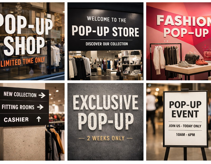
In Pop-Up Shops, typography is not a decorative afterthought but a core design decision. Because Pop-Up Stores operate for a limited time and rely heavily on first impressions, the fonts and typographic systems used in retail materials directly affect brand perception, clarity, and customer engagement.
From window signage and wall graphics to price tags and printed lookbooks, typography defines how information is consumed in a physical space. This article focuses deeply on fonts and typographic best practices for Pop-Up Shops, helping brands design retail materials that are both visually compelling and functionally effective.
The Role of Typography in Pop-Up Shops
Typography in Pop-Up Stores serves three primary purposes: communication, navigation, and emotion. Unlike permanent retail, temporary environments must explain themselves instantly.
Well-executed typography helps Pop-Up Shops:
- Communicate brand identity within seconds
- Guide visitors through the space intuitively
- Reinforce the emotional tone of the activation
Because customers rarely spend long periods reading text in Pop-Up Shops, typography must be concise, legible, and intentional.
Serif vs Sans-Serif Fonts in Pop-Up Stores
Choosing between serif and sans-serif fonts is one of the most fundamental typographic decisions in retail materials.
Sans-serif fonts are commonly used in Pop-Up Shops because they:
- Offer high readability at varying distances
- Feel modern, clean, and adaptable
- Perform well on large-format signage
Serif fonts, on the other hand, are effective when a brand wants to communicate:
- Heritage and craftsmanship
- Editorial or luxury positioning
- Sophistication and tradition
Many successful Pop-Up Stores combine both, using sans-serif fonts for functional text and serif fonts for headlines or storytelling elements.
Display Fonts and Accent Typography
Display fonts are designed to attract attention rather than support long reading. In Pop-Up Shops, they should be used sparingly and strategically.
Effective uses of display typography include:
- Window statements and campaign slogans
- Hero walls and photo backdrops
- Limited-edition product storytelling
Overusing decorative fonts can quickly overwhelm the space. In Pop-Up Stores, display typography works best when paired with a neutral base font that maintains clarity.
Font Weight, Size, and Scale
Typography in retail materials must account for physical distance and movement. Customers view Pop-Up Shops while walking, browsing, and interacting, not sitting still.
Key principles include:
- Use heavier font weights for distant readability
- Increase font sizes beyond digital design standards
- Avoid ultra-light fonts in printed or low-light conditions
Large-scale typography can also become an architectural element, turning walls and floors into brand communication surfaces.
Typographic Hierarchy in Retail Materials
Hierarchy ensures that customers understand what matters most at a glance. In Pop-Up Shops, strong hierarchy reduces cognitive effort and improves flow.
Clear hierarchy is achieved through:
- Distinct headline, subheadline, and body text levels
- Consistent spacing and alignment
- Controlled use of color and contrast
Retail installation should never force customers to search for essential information. Typography should lead the eye naturally through the message.
Alignment, Spacing, and White Space
Typography is as much about space as it is about letters. Poor spacing can make even the best font choices ineffective.
Best practices for Pop-Up Stores include:
- Generous line spacing for readability
- Consistent margins across all materials
- Intentional white space to reduce visual noise
In temporary retail, white space enhances perceived quality and helps typography feel confident rather than crowded.
Typography and Brand Voice
Fonts communicate personality before words are read. Rounded fonts may feel friendly and accessible, while sharp, geometric fonts can feel bold and progressive.
Typography should reflect:
- Brand tone of voice
- Target audience expectations
- Product positioning
When typography aligns with brand voice, Pop-Up Shops feel authentic and coherent rather than staged.
Typography Across Different Retail Touchpoints
Pop-Up Shops rely on multiple physical touchpoints, all of which should share a unified typographic system.
These include:
- Exterior signage and windows
- In-store displays and wayfinding
- Printed materials and packaging
Consistency across these elements builds trust and reinforces brand recall, even after the Pop-Up Store has closed.
Typography and Experiential Retail
In experiential retail, typography often becomes interactive. Floor decals, mirrors, and installations can all carry typographic messages that encourage exploration and social sharing.
As Rohan Singh, Head of Marketing, explains:
“Great typography in Pop-Up Shops does more than communicate. It shapes emotion, movement, and memory, turning retail materials into part of the experience rather than just information.”
This approach elevates typography from static design to experiential storytelling.
Common Font Mistakes in Pop-Up Shops
Even visually strong Pop-Up Stores can suffer from typographic missteps. Frequent mistakes include:
- Using too many fonts without structure
- Prioritizing aesthetics over readability
- Ignoring real-world viewing distances
- Inconsistent typography across materials
Avoiding these errors ensures that retail materials support engagement rather than distract from it.
The Future of Typography in Pop-Up Stores
As Pop-Up Shops evolve, typography is becoming more flexible and adaptive. Variable fonts, modular systems, and sustainable printing techniques are shaping the next generation of retail materials.
Typography will continue to play a central role in how Pop-Up Stores communicate value, identity, and emotion within limited timeframes.
FAQ
Why is font choice so important in Pop-Up Shops?
Font choice determines readability, brand perception, and how quickly messages are understood in Pop-Up Shops.
How many fonts should a Pop-Up Store use?
Most Pop-Up Stores perform best with one primary font and one secondary or accent font to maintain clarity.
Are decorative fonts suitable for Pop-Up Shops?
Decorative fonts work best as accents in Pop-Up Shops, such as for headlines or installations, not for body text.
Can typography influence customer behavior in Pop-Up Stores?
Yes. Clear and confident typography improves navigation, engagement, and purchasing decisions.
How does typography support experiential retail?
Typography can guide movement, create emotional impact, and become part of the immersive experience in Pop-Up Shops.