Flower Wallpaper Trends 2026: From Vintage Blooms to Modern Botanicals
Florals feel newly relevant in 2026 because they solve a common problem. Many homes look clean, yet a little flat. A well-chosen flower wallpaper print adds depth, softness, and a sense of intention in one move.
In this guide, you will see the biggest floral directions for 2026, how to pick color and scale by room, and which materials fit real life. You will also get styling and shopping steps that prevent costly misfires.
Why Flower Wallpaper is Trending in 2026
Florals keep winning because they adapt. One home can use them as a whisper. Another can use them as a statement. The category fits vintage architecture and modern builds with the right scale and palette.
Nature connection drives a lot of this momentum. After long days on screens, people want calmer visuals and fewer sharp edges. That is where botanical wallpaper earns its place, especially in bedrooms, dining rooms, and small baths.
Style has shifted, too. Older florals often looked dense and formal. Newer designs use cleaner linework, more negative space, and fresher color mixing. The result feels lighter and easier to live with.
Top Floral Styles for 2026
The best 2026 florals look curated, not crowded. Designers lean into controlled palettes, bolder scale, and finishes that add subtle depth.
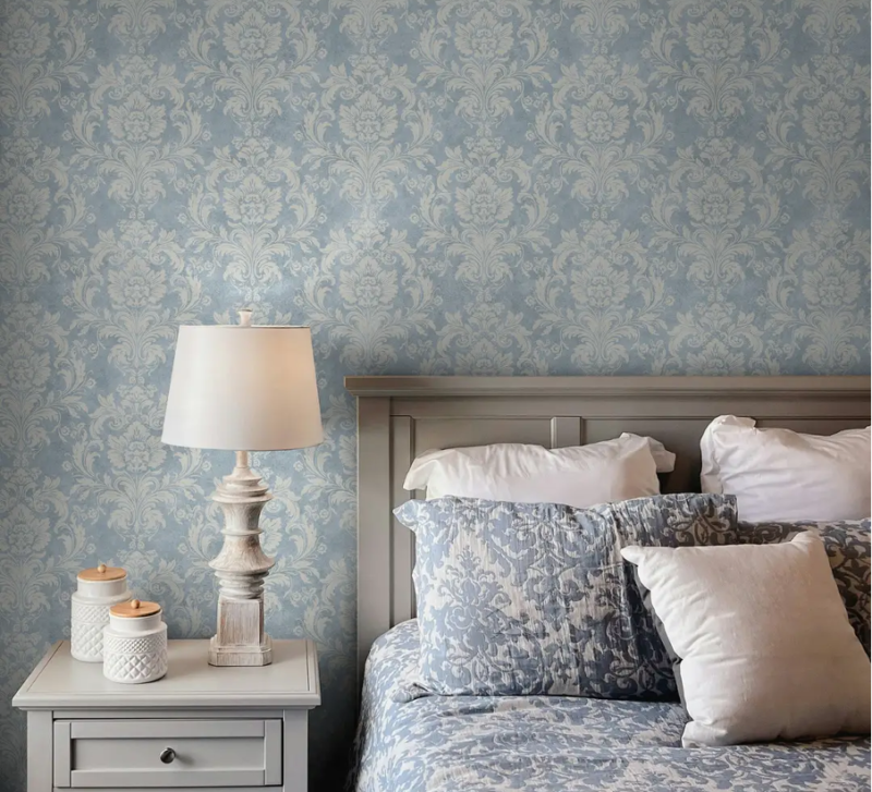
Vintage and Heritage: Victorian Damasks to Retro ’70s
Heritage florals are trending again, especially when they feel collected rather than precious. Think stylized roses, damask-inspired blooms, and retro curves that nod to the 1970s. A strong vintage flower wallpaper choice often includes warm undertones like tobacco, ochre, or antique cream.
To keep it current, balance it with simpler pieces. Choose one dominant wood tone and one metal finish. Let the wall do the heavy lifting, then keep art and accessories restrained.
Modern Abstract and Oversized Florals
Oversized blooms are a major 2026 statement. They look bold, yet they can still read calm when the palette stays tight. Abstract florals often use softened edges or simplified petals, which reduces visual noise.
This style shines behind a sofa, bed, or dining sideboard. It also works in open plans because the scale reads well from a distance. In smaller rooms, pick one oversized element on a lighter ground.
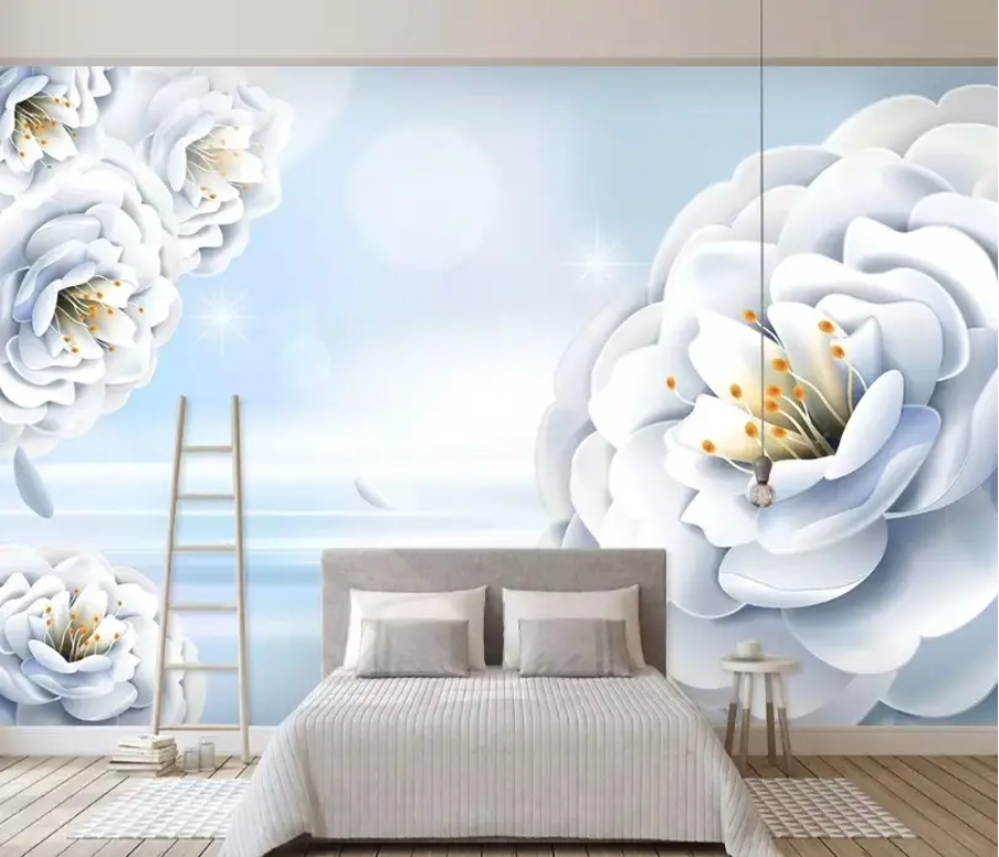
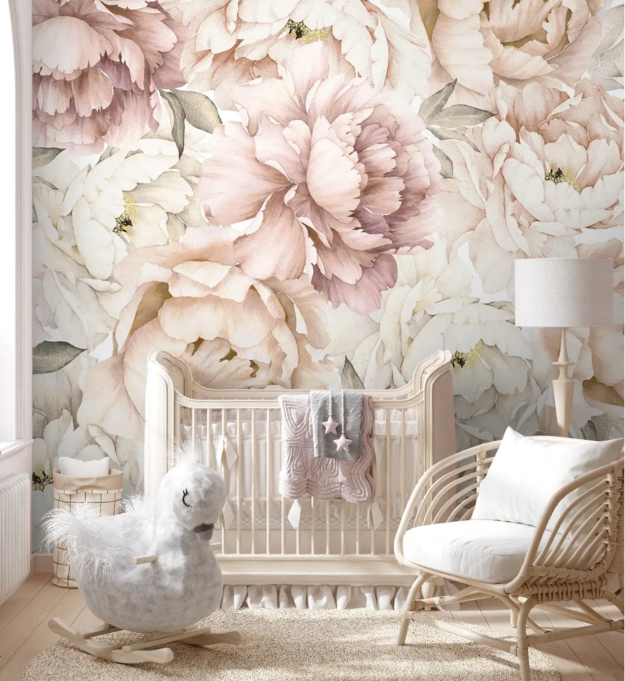
Watercolor and Botanical Murals
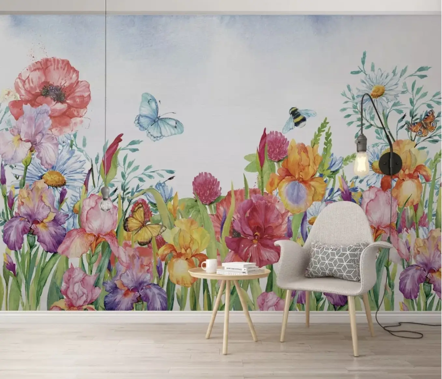
Mural-style florals feel popular because they read like art. Watercolor flower wallpaper brings gentle gradients and soft edges that flatter warm lighting. It suits bedrooms and quiet living rooms where you want a relaxed mood.
Botanical murals lean more scenic, with layered leaves and stems that create depth. They can make a room feel taller or wider, depending on the composition. Keep the surrounding décor simple, so the mural stays the focal point.
Dark Moody Florals
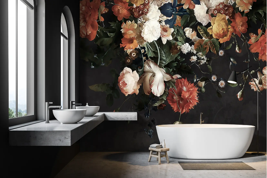
Dark florals remain a strong 2026 choice, especially in powder rooms, dining rooms, and bedrooms with layered lighting. Deep grounds, like ink navy or forest green, make petals look richer and more dimensional.
This look needs warm, soft light. Harsh overhead glare can flatten color and highlight seams. Add at least two light sources, then keep shiny accessories limited.
Soft Pastels
Pastels are trending too, but the modern version looks dusty and muted, not sugary. Think soft sage, blush-beige, and blue-gray. Pastels work well when you want brightness without sharp contrast.
To avoid a nursery-like feel in adult rooms, anchor the palette with one deeper neutral. Warm taupe, charcoal, or matte black can do the job.
Choosing Colors and Patterns for Different Rooms
| Room | Best floral direction | Why it works |
| Bedrooms | Watercolor blooms, softer botanicals, lower contrast | Supports rest and looks flattering under warm lamps |
| Living and Dining Rooms | Oversized florals, modern abstract blooms | Creates a strong focal wall and reduces the need for extra décor |
| Bathrooms and Small Spaces | Medium-scale botanicals, controlled palettes | Adds elegance without overwhelming tight footprints |
Material Options and Installation
Material choice affects how wallpaper installs, how it cleans, and how it ages. It also changes how confident you feel during a DIY project. Match material to moisture, traffic, and how long you want the look to last.
Peel-and-Stick for Renters and DIY Enthusiasts
Removable options work best on smooth, clean walls with well-cured paint. If you want flexibility, flower wallpaper peel-and-stick styles make it easier to test a bold print, then swap it later without a full repaint cycle.
Do a small test patch for 24 hours before committing. Check for edge lift and paint pull. That one step prevents most headaches, especially in older homes.
Vinyl for Durability and Moisture Resistance
Vinyl-coated or vinyl-based papers wipe more easily. They suit high-traffic spaces and homes with kids or pets. In bathrooms, keep wallpaper in drier zones and rely on a strong fan.
If you expect regular cleaning, durability often matters more than a delicate paper feel. A practical finish wins over time.
Large-repeat matching checklist (quick, dependable):
- Measure carefully and add extra for repeat and trimming.
- Mark a plumb line for the first panel.
- Dry-fit panels on the floor to preview alignment.
- Smooth from the center outward to push air out.
- Trim with a sharp blade and replace blades often.
- Recheck seams after one hour and press them again.
Styling Your Space with Florals
Florals look best when the rest of the room supports them. Styling works when you repeat a few cues from the print and keep everything else quiet.
Coordinating Furniture and Textiles
Pull two or three colors from the wallpaper and repeat them in textiles. Use solids for the biggest pieces, like rugs and curtains. Add one small patterned layer if you want extra depth.
Wood tone matters, too. Warm woods pair well with heritage florals and richer palettes. Lighter woods suit pastels and airy botanicals.
Lighting and Accessories to Complement Flowers
Lighting changes how florals read. Warm bulbs soften contrast and make petals look richer. Cool bulbs can flatten color and make dark grounds feel harsher. Layer lighting with at least two sources in rooms with deeper prints.
Accessories should echo the wallpaper, not compete with it. Pick one dominant metal and repeat it in two or three details. Too many mixed metals can feel busy fast.
Avoid pattern overload (fast Do and Don’t):
- Do keep one hero wall and simpler surrounding walls.
- Do repeat one color from the print in two places.
- Don’t mix multiple bold patterns at the same scale.
- Don’t stack busy art on top of a detailed print.
Shopping Tips and Budget Planning
Wallpaper shopping goes best with a plan. A few practical steps save money and reduce the risk of choosing a print that feels “too much” once it is installed.
Quality Markers: What to Look For
Start with print clarity and consistent color. Look for clean edges on linework and smooth gradients on watercolor-style designs. Check the surface finish under angled light. It should look intentional, not plasticky or uneven.
Think about maintenance before you buy. If the wall will get touched often, choose wipe-friendly materials. If you plan to remove it later, test a sample on your wall type first.
Sample Before Committing
A sample should answer three questions: color, scale, and finish. Tape it where the wallpaper will go and check it in daylight and at night. Many prints shift after sunset.
Step back to your usual viewing spot, then move closer. A pattern can feel calm from across the room and busy up close. If the surface has a sheen, point a lamp at it to spot glare.
If the design has a large repeat, plan extra for matching. Order all rolls at once when you can, since batch differences may show at seams.