Font Psychology in Packaging Design and Consumer Behavior
The visual appearance of text becomes visible to readers before they start reading the actual words. Product packaging in its competitive market uses font selections to share brand character and product excellence and emotional connections with customers through instant visual recognition. Designers who understand font psychology can develop packaging which draws customers in while using fonts to create particular emotional reactions that lead people to buy products. Packaging designers need to use typography as an underutilized design element which connects specific typefaces to human purchasing actions.
The Science Behind Font Perception
Consumer psychology research reveals that typography influences product perception more profoundly than most designers realize. Research shows that font selection creates 60% of initial impressions which result in product acceptance or rejection and typography elements affect customer perceptions of product quality by 40%. The preferences shown in these examples stem from font psychology which uses cultural associations and learned consumer responses that people have acquired through their entire life experience.
The human brain identifies packaging typographic elements through fast processes which exceed human thinking abilities. The use of serif font creates associations which link to traditional values and dependable workmanship and skilled handiwork. The design of a clean sans-serif font creates a modern look which represents both efficient operations and complete openness. Script fonts create an atmosphere of refined beauty which makes each design seem like it received individual care. The creative elements of display fonts present themselves as bold statements. The first consumer reactions take place before customers view the product description or brand messaging content.
The design of packaging needs strategic typography because it functions as a fundamental element instead of serving as a decorative element. The selection of fonts either supports or fights against the other communication elements which make up the brand. The industrial design of organic food labels through their use of industrial fonts creates mental conflicts in consumers. The use of casual typefaces for luxury items makes them appear less valuable to consumers. The relationship between font psychology and brand positioning leads to packaging designs which automatically draw in their target consumer market.
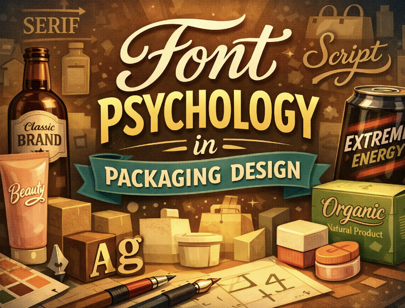
Font Categories and Their Psychological Triggers
Designers who understand how different font categories affect people can use this knowledge to select typography which achieves their brand goals.
Serif Fonts: Building Trust Through Tradition
Serif fonts achieve their visual weight through small decorative strokes which appear at letter ends to maintain their historical design elements. These typefaces communicate:
- The organization preserved its pre-existing reputation together with its official power base.
- Quality craftsmanship and attention to detail
- Timeless values and enduring traditions
- Sophisticated taste and refined aesthetics
Serif fonts deliver outstanding results for heritage brands and premium products and artisan goods and professional services. The use of serif typography on packaging labels creates an immediate connection between the product and its reputation for dependable and established quality which consumers link to the brand. Serifs work best for products which require trust because they suit gourmet food labels and luxury cosmetics and financial services and premium beverage packaging.
Sans-Serif Fonts: Projecting Modern Clarity
Sans-serif fonts remove decorative strokes which results in plain letterforms that present themselves in a direct manner. The basic framework allows people to create mental connections between:
- Contemporary innovation and forward-thinking approaches
- Honest transparency and straightforward communication
- Accessible friendliness and inclusive values
- Progressive efficiency and streamlined performance
The packaging of technology products and health and wellness items and minimalist brands and youth-oriented goods uses sans-serif typography as their primary font choice. The design presents a simple design which shows all information is accessible while the brand provides authentic value through its design without using any decorative elements.
Script Fonts: Creating Emotional Connection
Script fonts in packaging design create human touches through their handwritten and calligraphic appearance which adds artistic elements to the design. These typefaces evoke:
- Personal care and individualized attention
- Feminine grace and refined elegance
- Exclusive luxury and special occasion appeal
- Creative artistry and unique character
Script fonts perform best in markets which depend on emotional customer connections to generate sales. Script typography enables the communication of personal value and special significance which benefits all products including beauty items and wedding supplies and handmade products and high-end presents.
Display Fonts: Demanding Attention
Display fonts serve to create visual effects instead of readable text because they contain unique design elements which work best for headlines and brand identity purposes. These bold typefaces signal:
- Unique personality and original thinking
- Playful energy and fun experiences
- Confident disruption and category innovation
- Memorable distinction from competitors
Display fonts work best for children’s products and novelty items and bold brands and event-specific packaging which need to draw attention instead of building trust.
Typography Hierarchy in Packaging Design
The visual organization of consumer attention in packaging design depends on using different font styles to establish an information hierarchy which shows vital details first. The system presents its content through three separate levels which deliver the best results while keeping the information accessible to users.
The brand name together with product identifier appear in Primary typography which employs bold distinctive fonts that range from 36 to 72 points in size. The brand needs to act right away during this stage because it enables fast brand identification yet requires immediate problem resolution.
The secondary typography system employs medium-weight clear fonts which range from 18 to 24 points to present product advantages and category details. The design receives essential information at this level which helps with buying choices without creating information overload.
The tertiary typography section displays ingredients and instructions and regulatory information through highly readable fonts which range from 8 to 12 points in size. The system at this level protects both organizational rules and clear information presentation and visual organization structure.
The design system uses a systematic method which enables customers to find vital information directly through its interface while keeping visual elements that match their brand design.
Strategic Font Pairing for Packaging
Single-font packaging often lacks visual interest and hierarchical clarity. Designers achieve both readable text and brand identity through their strategic selection of fonts which create energetic visual effects. The successful combination of elements needs to follow particular basic rules which must be followed.
- The design needs contrast to operate as its fundamental design principle – Choose two fonts which present different visual elements through their design aspects and weight and structure instead of selecting fonts that appear identical.
- Limit font families – Use 2-3 typefaces maximum to avoid visual chaos and maintain cohesive brand identity.
- The organization needs to create an organized structure for its operations. The organization uses specific fonts to direct customers toward essential information which they can access right away.
- The document needs to use at least one font which provides excellent readability during small size viewing for its regulatory and instructional sections.
- Test at actual size – The testing process requires printing samples at packaging dimensions to evaluate font behavior during their actual deployment.
The design combination of serif typefaces with sans-serif typefaces creates visual elements which preserve classic design elements while displaying modern design elements. The combination of script-with-sans-serif fonts produces attractive headlines which work well with the simple body text design. The design achieves balance through its combination of geometric and humanist styles which unite structured precise elements with natural organic elements.
Cultural Considerations in Font Selection
Designers need to study their target audience preferences because different cultures link fonts to different meanings which they should avoid for creating positive designs.
- Western markets associate serif fonts with their historical origins but link sans-serif fonts to modern design standards.
- Designers who work with Asian markets need to focus on two essential design elements which require them to create complex characters and maintain suitable spacing.
- The Middle Eastern market chooses elaborate calligraphic designs to create luxury brand images but geometric font styles represent modern innovative designs.
- Latin American markets respond to bold, warm typefaces while excessive minimalism may feel cold or unwelcoming.
International brands need to select typography which creates positive effects throughout different cultural settings because they might need to create separate packaging designs for specific regions to achieve the right emotional response.
Practical Application in Gift Packaging
The process of gift packaging creates special typography problems which need fonts that show both celebration and premium quality and thoughtfulness regardless of what is inside the package. The typography needs to function between different products while preserving its elegant design which makes it suitable for gift-giving. Businesses that produce custom gift packaging boxes should choose their fonts carefully because this selection will turn practical containers into meaningful brand experiences which people will treasure and continue using.
The successful combination of gift packaging typography requires fonts which serve various purposes while creating emotional connections through their ability to maintain both versatility and sophisticated warmth. Script fonts help people create special touches which make their personal events more meaningful. Serif fonts produce an elegant formal appearance which makes them suitable for using in professional gift presentation settings. Clean sans-serifs deliver modern refinement for contemporary presentations.
Measuring Typography Effectiveness
Smart packaging designers test their font selections instead of depending on their individual preferences to confirm their design choices. The following measurement methods prove effective for their applications:
- The research evaluates sales performance by conducting A/B testing which studies how different typography styles influence customer actions.
- The research uses eye-tracking studies to study how people focus their attention and how they read information.
- The research uses consumer surveys to obtain perception data which shows how consumers perceive different font options and their relationship to particular brands.
- The research includes competitor analysis which evaluates our performance against successful leaders in our category.
- Readability testing verifying information accessibility at point-of-sale distances.
These research methods produce unbiased results which validate the typography decisions that designers would normally make through their individual design preferences.
Conclusion
Packaging design companies employ font psychology to influence consumer behavior through automatic mental responses which people experience without being aware of them. The selection of typography elements determines how customers judge product quality and brand character and emotional connection which leads to instant purchasing decisions when they see the design. Designers who understand font psychology create packaging that looks attractive through typographic elements which they use to boost sales by applying psychological design principles.
Designers who want to achieve their marketing goals need to understand how fonts influence customer reactions when they create packaging for high-end cosmetics and regular consumer products. ZEE Custom Boxes UK achieves successful design implementation through their ability to unite their typography skills with their manufacturing expertise which results in ready-for-retail products that function well. The most effective packaging typography achieves success through its ability to create psychological effects while maintaining readability and its suitability for different cultures and its power to distinguish brands from others and its ability to attract customers while delivering essential information.