
Free Fonts That Stay Readable in a Tiny Profile Picture (Tested at 24 px)
Most logo font advice is written for the big version of the logo: the website header, the business card, the shop sign. But for a lot of small brands, the place where the logo is seen most often is a circle of about 32 pixels next to a comment, a message or a notification.
A profile picture shrinks fast. On a profile page it is large; in a comment thread, a group chat or a list of followers, it is often between 24 and 40 pixels wide. That is where many good-looking logos turn into a dark dot with some white noise inside.
So I ran a simple test. I took one short name, “nova”, set it in white on a navy circle, and made it as wide as possible inside the circle: 78% of the diameter, the same for every font. Then I shrank the circle from 96 to 24 pixels with twelve free fonts that are popular for logos.
※ All the fonts in this article are 100% free for both personal and commercial use. They are in the Google Fonts directory, under the SIL Open Font License.
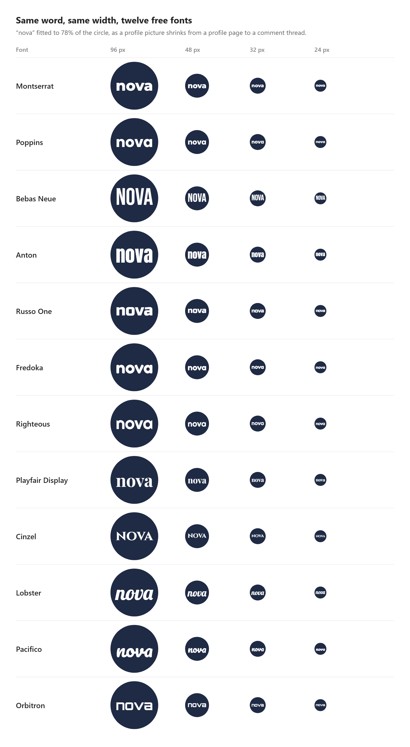
Same word, same width: the circle only leaves room for so much width, so narrow fonts get taller letters.
The result in one sentence: in a circle, width is the enemy
A circle limits the width of the word, not its height. Once every name is fitted to the same width, a narrow font simply gets more height for its letters, and height is what the eye reads at small sizes.
I measured it in a 32 px avatar. With the word at the same width (25 px), Bebas Neue’s letters stood 11 px tall and Anton’s lowercase 10 px. Montserrat, Poppins, Russo One and Orbitron, all wide geometric fonts, ended up with a lowercase only 6 px tall. That is almost half the size, for exactly the same space.
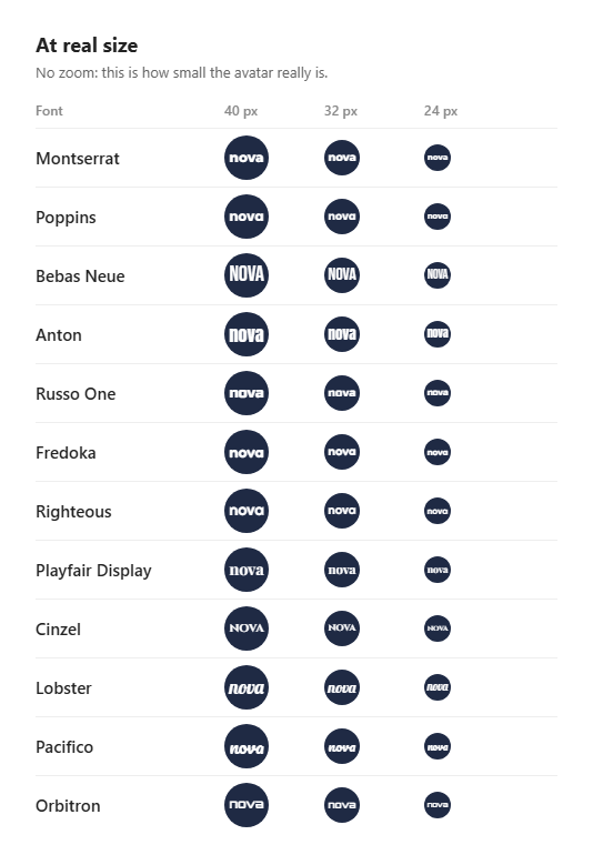
At real size, without zoom. Look at the 24 px column from a normal distance.
Bebas Neue
Bebas Neue is the clear winner of the test. It is an all-caps, condensed sans serif, so a short name keeps tall, clean letters even in the smallest circle. It also has no thin strokes to lose.
At 24 px: still readable from a normal distance, the only font of the twelve where I did not have to lean in.
Designed by Ryoichi Tsunekawa (Dharma Type) · 1 style (Regular, caps only) · License: SIL Open Font License
Anton
Anton is a condensed display font in the spirit of the classic advertising grotesques, with a lowercase. If you want your name in lowercase (many brands do, it feels friendlier), Anton is the best choice of the test.
At 24 px: very close to Bebas Neue. The counters of the “a” start to fill in, but the word stays clear.
Designed by Vernon Adams · 1 style (Regular) · License: SIL Open Font License
Lobster
A surprise: Lobster is a bold, connected script, and it held up much better than I expected. Its letters are heavy and slightly condensed, which gives them the height that wide fonts lack.
At 24 px: readable, as long as the name is short. With two words, the connections between letters merge.
Designed by Pablo Impallari · 1 style (Regular) · License: SIL Open Font License
Montserrat and Poppins
These are the two fonts most often recommended for logos, and both look great at 96 px. In a small circle, their round, wide letters are the problem: the word has to shrink to fit, and the lowercase drops to 6 px.
At 24 px: you can guess the word if you already know it. A new visitor will not read it.
Montserrat: Julieta Ulanovsky, 9 weights plus italics · Poppins: Indian Type Foundry, 9 weights plus italics · License: SIL Open Font License
Playfair Display and Cinzel
Elegant serifs live on contrast: thick strokes next to very thin ones. At small sizes, the thin strokes disappear first. Cinzel adds a second handicap, since its capitals are wide.
At 24 px: the thin parts are gone, the letters fall apart. Keep these fonts for the large version of the logo.
Playfair Display: Claus Eggers Sørensen · Cinzel: Natanael Gama, caps only · License: SIL Open Font License
Orbitron, Russo One, Righteous, Fredoka and Pacifico
Each has a strong personality, but all five are wide. Orbitron, the widest of the test, needed the smallest font size of all to fit. Pacifico, unlike Lobster, has a small lowercase under large swashes, so most of its height is decoration.
At 24 px: a texture rather than a word. Fine as a mood, not as a name.
Orbitron: Matt McInerney · Russo One: Jovanny Lemonad · Righteous: Astigmatic · Fredoka: Milena Brandão · Pacifico: Vernon Adams · License: SIL Open Font License
What to do if your logo font is wide
You do not have to give up the font you love. Use it for the full logo, and make a second, small version for the profile picture. Three things work well:
Initials instead of the full name. Two letters can be twice as large as four. This is why so many brands use a monogram as their avatar.
A condensed font for the avatar only. Bebas Neue or Anton next to a wide font in the main logo is a classic pairing, and nobody will see them side by side at 24 px anyway.
A heavier weight. If the font has one, take the Bold or Black style for the small version: thin strokes are the first thing to vanish.
You can see it for yourself in a minute: in this free logo maker, type your name, switch between the fonts and look at the result in the profile picture format before you download it. It runs in the browser and does not ask for an account.
Conclusion
When you pick a logo font, test it the way people will really see it: tiny, in a circle, from a normal distance. For a name, condensed fonts like Bebas Neue and Anton win easily. Wide favourites like Montserrat and Poppins are better kept for the large logo, with initials or a condensed font for the avatar.
If you want the full method for the big version of your logo, our guide on how to choose a logo font covers brand personality, pairing and licensing.