
How to Choose and Set Up Fonts for a B2B Website in Webflow
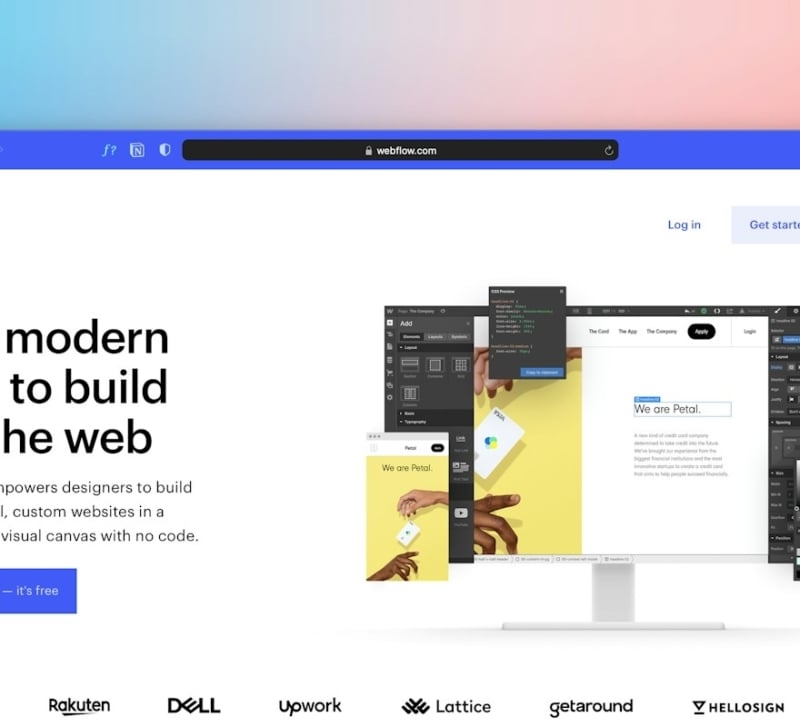
Most B2B websites get their fonts chosen in a design file. Someone tries a few typefaces in Figma, the team picks the one that looks most on-brand, and the decision is made. Nobody checks whether the license covers the website, how the files will load, or how the fonts will hold up once 40 pages are built and edited by a marketing team.
Those questions surface later, inside Webflow. A license turns out to be desktop-only. Headings shift as the font loads. Body text drifts between 16 and 18 pixels across templates. Each problem is small, but together they make a site feel less trustworthy. This guide covers how to choose fonts that suit a B2B website and how to set them up in Webflow so they stay consistent.
What a B2B Website Needs From a Typeface
B2B websites carry more dense information than most sites. Product pages list specifications. Pricing pages compare plans. Case studies include figures and quotes. A typeface that looks striking in a hero headline may become tiring to read in a feature table.
Start with readability at body size. Test candidate fonts at 16 to 18 pixels with real paragraphs, not a single sentence. Look at letter spacing, the height of lowercase letters and how easily similar characters such as I, l and 1 can be told apart. Typefaces designed for screens, such as Inter or IBM Plex Sans, are a useful benchmark because they were built for exactly this kind of dense interface text.
Check the range of weights. Most B2B sites need at least regular, medium and bold for body text, labels and buttons. A display font with only one weight will limit the design quickly.
Look for tabular figures if your site shows numbers in columns, such as pricing or comparison tables. Tabular figures give every digit the same width, so numbers line up. Finally, confirm language support if you sell in more than one market. A font that lacks accented characters will fall back to a different typeface mid-word.
Check the License Before You Commit
Font licenses are easy to overlook and expensive to get wrong. A desktop license lets designers use a font in design tools. It does not usually allow the font to be embedded on a website. Web licenses are often separate and may be priced by monthly pageviews.
There are three common routes for a Webflow site. Google Fonts are free and open source, and Webflow can load them directly. Adobe Fonts are included with a Creative Cloud plan and connect to Webflow through a web project. Commercial or independent fonts are self-hosted, which means you buy a web license and upload the files yourself.
Free fonts still need checking. Fonts shared on libraries and type sites come with different licenses, and some allow personal use only. Read the license for each font, keep a copy with your brand files and note any pageview limits. That record saves time when someone asks during a rebuild whether the font can be used.
Set Up Fonts in Webflow So the Site Stays Consistent
How fonts are set up matters as much as which fonts you choose. A careful setup keeps the site fast and stops styles drifting as more people edit it.
Teams that hand a rebuild to an outside partner, such as the Veza Digital B2B Webflow agency team or a freelance developer, should ask to see the type variables and tag styles described below before any page is built. Fixing the system at that stage takes far less time than fixing it after launch, when every template has to be checked.
For self-hosted fonts, Webflow’s guide to uploading custom fonts covers the steps. Beyond the upload itself, these habits keep typography under control:
- Upload WOFF2 files only. WOFF2 is the most compressed web font format and is supported by all current browsers.
- Upload only the weights you use. Each extra weight adds a file the browser may need to download.
- Set fallback fonts. Choose a system font with similar proportions, so the page looks close to final while the web font loads.
- Use font-display swap. This shows text immediately in the fallback font instead of hiding it until the web font arrives.
- Define the type scale as variables. Store font sizes, line heights and families as Webflow variables, so a change in one place updates the whole site.
- Style the tags first. Set All H1 to H6 headings, Body and paragraph styles at the site level before building pages, then use classes only for genuine exceptions.
- Limit the site to two families. One for headings and one for body text is enough for most B2B sites.
Test Typography Before Launch
A type system that looks right in the Designer can still behave differently in browsers. A short round of testing catches most problems.
Run key pages through PageSpeed Insights and check Cumulative Layout Shift. If headings jump as the page loads, the fallback font is too different from the web font, or a font is loading late.
Check the site on Windows as well as macOS. Fonts render differently across systems, and thin weights that look elegant on a Mac screen can become hard to read on Windows.
View pages on a phone and at 200 percent browser zoom. Headings that fit on desktop may break awkwardly on small screens, and long product names can overflow buttons.
Test with real CMS content as well. Blog titles, customer names and translated pages are often longer than the placeholder copy used in design. Publish a few test items with the longest realistic text and check that cards, navigation and buttons still hold their shape.
Finally, check contrast against WCAG guidelines, especially for light gray body text and text placed over images. Readability is part of accessibility, not only style.
Treat Typography as Part of the Build
Fonts on a B2B website do more than set a mood. They carry pricing, specifications and the arguments that move a buyer forward. Choose a typeface that reads well in dense content, confirm the license covers web use and set it up in Webflow as a system rather than a series of one-off styles. That approach keeps the site fast, consistent and easy for the whole team to maintain.