The Psychology of Typography in Self-Publishing: How Font Choices Can Make or Break Your Book Sales
In the crowded ocean of book covers, your font is your book’s handshake — it can be firm and confident, warmly inviting, or awkward enough to make readers glance away. Believe it or not, readers form an opinion about your book within seconds, and poor typography is like that awkward handshake that sends them sailing past without a second thought. It’s not just fluff: studies reveal that over 60% of book sales are influenced by cover design, and typography plays a starring role.
For self-publishers, this means your book typography isn’t just about looking pretty—it’s a powerful sales tool. Yet, so many indie authors overlook this crucial piece, unknowingly sabotaging their chances before anyone even reads the first line. The wrong font in book cover design can confuse your target audience, clash with your genre, or simply scream “amateur hour.”
But don’t panic. Typography isn’t rocket science, and you don’t need to become a font guru overnight. Understanding the psychology behind font choices and how they shape perception can give your book the professional edge it deserves. From sleek, trustworthy serifs to playful, eye-catching scripts, your font is your silent pitch, speaking volumes before your story even begins.
Ready to turn your font from foe to friend? Let’s see how smart typography choices can make or break your book sales and set you up for self-publishing success.
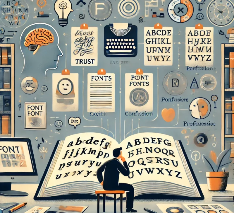
The Psychology Behind Font Choices: Fonts With Personality
Fonts aren’t just shapes on a page—they’re full-blown characters with moods, personalities, and attitudes. Think of them as the outfit your book wears to the party, setting the tone before anyone even cracks open the cover.
Take serif fonts, for example. They’re the classic storytellers, the quiet, reliable ones who whisper tradition, trust, and a touch of sophistication. Perfect for literary fiction, historical novels, or any book that wants to convey timelessness and depth. Imagine the dignified Times New Roman or the graceful Garamond fonts that say, “Take me seriously; I’ve got substance.”
On the flip side, sans-serif fonts are the fresh-faced newcomers—clean, modern, and unpretentious. They shout clarity and simplicity, making them favorites for business guides, self-help books, and tech manuals. Fonts like Helvetica or Arial don’t just look sleek; they suggest efficiency and forward-thinking, appealing to readers who want no-nonsense, straightforward info.
Then there’s the playful side of typography—the scripts and decorative fonts that swoon for romance novels or charm children’s books. These fonts flirt with elegance and creativity, drawing readers into a world of emotion and imagination. And for the thriller crowd? Bold, condensed fonts that hit you like a punch, cranking up tension and suspense before you even read the blurb.
Here’s a real-world peek: In 2016, Penguin Random House revamped the cover of Gillian Flynn’s Sharp Objects for a new edition, switching from a softer, more generic sans-serif font to a bold, condensed, and angular typeface that better matched the novel’s dark, suspenseful tone. This redesign not only aligned the typography with the thriller’s mood but also increased visibility on shelves and digital storefronts. Industry insiders noted a measurable uptick in sales following the redesign, proving how the right font choice can sharpen a book’s impact and attract the exact audience it’s meant for.
Your font choice is your book’s first impression—it sets reader expectations and emotions before the first sentence lands. Get it right, and your typography becomes your silent but powerful marketing partner, guiding readers to pick up your book and dive in.
Genre Fonts: Speaking Your Reader’s Language
When it comes to fonts, think of them like outfits that speak your book’s language—and nothing kills the vibe faster than a fashion faux pas. Matching your font to your genre isn’t just style—it’s a must. Here’s how to dress your book for success, font-style.
Romance
Want to woo readers at first glance? Flowing script fonts and elegant serifs are your best friends. Think of them as the silky gowns and tailored tuxedos of typography—romantic, graceful, and full of charm. Fonts like Lora, Playfair Display, or delicate scripts add that swoon-worthy touch, whispering love stories before the first page. Avoid anything too rigid or harsh—this is a genre all about softness and feeling.
Thriller & Mystery
Now, these books need fonts with edge—bold, condensed, and a little bit dangerous. Picture sharp leather jackets and sleek boots that keep you on the edge of your seat. Fonts like Impact, Bebas Neue, or Oswald punch up suspense and urgency, pulling readers into the adrenaline rush. Too flowy or fancy here? You risk diluting the tension or confusing the mood.
Business & Self-help
For these, clean and crisp fonts are the power suits of typography. Think sharp, confident, and trustworthy—fonts that say “I know my stuff.” Sans serifs like Helvetica, Montserrat, or Open Sans build authority and clarity, making complex ideas feel accessible and professional. Avoid overly decorative fonts; your readers want confidence, not clutter.
Children’s Books
Here, fonts get playful and chunky—think colorful sneakers and comfy overalls. The goal is readability and fun, so fonts like Comic Sans (yes, it still has its place!), Baloo 2, or Fredoka One charm young readers with their friendly shapes. Keep it simple and bold—kids need to recognize letters easily and feel invited to explore.
Designing your own book cover means making these font choices count. A mismatch—like dressing a thriller in a frilly script—can confuse your audience or worse, send them packing. Your font sets the tone, whispers genre cues, and invites the right readers in. So pick your typography wardrobe wisely—it’s your book’s first impression and the start of the story you want to tell.
Typography Tips for Self-Publishers: Readability & Pairing Secrets
Great typography is like a perfectly rehearsed duet — your cover font and interior font need to sing in harmony. If your cover shouts in bold serif, your interior text should whisper smoothly in a clean sans-serif, or vice versa. This balance keeps readers comfortable and engaged, letting your story take center stage without any font fights stealing the spotlight.
One of the biggest pitfalls self-publishers face is readability, and it’s not just about picking a pretty font. What looks crisp and clear on a Kindle or tablet might blur or crowd on printed pages. For digital reading, sans-serif fonts like Open Sans or Lato tend to perform best because of their clean lines and simplicity. For print interiors, classic serifs like Garamond or Merriweather are easier on the eyes during long reading sessions.
Don’t forget about size and spacing: line height (leading) and letter spacing (tracking) can make or break how easy your book is to read. Too tight, and your text feels cramped; too loose, and it drags the reader down. Aim for balanced white space — it’s like breathing room for your words.
Worried about breaking the bank on font licenses? Good news: there are plenty of professional-quality free fonts that won’t cost you a dime but will still elevate your design. Google Fonts, for instance, offers tons of great options like Montserrat, Roboto, and Playfair Display that pair beautifully and look polished across devices and print.
Custom book printing services can make or break how your typography looks in the real world. The right printer helps ensure your chosen fonts, spacing, and layout stay crisp and consistent across every copy. You can even request proofs to see how your type choices translate to paper before committing to a full run.
When designing your own book cover, keep font pairing simple but purposeful. Stick to two or three fonts max to avoid visual chaos. Remember, typography isn’t decoration; it’s a tool to guide your reader smoothly into your story. Nail this, and you’ll not only look like a pro — you’ll also keep readers turning pages, hooked from start to finish.
Tools & Resources: Let Tech Do the Heavy Lifting
Let technology be your secret weapon when it comes to creating eye-catching book covers and choosing the perfect fonts. You don’t have to be a design expert to make your book look polished and professional — there are plenty of smart tools out there that can do the heavy lifting for you.
AI-powered design assistants can help you experiment with font pairings, color schemes, and layouts quickly, giving you instant feedback on what works best. These tools take the guesswork out of design, so you can focus more on your story and less on stressing over every pixel.
When it comes to fonts, there’s a vast world of free, high-quality options available online. These collections cover every genre and mood, from playful scripts to bold display fonts and clean serifs. Using these resources means you can find fonts that look amazing without spending a fortune on licenses — perfect for self-publishers working with a budget.
To keep your typography on point, here’s a quick checklist to follow:
- Choose fonts that match your book’s genre and tone.
- Limit yourself to two or three fonts to avoid clutter.
- Make sure your fonts are legible in both print and digital formats.
- Test your cover design at different sizes to ensure clarity.
- Pay attention to spacing — proper line height and letter spacing improve readability.
Armed with these tools and tips, you can confidently select fonts that don’t just look good, but actually help your book sell. Remember, great typography isn’t about fancy — it’s about smart choices that make your story shine.