
How Font Compatibility Affects Business Documents Across Windows and Mobile Devices
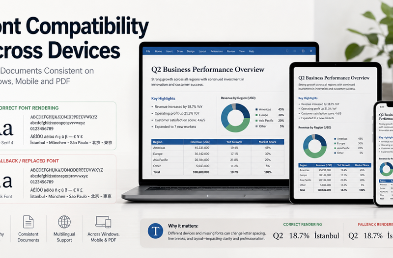
A business document can look perfectly formatted on the computer where it was created but appear very different when opened by a colleague, customer, or external partner. Headings may wrap onto new lines, tables may expand beyond the page, presentation text may overflow, and unfamiliar characters may be replaced with empty boxes.
These problems are often caused by font compatibility rather than the document content itself. When a file moves between Windows computers, mobile devices, operating systems, and office applications, the original typeface may not always be available. The receiving system may replace it with another font that has different spacing, character widths, or language support.
Font compatibility is therefore more than a visual design issue. It can affect document accuracy, readability, brand consistency, approval workflows, and the professional impression a business creates. Organizations need a practical approach that combines suitable fonts, consistent templates, compatible document tools, and cross-device testing.
Why Fonts Change Between Devices and Applications
The Original Font Is Not Installed
Most editable business documents depend on fonts installed on the device used to open them. If an employee creates a report with a typeface that is not available on a colleague’s computer, the operating system or application may select a replacement automatically.
The substitute font may look similar, but even small differences in character width and line height can change the layout. A title may move onto a second line, a paragraph may continue onto another page, or a table may no longer fit within its original column width.
This problem is common when employees use personal font collections, commercial brand fonts, or typefaces installed only on design department computers.
Operating Systems Use Different Default Fonts
Windows, macOS, Android, and iOS do not always include the same fonts. Even when two devices use typefaces with similar names, the exact font files and rendering behavior may differ.
Mobile devices may also use system fallback fonts when the original typeface is unavailable. This can affect line breaks, punctuation, spacing, and the visual balance of the page. A document designed for a large desktop display may consequently appear crowded or uneven on a phone or tablet.
The Font Does Not Support Every Language
Many fonts support basic Latin characters but do not include complete character sets for Chinese, Japanese, Korean, Cyrillic, Greek, or accented European languages. They may also lack currency symbols, mathematical notation, or specialized punctuation.
In multilingual business documents, unsupported characters may appear as blank spaces, square boxes, or symbols from an unrelated fallback font. This can make names, addresses, product details, and financial information difficult to read.
Businesses working across regions should check the actual language coverage of a font instead of assuming that every modern typeface supports international content.
Fonts Are Not Embedded or Exported Correctly
Editable documents usually rely on fonts installed on the receiving device. PDF files can provide more stable presentation because fonts may be embedded during export, but the result still needs to be checked.
Some font licenses restrict embedding or distribution. Certain export settings may also create incomplete font subsets, convert text unexpectedly, or replace unsupported characters. Teams should therefore review the final PDF instead of assuming that export automatically preserves every detail.
How Font Substitution Affects Business Documents
Broken Page Layouts
Font substitution can alter page length and document structure. Headings may wrap differently, paragraphs may shift, and page breaks may move. Headers, footers, captions, and numbered sections can become misaligned.
In contracts, policies, and formal reports, these changes may make internal references inaccurate. A table or clause expected on one page may appear on another, creating confusion during reviews and approvals.
Spreadsheet Readability Problems
Spreadsheets are also affected by font changes. Wider characters may cause labels to be cut off or displayed across neighboring cells. Numbers, percentages, and currency values may become harder to distinguish when a substitute font has different spacing.
Changes in row height or column width can also affect printed reports, dashboards, and financial summaries. Teams should test important spreadsheets on the devices and applications used by their intended recipients.
Presentation Inconsistency
Presentations rely heavily on controlled text placement. When a font is replaced, text may overflow its box, overlap an image, or move outside the visible slide area. Differences between regular, bold, and italic styles can also weaken the intended hierarchy.
These issues are especially noticeable in customer presentations, investor materials, training decks, and conference slides, where visual consistency contributes to credibility.
Multilingual Content Errors
A document may use one font for English text and another for Asian characters without making the distinction obvious. When the file is opened elsewhere, the system may apply several unrelated fallback fonts, creating inconsistent weight, spacing, and punctuation.
For multilingual documents, teams should select typefaces that provide broad character coverage or define approved alternatives for each supported language.
Choosing Office Software for Font-Sensitive Workflows
Businesses should test document software with the fonts, templates, and languages they use in actual work. A simple sample document cannot reveal how the platform will handle a complex report, branded presentation, multilingual contract, or spreadsheet containing specialized symbols.
Teams that regularly prepare reports, spreadsheets, and presentations should test their chosen office software for Windows with the fonts, templates, and multilingual documents they actually use, rather than relying only on simple sample files.
Useful tests should include opening files created by external partners, checking how missing fonts are replaced, reviewing documents on mobile devices, and exporting final versions to PDF. Businesses should also verify whether the software preserves comments, tables, images, charts, and text formatting during editing and conversion.
Selecting Fonts That Travel Well Across Devices
Prefer Broad Character Coverage
Before approving a typeface for business use, check whether it supports the required languages, accented characters, currency symbols, punctuation, and numerical formats. A font used for international documents should provide more than a visually attractive Latin alphabet.
Teams should also confirm that the required weights are available. If a font includes regular text but lacks a true bold or italic version, applications may create artificial styles that appear inconsistent across devices.
Limit the Number of Font Families
Using too many font families increases the risk that one or more will be unavailable on another device. It also makes templates harder to manage and can create unnecessary visual inconsistency.
A practical business template often needs only one font for headings and one for body text. A separate monospaced font may be used where technical data or code must be displayed clearly.
Use Common Fonts for Editable Files
Documents that will continue to be edited by employees, customers, and external partners generally benefit from widely available fonts. The most distinctive typeface is not always the most reliable option for collaborative work.
Common fonts can reduce substitution problems and make it easier for recipients to edit a file without changing its layout. Specialized brand fonts can still be used in controlled outputs where the final appearance can be verified.
Reserve Decorative Fonts for Final Outputs
Display and decorative fonts are suitable for selected headings, posters, campaign graphics, and fixed marketing materials. They are less suitable for long reports, spreadsheets, contracts, or documents that need frequent editing.
When a specialized typeface is important to the design, teams can prepare a verified PDF or convert limited display text into approved graphic elements, subject to the relevant license.
Font Licensing Is Part of Document Management
A font that can be downloaded without payment is not automatically approved for commercial business use. Font licenses may distinguish between personal projects, desktop documents, websites, applications, electronic publications, and product packaging.
Businesses should maintain records showing where each font was obtained, which license applies, and how many employees or devices are permitted to use it. This is particularly important when designers, agencies, and freelancers deliver editable project files.
Employees should not send commercial font files to customers or partners unless the license specifically permits redistribution. When recipients do not have access to the required typeface, the safer approach may be to provide an approved alternative or a finalized PDF.
Building a Font-Safe Document Workflow
Create an Approved Font List
The organization should maintain a short list of approved fonts for internal documents, customer materials, presentations, and multilingual content. Each primary font should have a documented fallback option.
Standardize Document Templates
Templates should define heading levels, body text, font sizes, line spacing, table styles, page margins, headers, and footers. Standardization reduces manual formatting and makes compatibility problems easier to identify.
Test Files on Multiple Devices
Important documents should be tested on a Windows computer, a mobile device, and the PDF reader commonly used by employees or customers. Presentations should be checked on the equipment used for delivery whenever possible.
Maintain Editable and Final Versions
Teams should preserve an editable source file and create a separate final version for distribution. The editable file supports future revisions, while the PDF or other controlled output helps preserve the approved appearance.
Using consistent font-friendly document tools can make it easier to review formatting, replace unsupported typefaces, and prepare stable versions for colleagues, clients, and mobile users.
A Pre-Delivery Document Checklist
- Check font availability. Confirm that recipients are likely to have access to the required typefaces.
- Review multilingual characters. Look for missing symbols, empty boxes, or inconsistent fallback fonts.
- Verify headings and page breaks. Make sure titles, paragraphs, and sections remain in the intended positions.
- Inspect tables and spreadsheets. Check column widths, numerical formatting, and printed layouts.
- Review presentation slides. Look for overflowing text, missing styles, and misplaced elements.
- Test the PDF export. Confirm that the final file preserves the expected layout and searchable text.
- Open the file on mobile. Ensure that essential content remains readable on smaller screens.
- Confirm font licensing. Verify that the planned commercial use and distribution are permitted.
- Preserve the editable source. Do not rely on the final PDF as the only working copy.
Common Mistakes to Avoid
One common mistake is reviewing a document only on the computer where it was created. This does not show how the file will behave when opened on another operating system or mobile device.
Businesses should also avoid using too many fonts, applying decorative typefaces to long passages, or assuming that every font supports multilingual text. A document that opens successfully may still contain significant formatting errors.
Another mistake is treating the PDF as the only source file. Finalized files are useful for distribution, but future revisions require a well-managed editable version.
Organizations should not ignore licensing records or distribute commercial font files casually. Font management should form part of the wider document governance process.
Conclusion
Font compatibility affects much more than the appearance of a document. It can influence readability, data presentation, page structure, brand consistency, and the speed of business reviews.
Organizations can reduce compatibility problems by selecting fonts with suitable language coverage, limiting unnecessary typefaces, standardizing templates, checking licenses, and testing important files across devices.
A reliable document does not depend on one perfect font. It depends on a repeatable workflow that connects font selection, software compatibility, cross-device testing, and controlled final delivery.