How to Choose the Right Font for Product Packaging: A Practical Guide for Designers
Fonts serve as fundamental design components that determine all aspects of product packaging design. The specific fonts used in packaging determine how customers will read product details, which affects their ability to understand the product and make quick decisions within a two-second timeframe.
The product becomes visually complex and unattractive through badly chosen font design, but proper font selection enables the packaging to show all its design and functional capacities. Designers need to use their creative skills in conjunction with their need to fulfill practical requirements in order to choose a font.
The process of font selection involves creativity and an effective message. This guide explains how to choose the right font using simple and clear principles.
Understand the Brand Before Selecting Typography
The first step in choosing a font is understanding the brand identity. Every product exists to deliver a particular message, which the font must support. Some brands focus on simplicity while others choose to present their content through more complex and detailed designs. The font should reflect this direction without creating confusion.
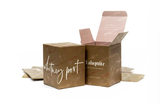
A luxury rigid box design for high-end products requires control and cleanliness, together with sophisticated design elements. The design requires a font that combines even letter spacing with detailed letter design to create a luxurious appearance that remains subdued. The objective is to ensure that the font fits with the overall image of the brand.
Make Readability a Priority
The font may look great, but it must also be readable. Packaging designs are often scanned in a hurry.
To ensure readability:
- Choose fonts with simple and clear letterforms
- Avoid overly decorative styles
- Make sure text remains visible at smaller sizes
Customers should be able to read important information without effort. If the text is difficult to understand, it can reduce trust in the product.
Choose Fonts That Match the Product Type
There are different types of products that need different types of typography styles. The type of font that is included must be in accordance with the type of product and the probable expectation of the buyer.
For example:
- Food packaging often uses friendly and clean fonts
- Medical or technical products need structured and clear fonts
- Premium items benefit from more refined and minimal typography
Matching the font style with the product category will result in a logical design.
Avoid Using Too Many Fonts
The packaging design will appear disorganized when multiple fonts are used across one design. The visual design achieves better results through its basic structure, which provides easier management for the entire system.
A common and effective approach is:
- One font for the product name or heading
- One font for additional details
By using as few as 2 different fonts, the document design will maintain a clean and readable design system.
Create Balance with Font Pairing
When more than one font is used in a design, the selected fonts must work together. The design should use complementary fonts that need to show both contrasting elements and matching features.
Some practical tips:
- Use a bold font with a lighter font
- Use a font with serifs and a font without serifs
- Don’t use fonts that look too similar
Balanced font pairing helps guide the reader’s attention without making the design look disconnected.
Consider Printing and Packaging Materials
Fonts do not always appear the same on different materials. The packaging surface can affect how text is displayed after printing. The designers of luxury rigid boxes for premium products use fonts that must remain legible through all printing methods, including embossing and foiling.
Thin or overly detailed fonts may lose clarity on certain surfaces. Testing fonts on the actual material helps ensure the final output looks as expected.
Manage Spacing for Better Clarity
Spacing plays a key role in typography. Even a good font can look difficult to read if spacing is not handled properly.
Focus on:
- Proper letter spacing
- Clear line height
- Balanced margins
The design creates an organized appearance through its effective spacing system, which improves reading abilities.
Maintain Consistent Typography Across Products
The brand will achieve better recognition when all its packaging designs use identical typography. The design will achieve a professional appearance through the implementation of unified typography.
Test Fonts in Real Conditions
Before finalizing the design, testing is important. Fonts may look good on a screen but behave differently in real use.
You can:
- Print sample designs
- Check readability from different distances
- Examine how it looks with different levels of lighting
The system will detect operational issues during the initial development phase, which will enable verification of its real-world performance capabilities. Designers often collaborate with experienced packaging manufacturers such as Blue Box Packaging to ensure typography and print quality appear exactly as intended on the final packaging.
Final Thoughts
The designer has to learn about design principles when choosing a font, as it demands precision as well as a complete understanding of design principles. The font should match the brand, remain easy to read, and work well with the packaging material.
Designers achieve effective package communication through their design process of using three principles, which are clarity, balance, and consistency.