
How to Choose the Right Fonts for Your Logo: A Designer’s Guide
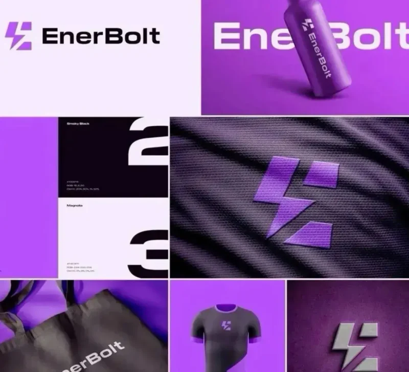
Your logo is usually the first thing people notice about your brand. And while most business owners obsess over colors and shapes, the font you pick can make or break the whole thing. The right typeface communicates your personality before anyone reads a single word.
Whether you’re starting fresh or rethinking an existing identity, getting the typography right matters more than most people realize. Many businesses turn to professional logo design services early in the process and for good reason. Font decisions are not just aesthetic; they’re strategic.
Let’s break down exactly how to choose the right font for your logo.
Why Typography in Logos Is Such a Big Deal
Think about some of the most recognized logos in the world: Coca-Cola, Google, and FedEx. The font is doing a lot of heavy lifting in each of them. It sets the tone, communicates the industry, and triggers an emotional response.
A playful font works well for a kids’ toy brand. That same font on a law firm’s logo? It would instantly kill credibility.
Typography isn’t decoration. It’s communication.
The Main Font Categories (And What They Say About Your Brand)
Before you start browsing through hundreds of options, it helps to understand what each font style actually signals.
Serif Fonts
Serif fonts have small “feet” at the ends of each letter stroke. Think Times New Roman or Garamond. They feel traditional, trustworthy, and established. Great for law firms, finance brands, luxury goods, and publishers.
Sans-Serif Fonts
No feet, cleaner lines. Think Helvetica or Futura. Sans-serif fonts feel modern, clean, and approachable. Tech companies, startups, and lifestyle brands tend to gravitate here.
Script Fonts
These mimic handwriting. They feel personal, elegant, or creative depending on the style. Good for beauty brands, boutiques, wedding businesses, or anything that wants a human touch. But be careful, scripts can get hard to read at small sizes.
Display and Decorative Fonts
These are the bold, personality-heavy fonts made to stand out. They work well for brands that want to be memorable and distinctive, like restaurants, entertainment companies, or creative studios. Use sparingly; they don’t always scale well.
Monospace Fonts
Every character takes up the same width. They feel technical and precise. You’ll see these in developer tools, tech products, and anything that wants to communicate accuracy or code culture.
How to Match a Font to Your Brand Personality
Here’s a simple exercise. Write down three to five words that describe your brand. Maybe it’s: bold, modern, trustworthy. Or: playful, colorful, friendly.
Now look at those words and ask yourself which font category naturally aligns with that description?
- Bold and modern → geometric sans-serif
- Trustworthy and established → classic serif
- Friendly and approachable → rounded sans-serif
- Creative and handcrafted → script or hand-lettered
- Technical and precise → monospace or clean sans-serif
This matching process cuts through the noise fast. Instead of scrolling through 500 fonts, you’re narrowing down to a specific category that fits your brand’s voice.
The Readability Rule
A logo font needs to work at multiple sizes across a billboard, a business card, and a mobile screen. If your font looks great at 300px but falls apart at 20px, it’s going to cause problems.
Always test your font at small sizes before committing. If the letters blur together or become hard to read, move on.
Script fonts are the most common offenders here. Some are beautiful but completely illegible when scaled down. According to Google’s Material Design guidelines, legibility and clarity should always take priority over decorative style, a principle that applies just as much to logos as it does to interfaces.
Avoid These Common Font Mistakes
Using Too Many Fonts
Stick to one font in your logo, two at most. Using three or more typefaces makes the design feel chaotic and unresolved.
Picking a Trendy Font
Trends fade. A font that feels fresh today can feel dated in two years. Aim for something with longevity rather than something that’s just popular right now.
Stretching or Distorting Fonts
Never manually stretch a font to make it fit. It throws off the letter proportions and instantly makes the design look amateur.
When to Bring in the Professionals
There’s a point where DIY font choices start costing you more than they save. If you’re building a brand that needs to compete, stand out, and stay consistent across every touchpoint, packaging, signage, digital, and print, you need more than a font picker.
Working with a branding agency means you get a team thinking about the full picture: how your font pairs with your color palette, how it scales, how it translates across different mediums, and how it holds up against competitors in your space. That kind of strategic thinking is hard to replicate with a free tool.
A Quick Checklist Before You Finalize Your Logo Font
- Does it match your brand personality?
- Is it readable at small sizes?
- Does it work in black and white?
- Is it licensed for commercial use?
- Does it feel timeless rather than trendy?
- Have you tested it across different backgrounds and formats?
If you can check all six boxes, you’re in good shape.
Final Thoughts
Choosing a font for your logo isn’t just about what looks good; it’s about what communicates the right message to the right audience. Take your time, test your options, and don’t rush the decision.
Your font will represent your brand for years. Make it count.